
PRINTED MARKETING PIECES
Time length:
Various lengths of timeTools:
InDesign, Photoshop, IllustratorRoles/Skills:
Marketing, Branding, Design Layout, Time Management, ProductionOVERVIEW
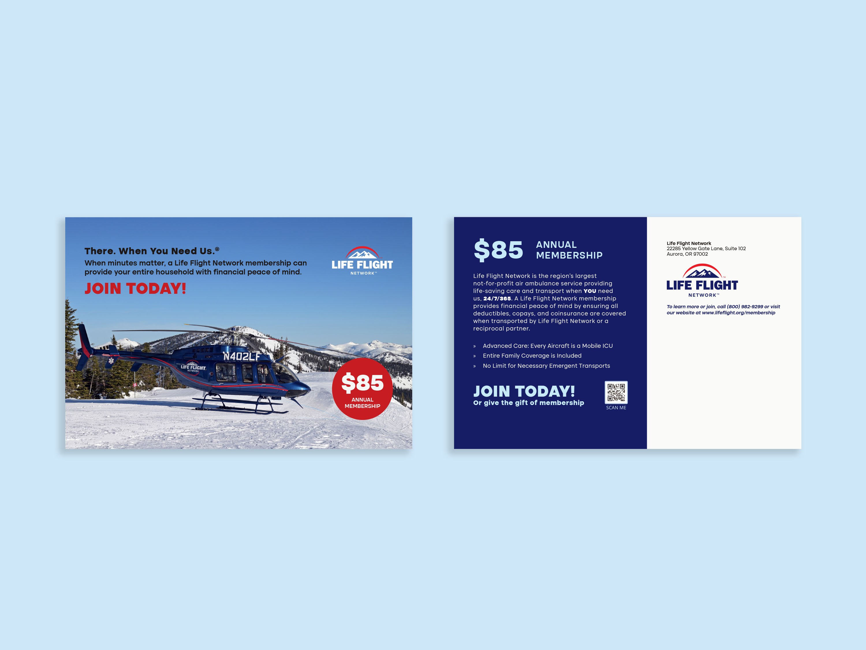
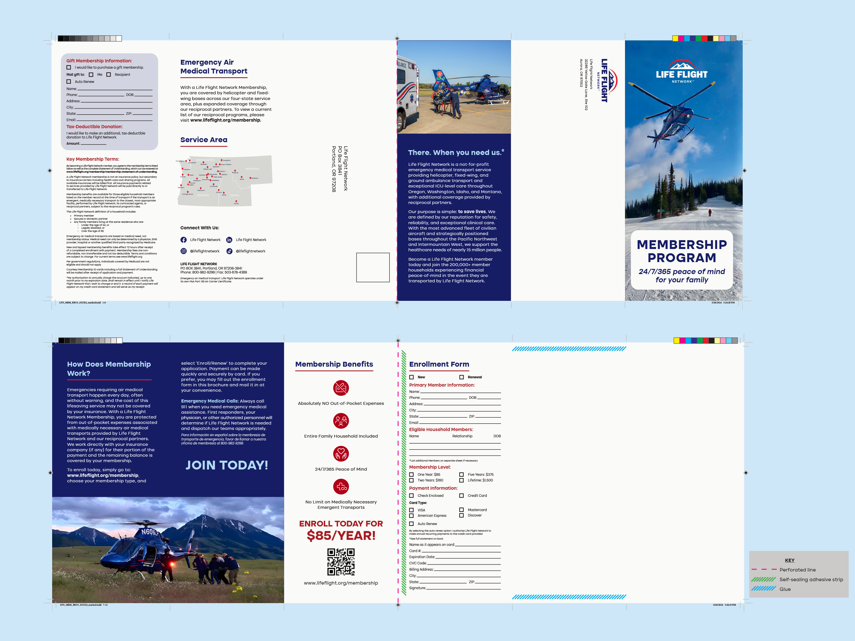
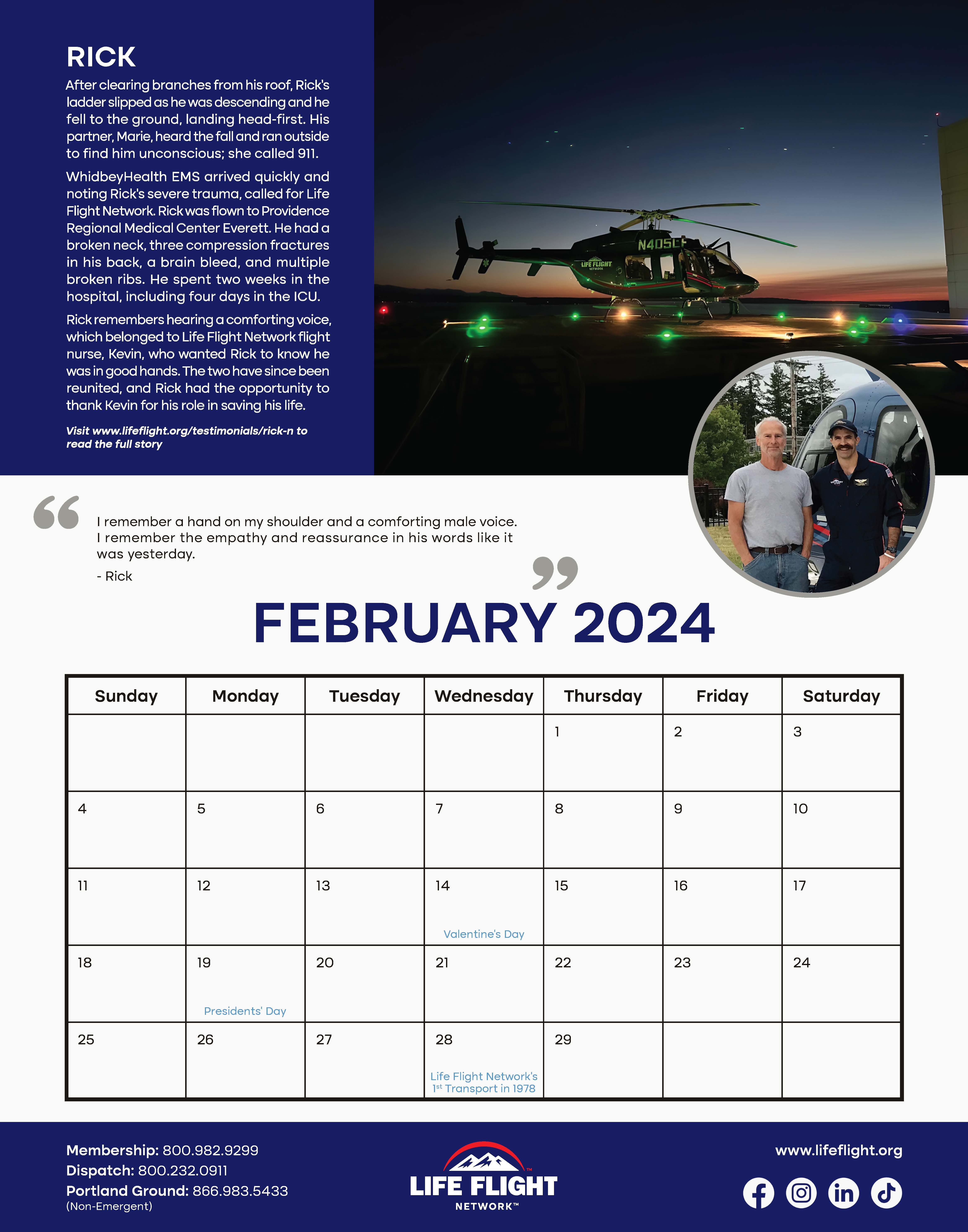
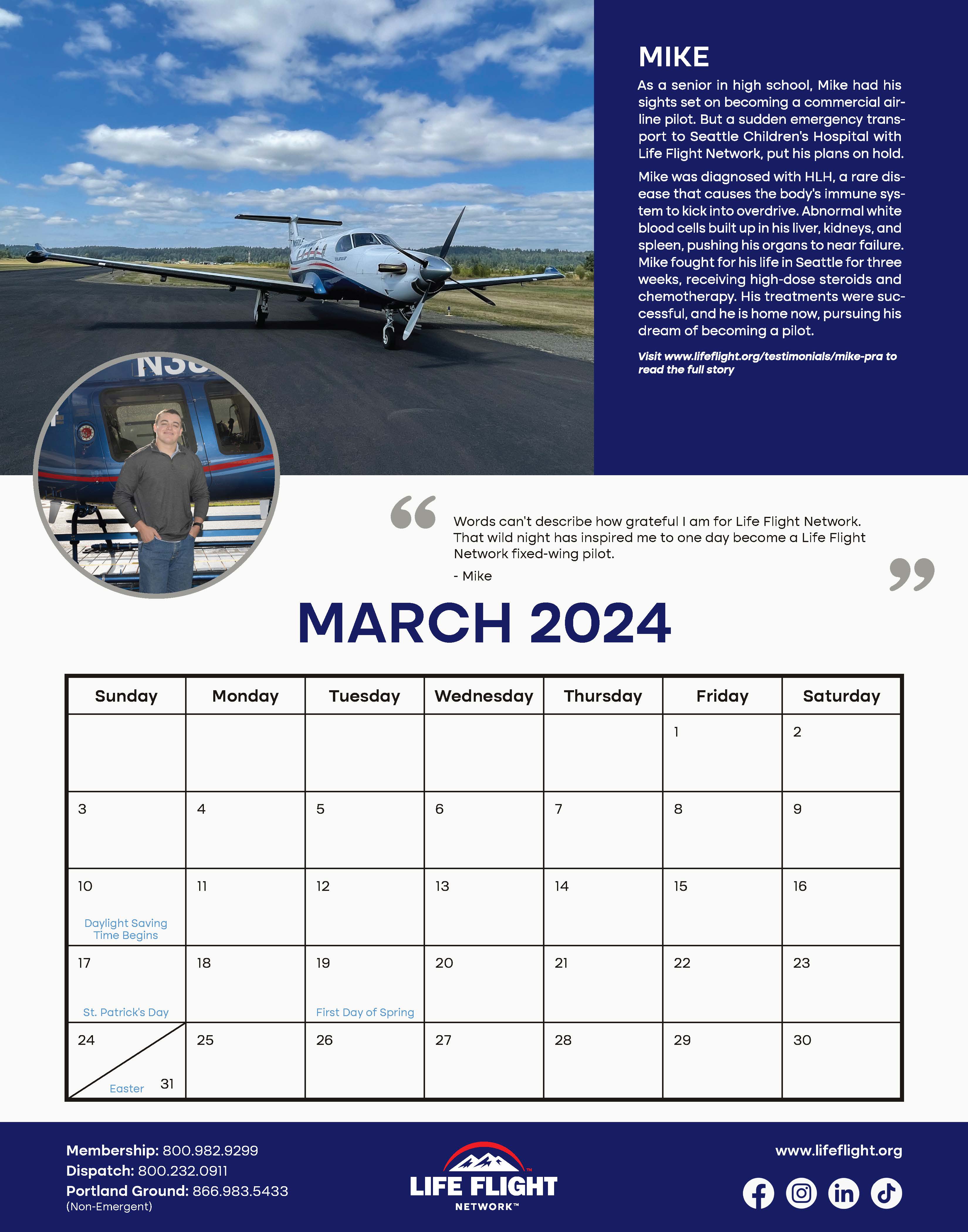
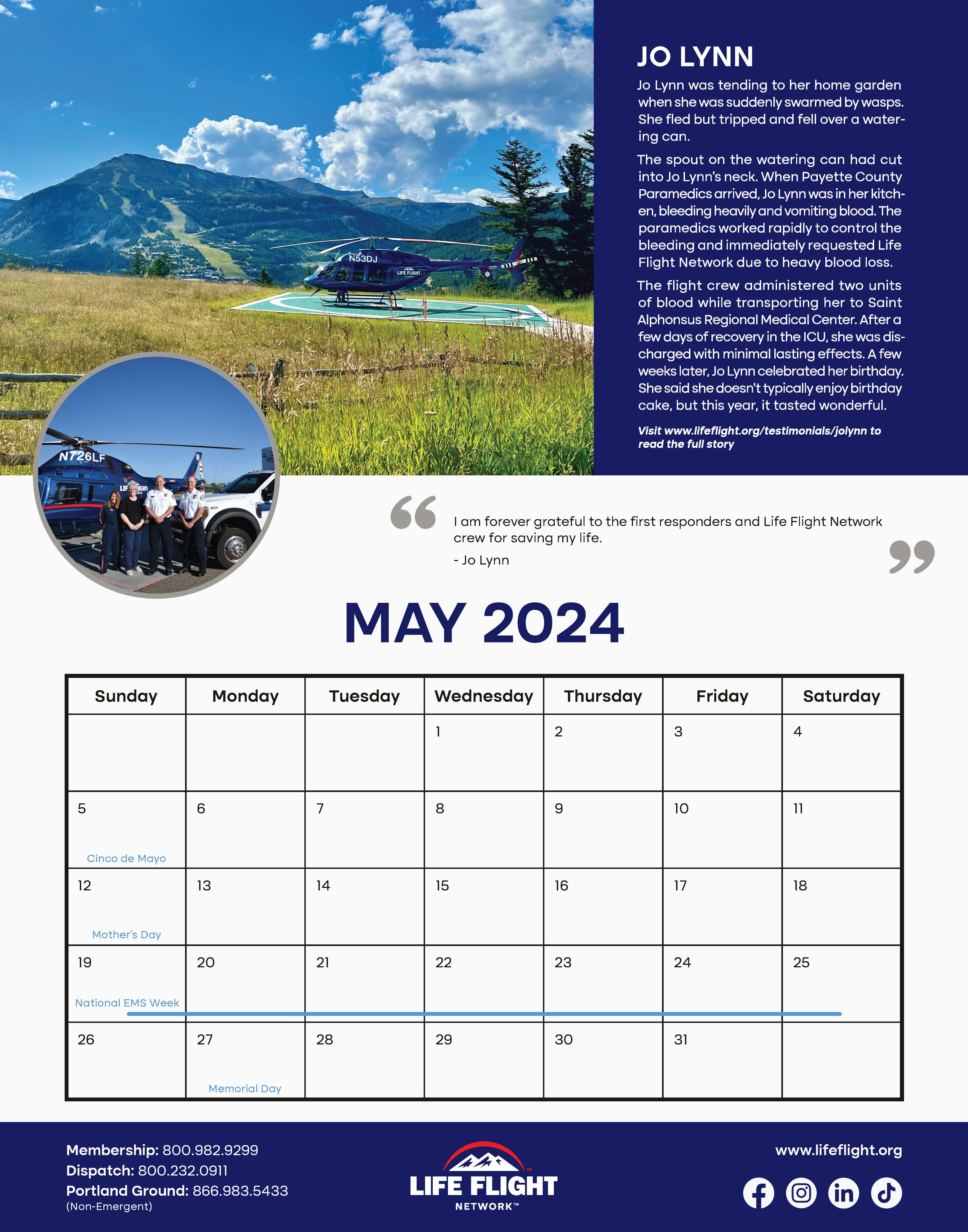
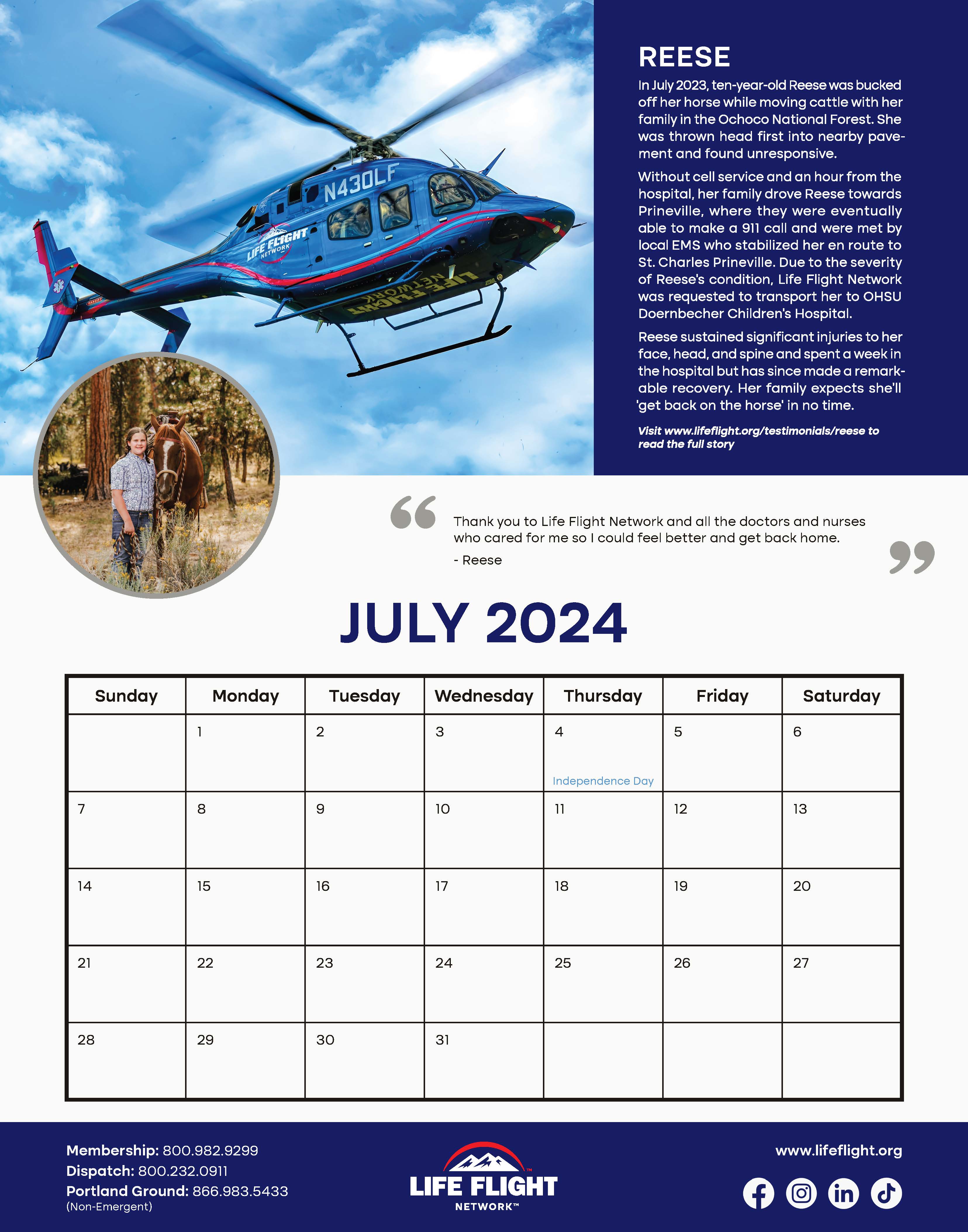
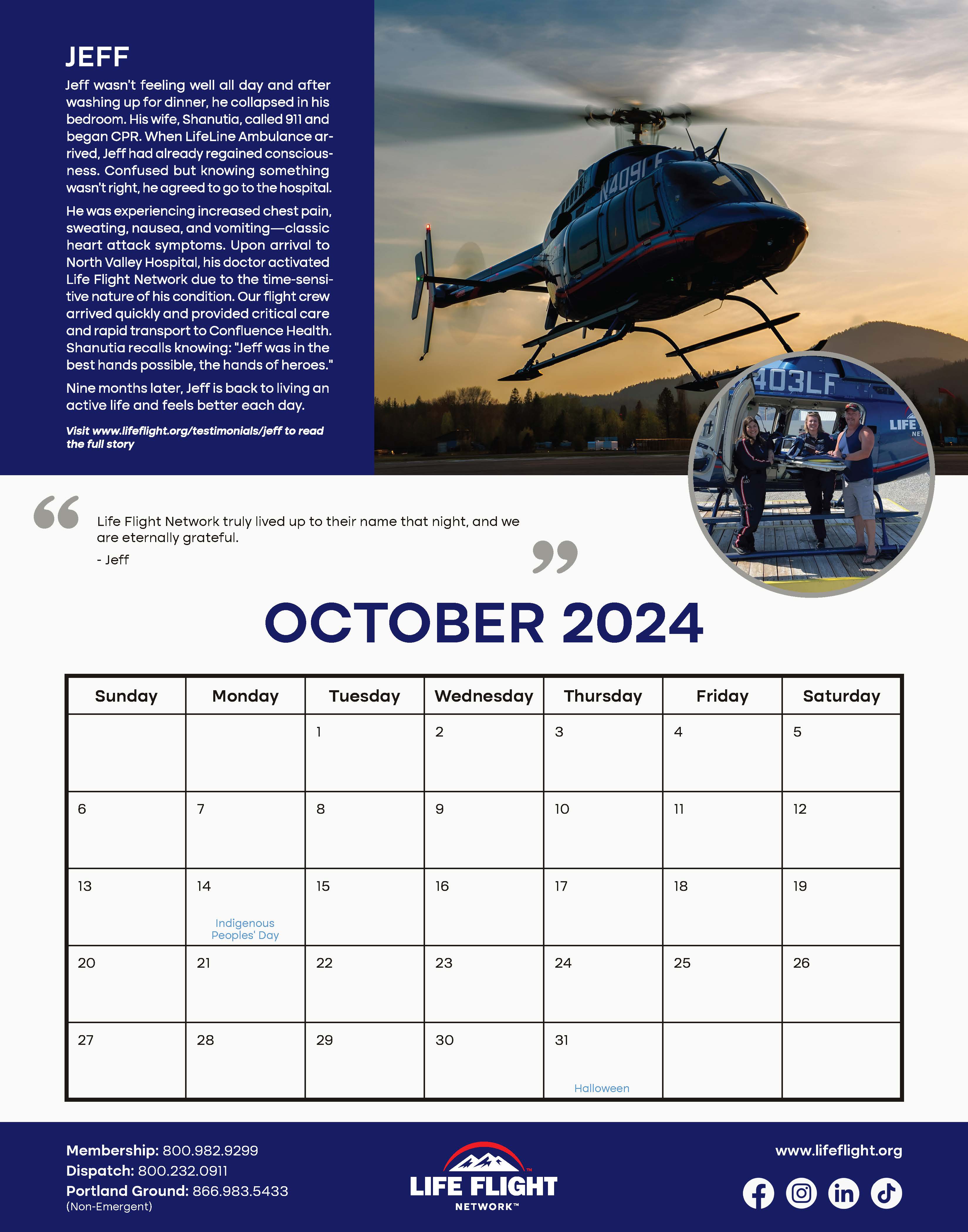
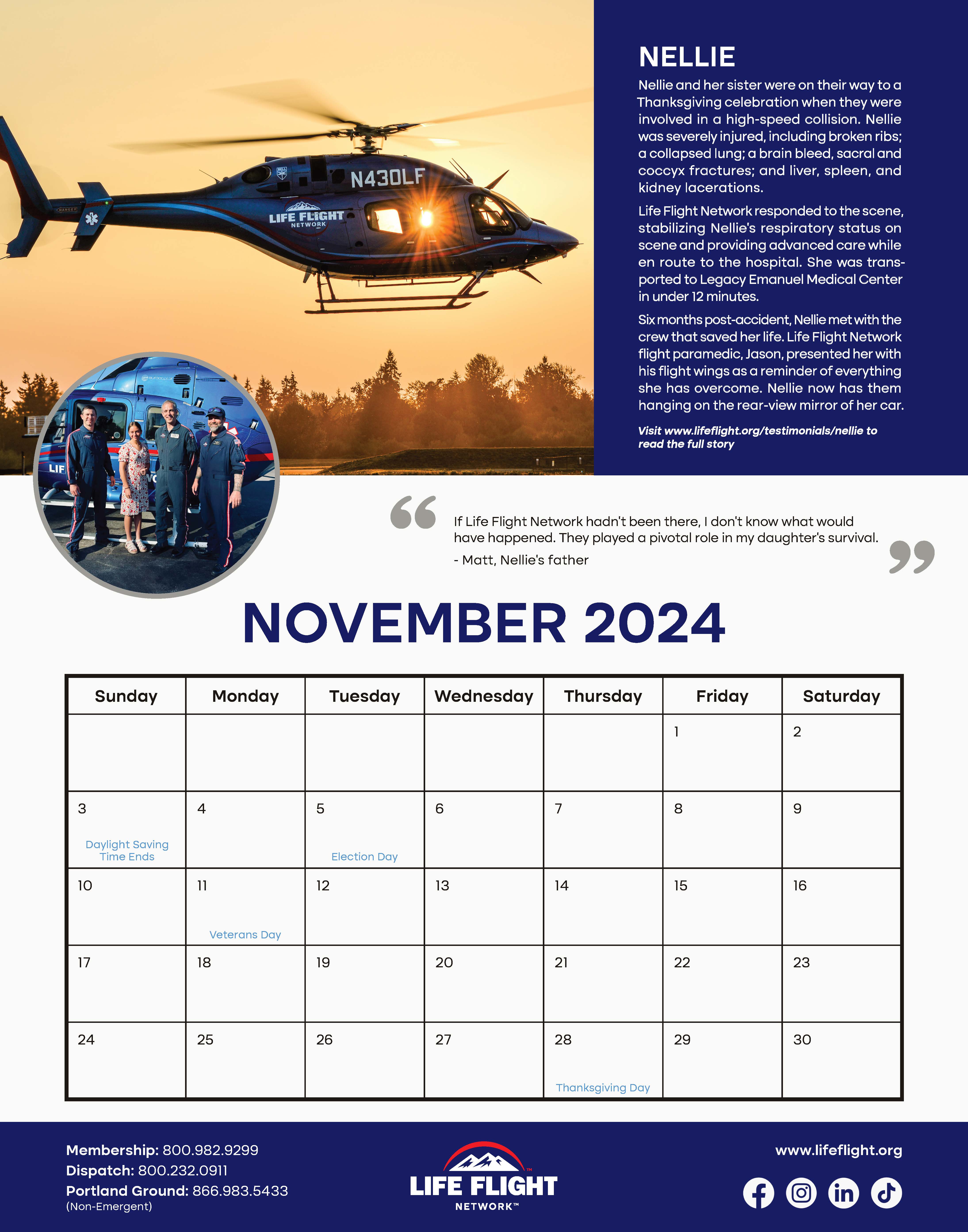
Our company distributes a wide variety of printed marketing pieces, ranging from a yearly calendar filled with captivating stories and images to direct mail pieces promoting a specific message. The company’s previous marketing collateral was dated, cluttered, and lacked strong branding. The challenge was to create a new layout for this material that would showcase the content in a compelling way, while also creating brand awareness for the company.
PROCESS
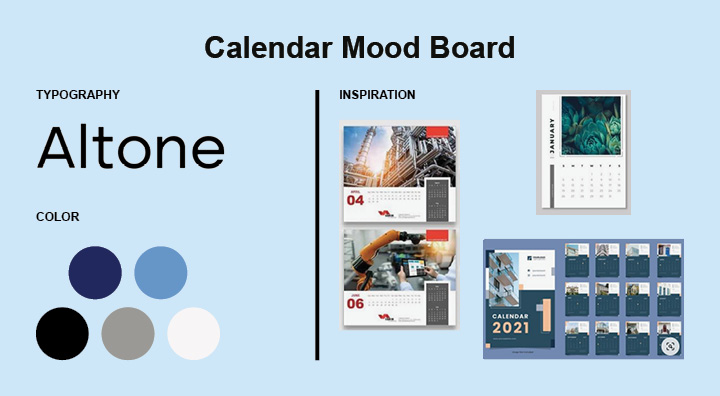
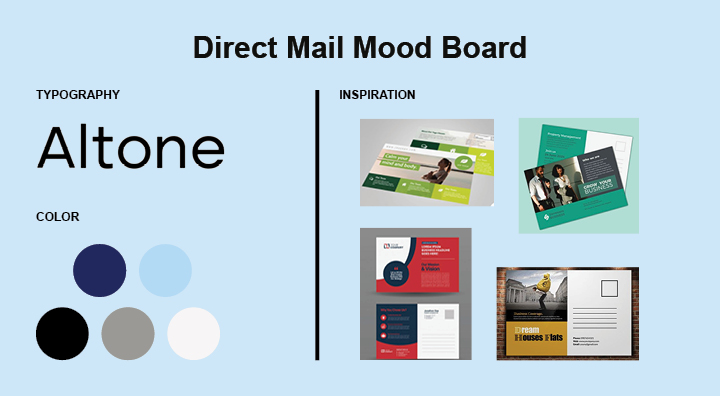
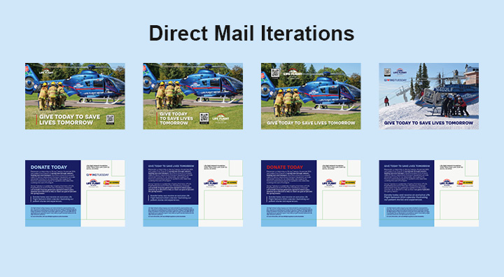
For each project, I started by analyzing the previous layout and noting areas of improvement. I sought out feedback from customer service managers and other team members. In addition, I evaluated the hierarchy of information, images, and text that we would need to include in the new layout. Through this critique, I advocated for condensed text, simplified layouts, and ways to highlight the main details of a message and lead the consumer to our new website for more information.
PROCESS DOCUMENTS


PROCESS CONTINUED
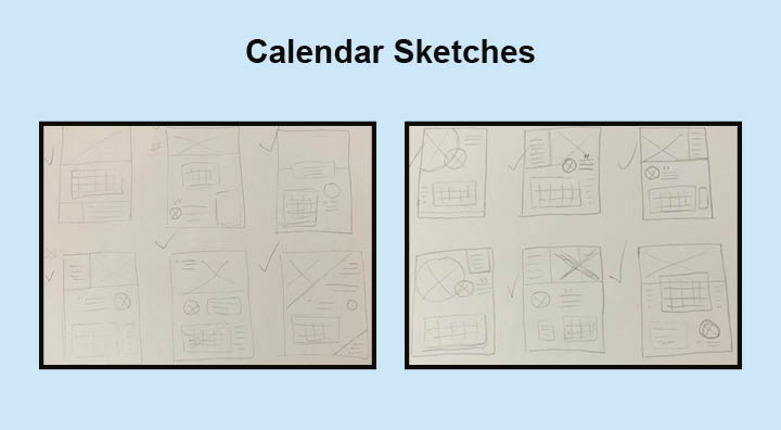
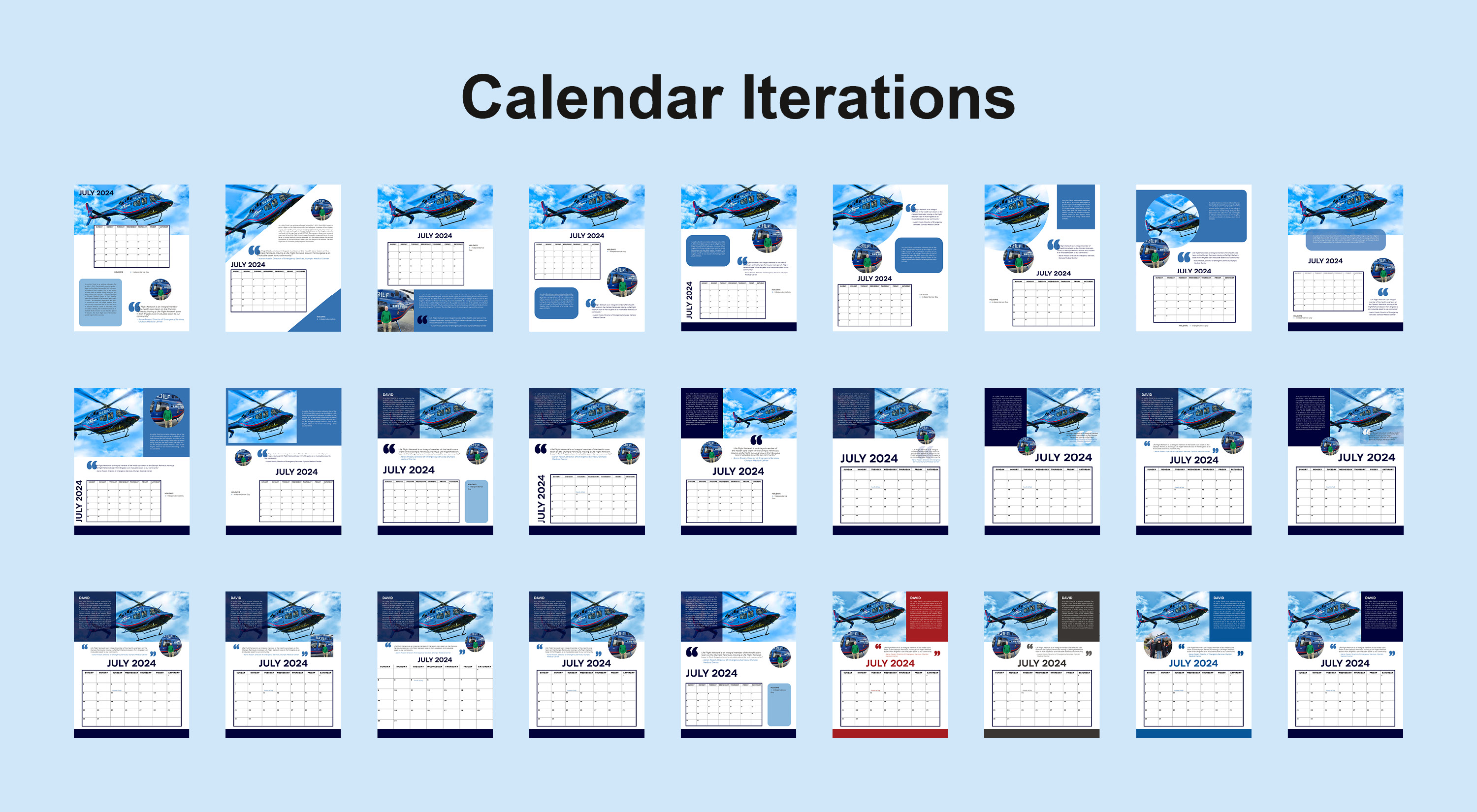
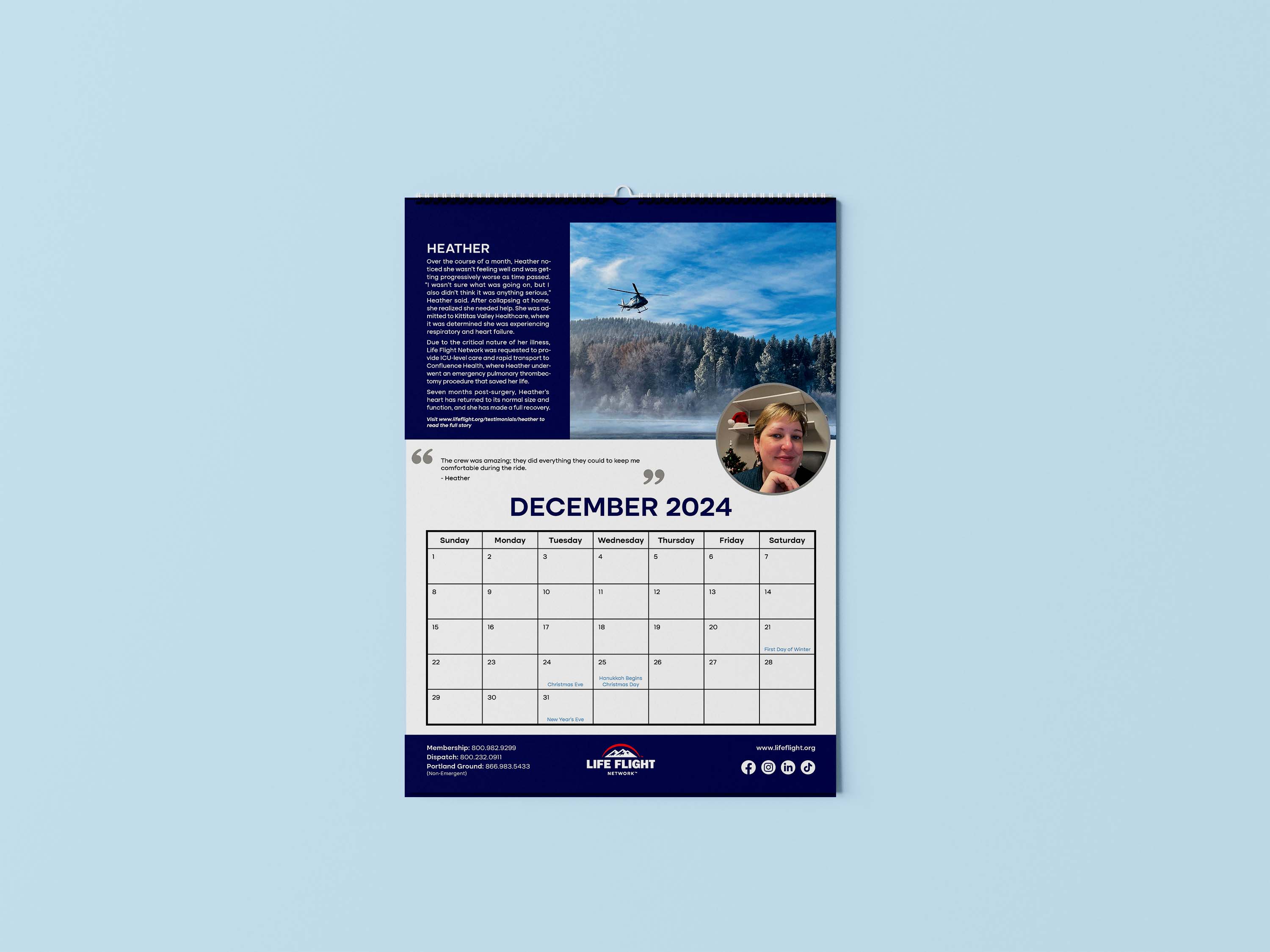
Once our high-level plan for the new pieces was complete for each project, I sketched iterations of a new design layout that would simplify the content in a compelling way and provide an effective use of space. From here, we picked a few layouts and I created high-fidelity versions in InDesign. After a few rounds of refinement, we finalized the design and/or created a template that would streamline production for more complex projects, like the calendar.
During the rest of the production process, I strived to use striking photography of our aircraft that aligned with the message. In addition, there were many levels of review, including microtypography and image correction.
DELIVERABLES




FULL CALENDAR








FINAL THOUGHTS
Our new marketing pieces have been well received by our customers and community. The layouts are fresh and attractive, which encourages people to engage and think of us throughout the year. The new material utilizes our brand guidelines with the color scheme and layout, making it easily identifiable as our own. The layouts are concise, yet easy to follow, providing a smooth flow for the user. As a bonus, we were able to create more touchpoints with our consumer by driving our customers and community to our new website.

REQUIEM MAGAZINE
Time length:
16 weeksTools:
InDesign, PhotoshopRoles/Skills:
Solo project - Design Layout, Time Management, Production, Art Direction, EditorialOVERVIEW
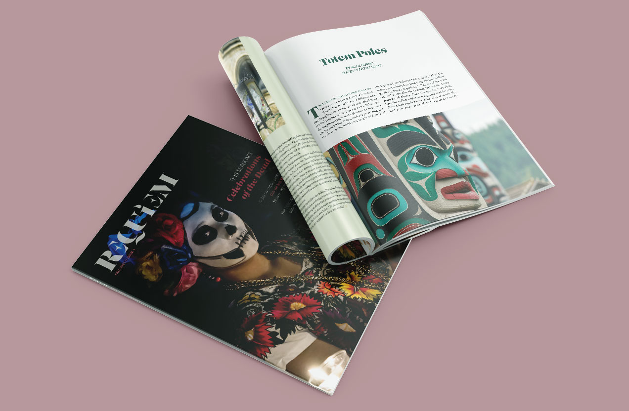
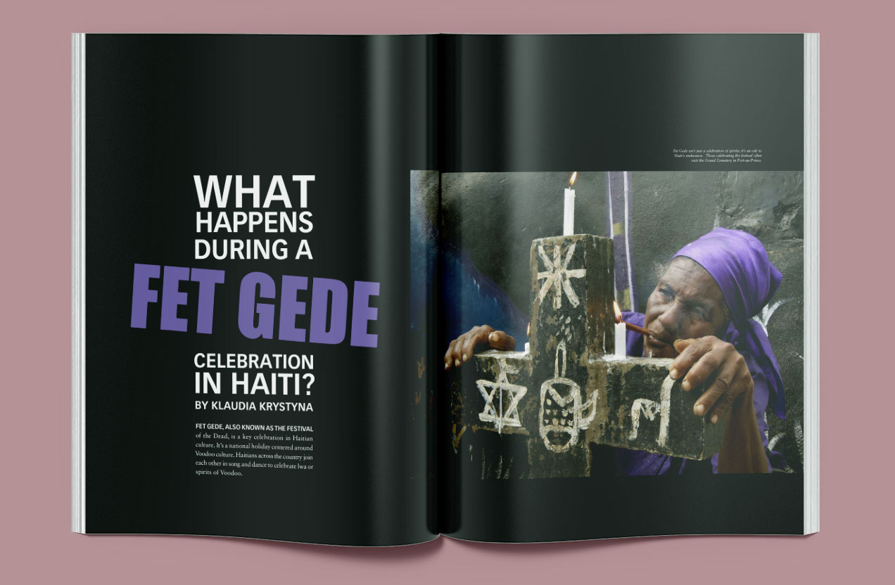
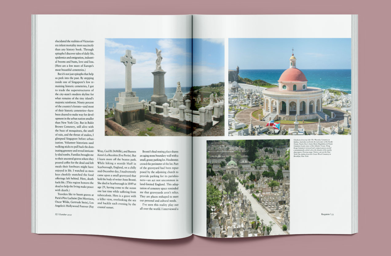
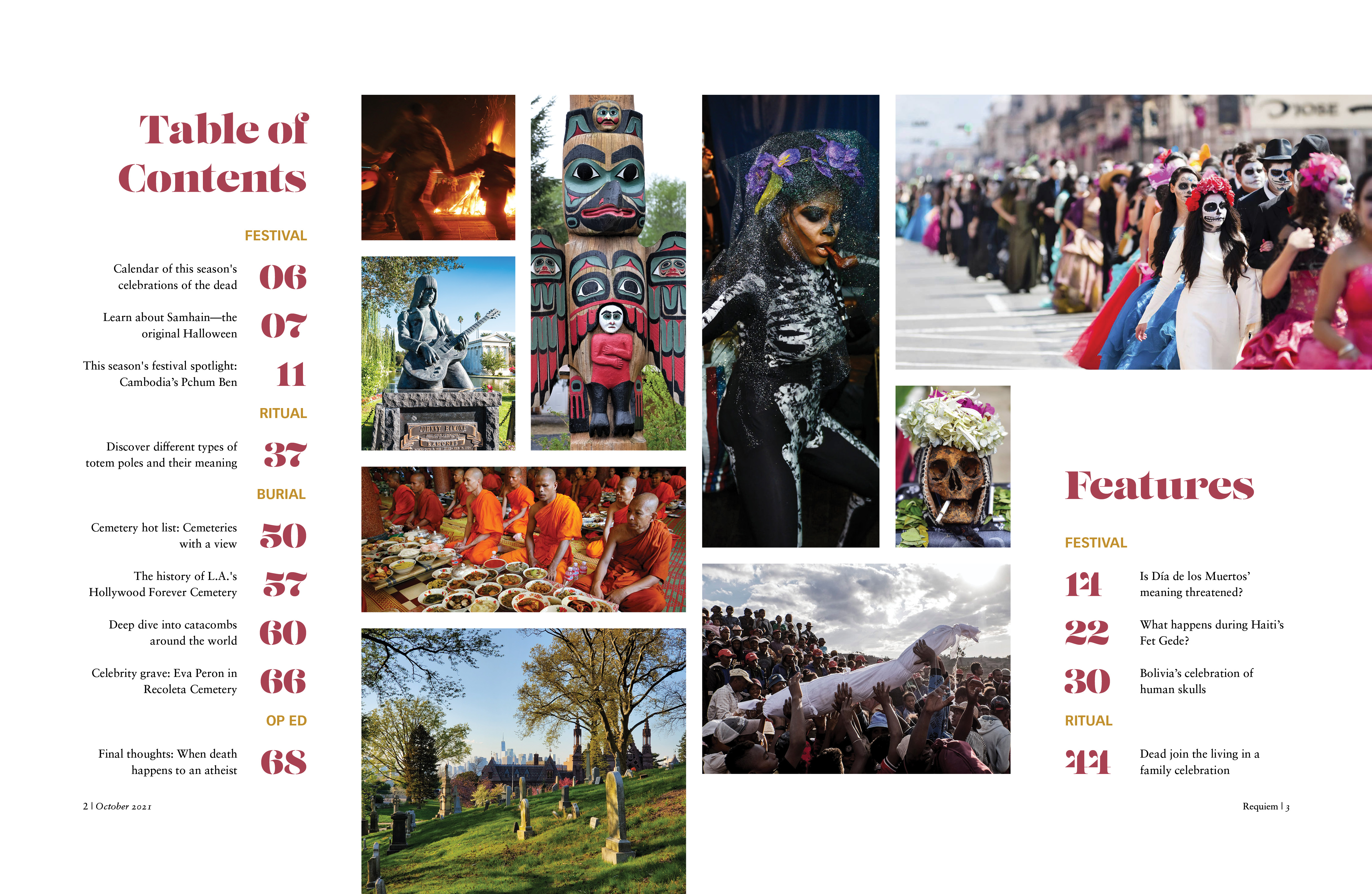
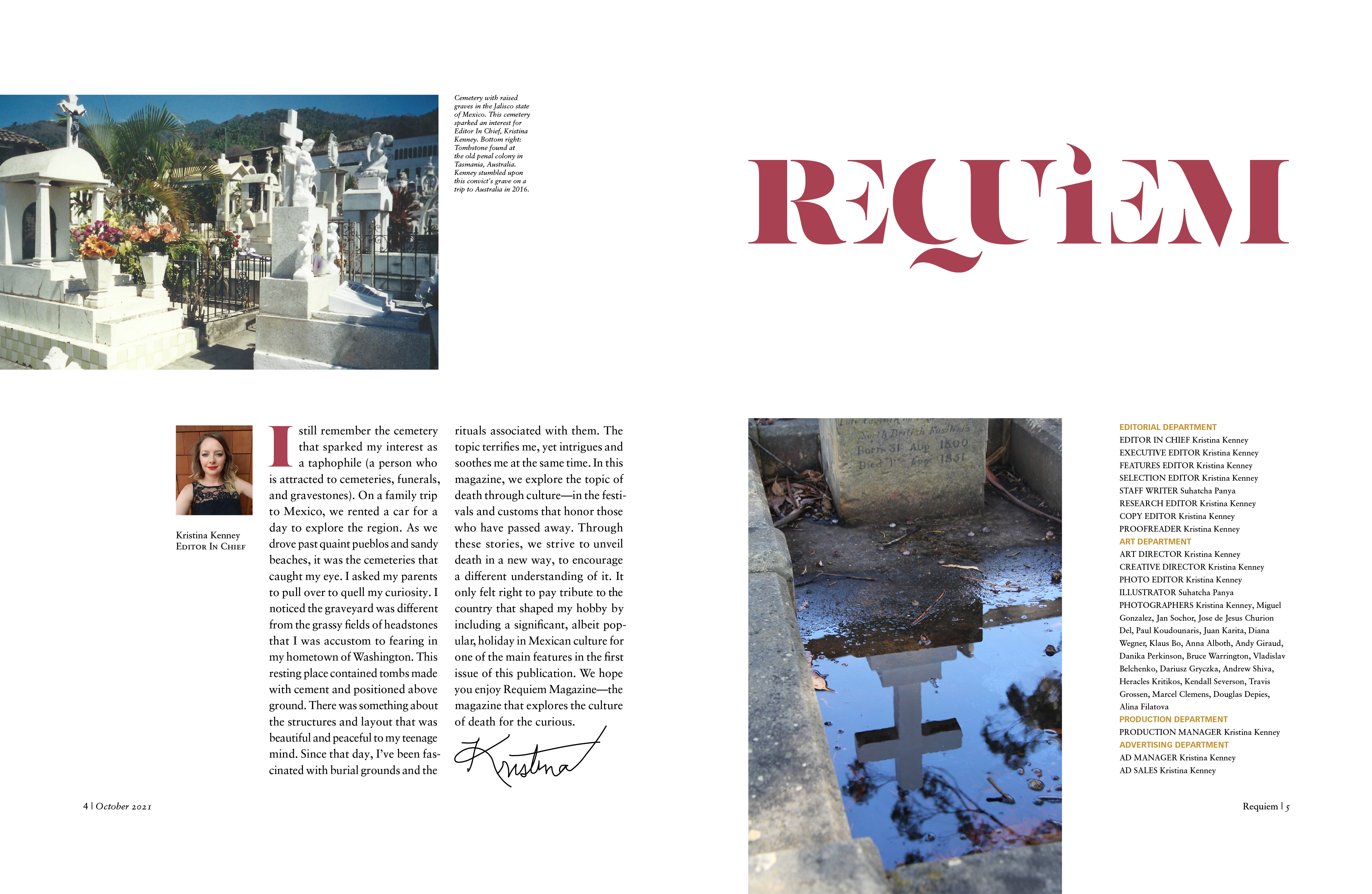
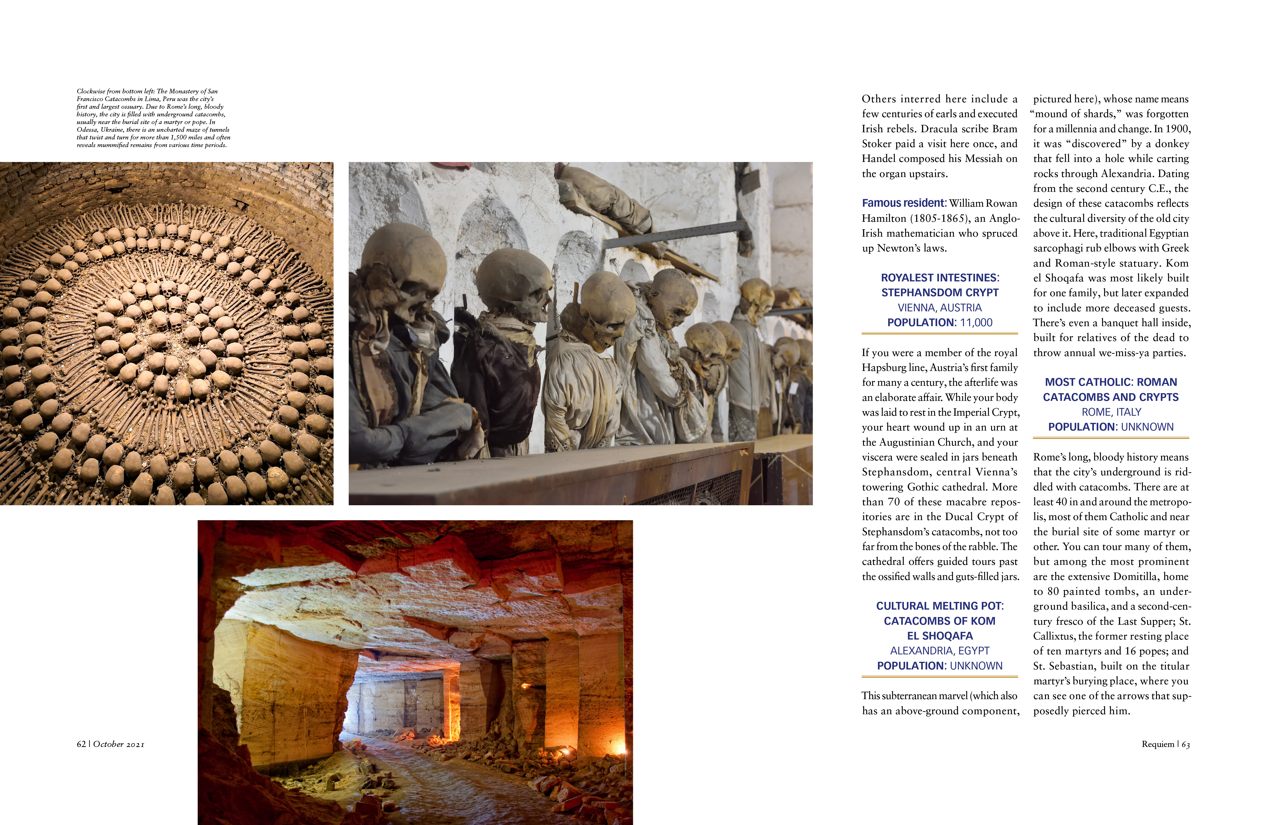
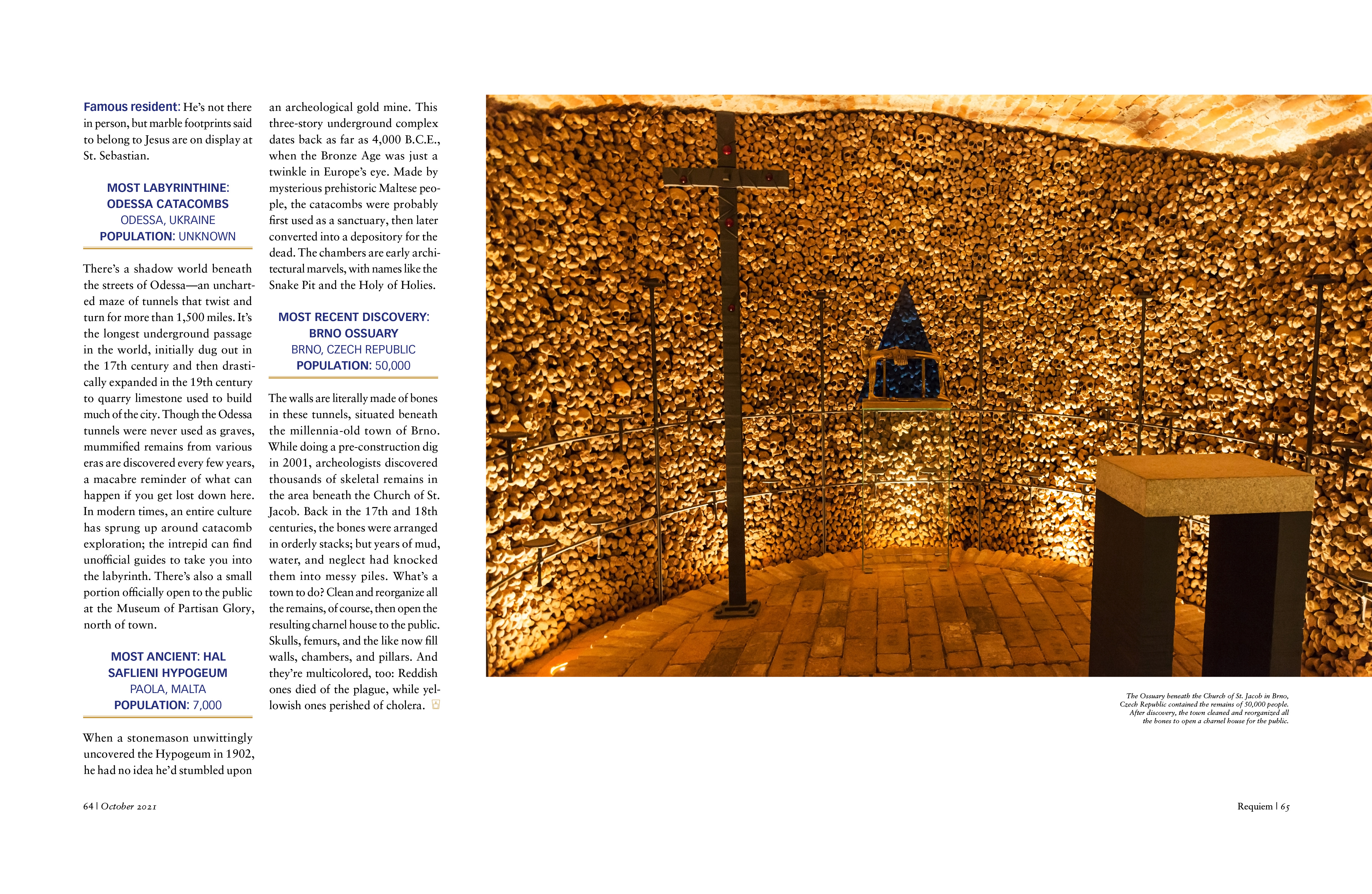
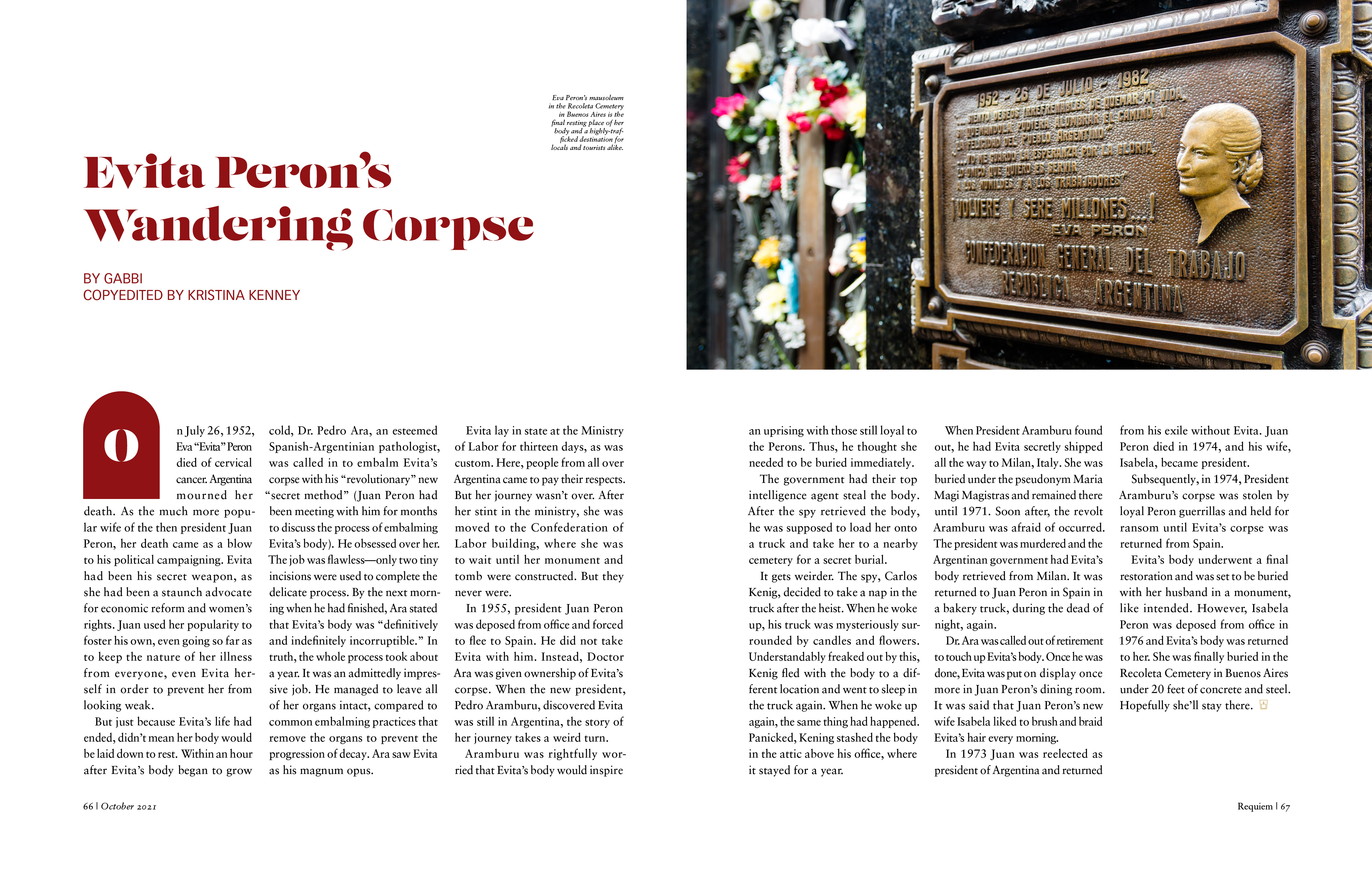
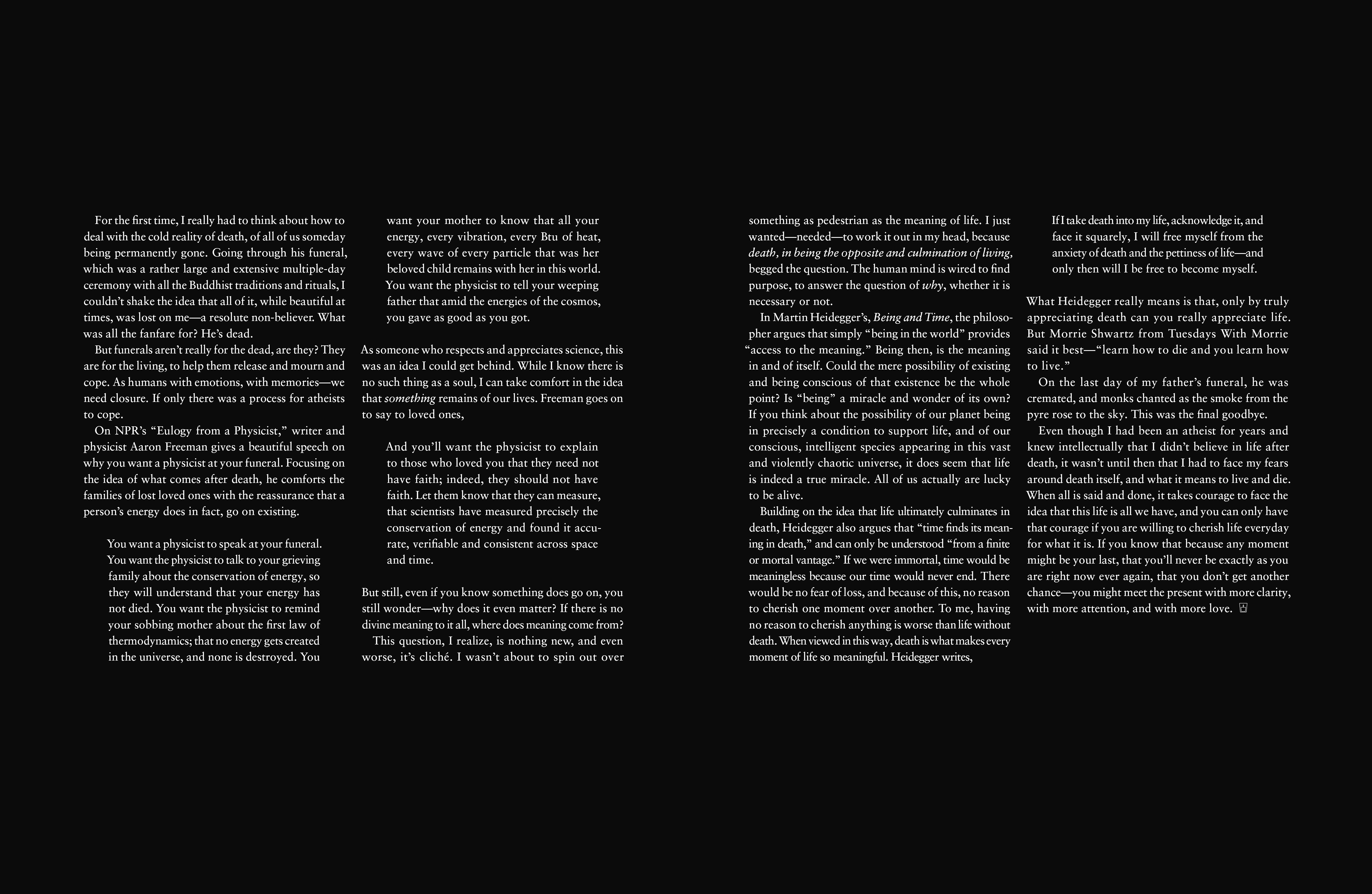
Death can be a taboo subject in American culture. Requiem Magazine strives to encourage a different understanding of it. This quarterly magazine maintains a consistent theme and blueprint across all issues. It showcases articles about festivals honoring the dead, rituals, and burial sites for various cultures around the world. Requiem strives to captivate the culturally curious with vivid photography and educational stories through an unbiased and inclusive lens.
PROCESS
For this passion project, I started the process by picking a topic and concept that would be strong enough to run for many years. After I pitched the idea and developed the magazine name and tagline, I gathered articles that would fit with the concept and high-resolution images that helped tell the story of each article. It was essential to pick photographs that were authentic, bold, and high quality to ensure each article was featured in the best possible way.
TARGET AUDIENCE


PROCESS CONTINUED
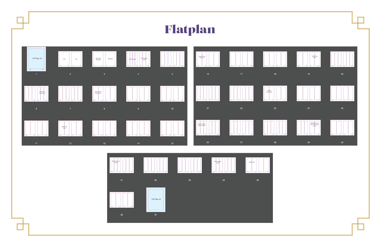
During this process, I also defined the personas that would be interested in the magazine and what each persona would hope to gain from the magazine. Next, I created a flat plan and organized the order of the magazine by front of book, featured articles, and back of book and curated the articles that would go into each section.
PROCESS DOCUMENTS



PROCESS CONTINUED
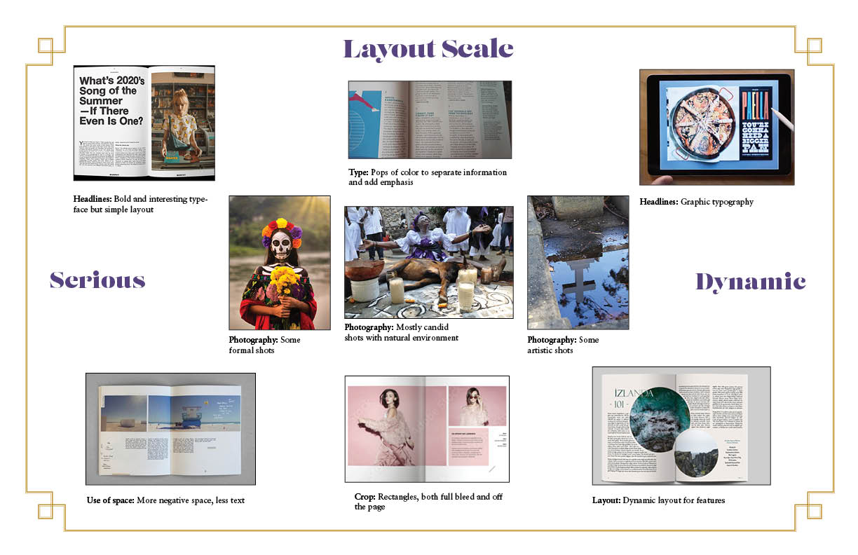
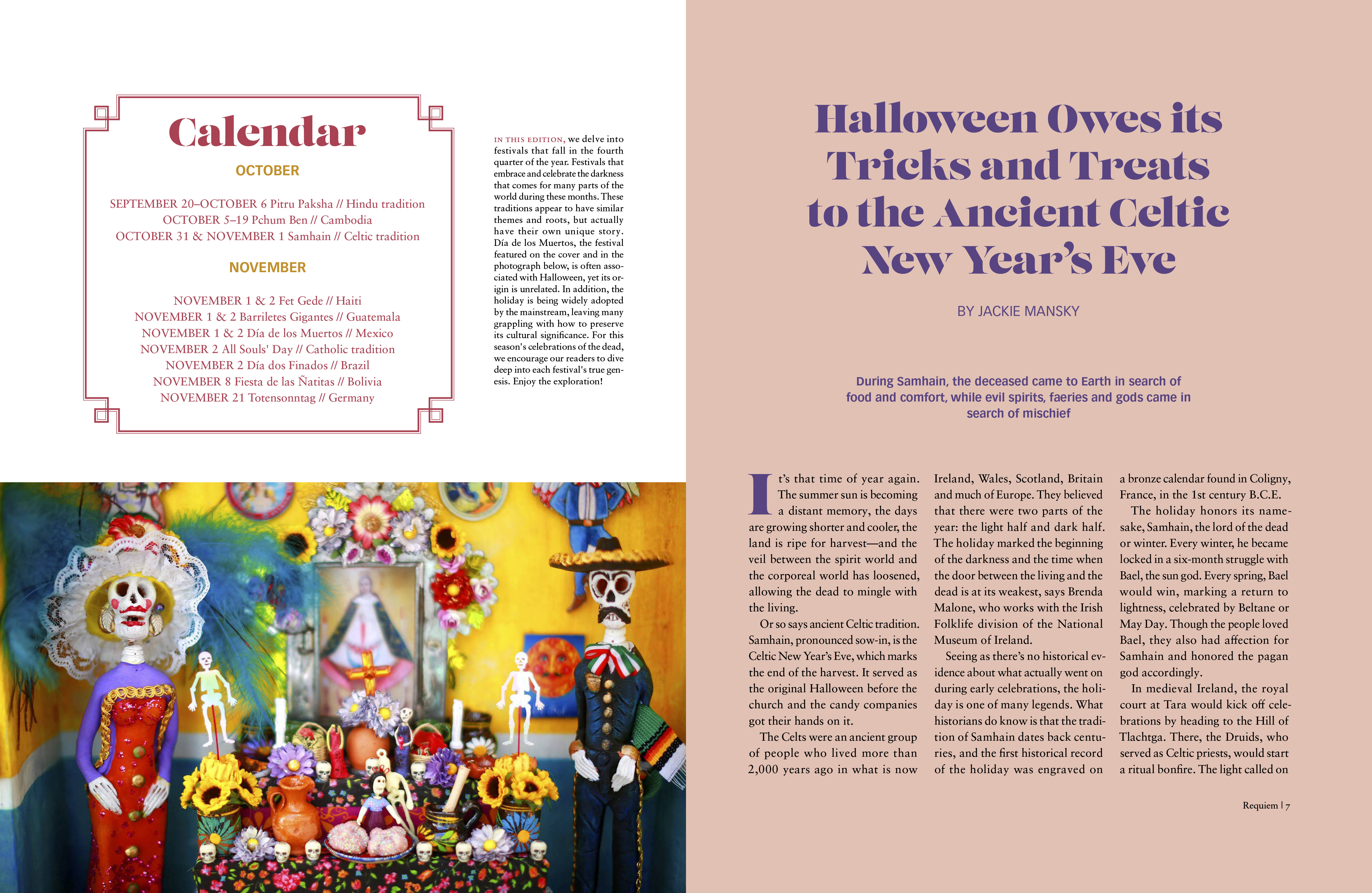
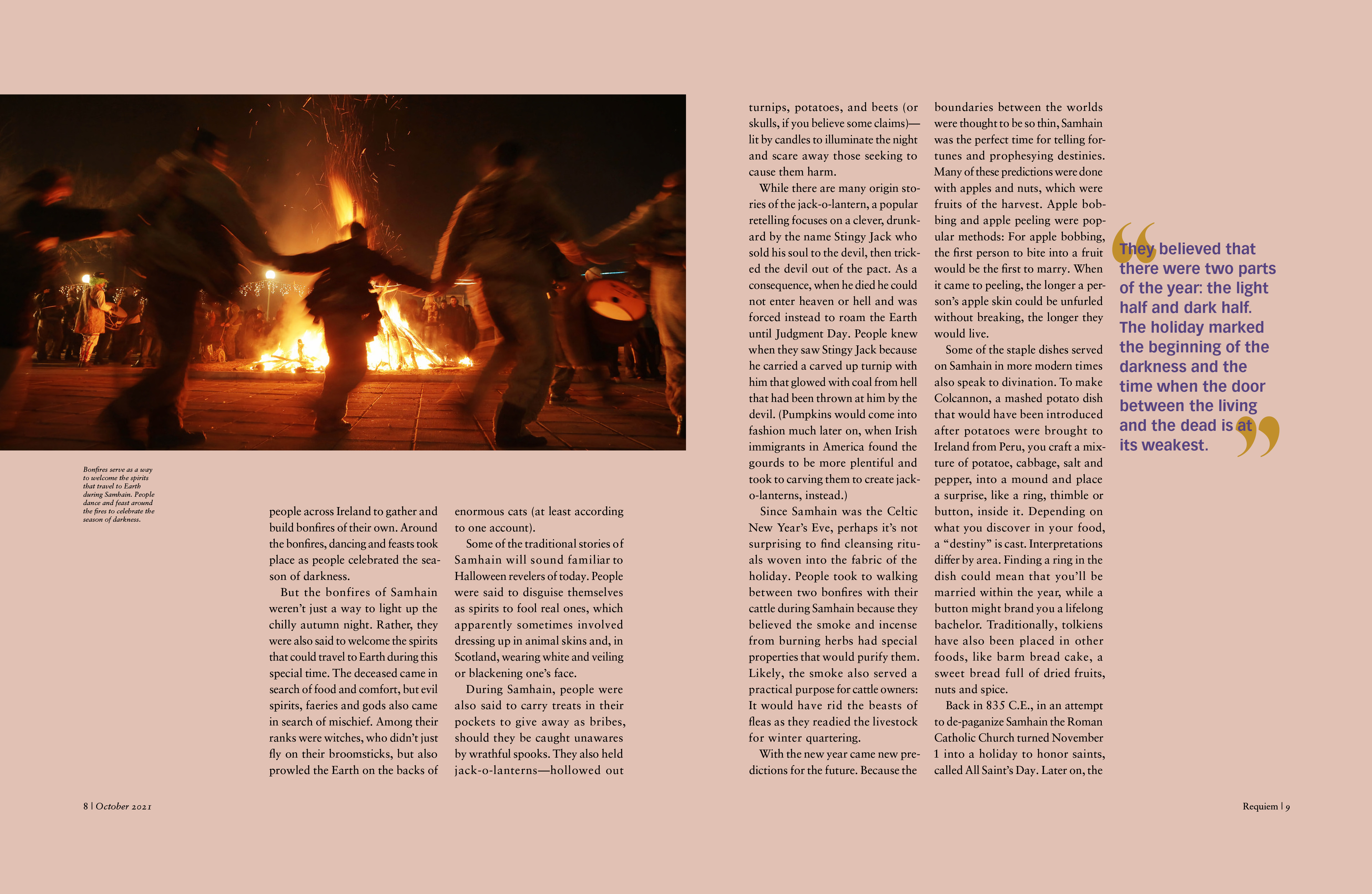
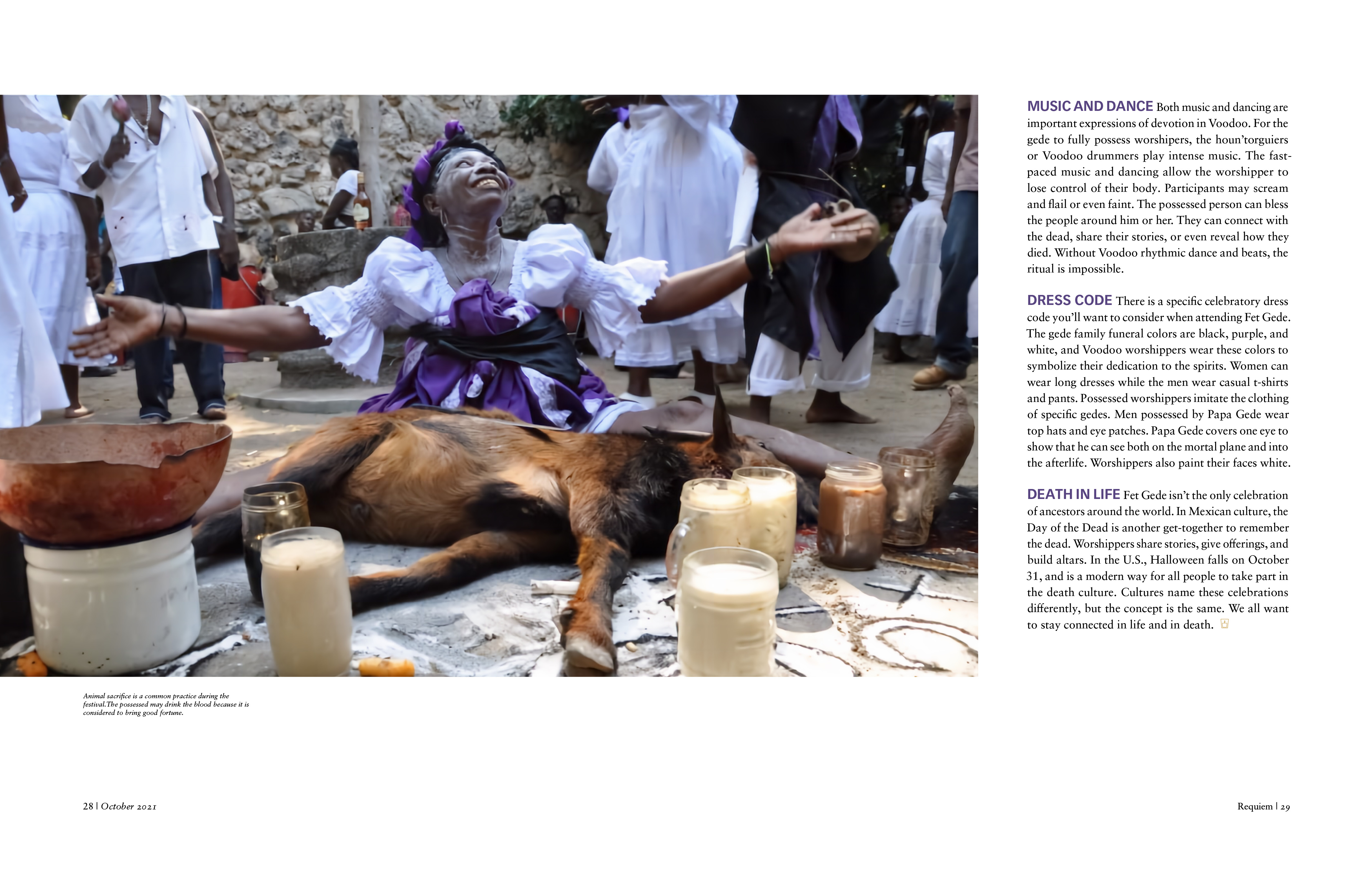
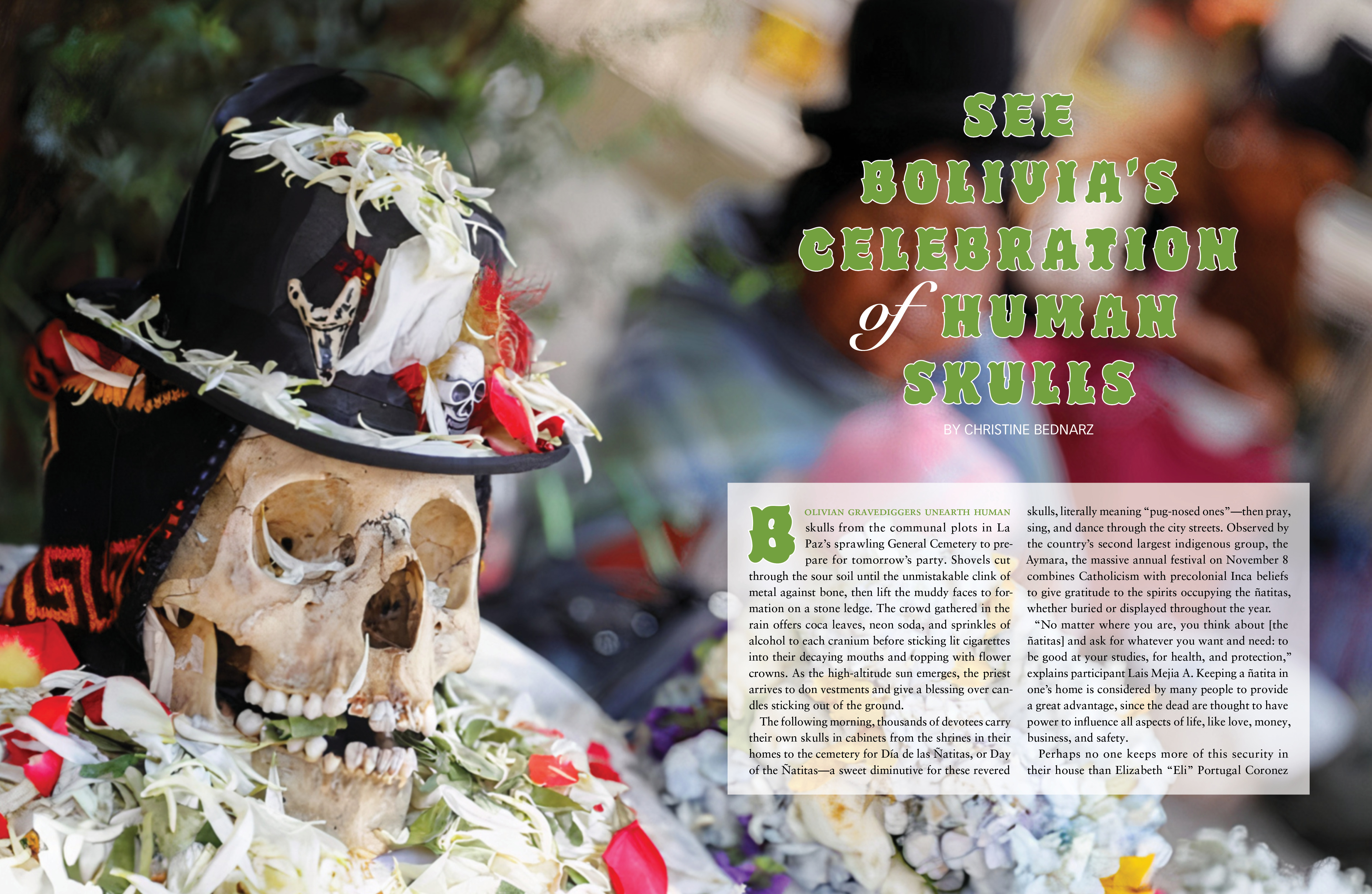
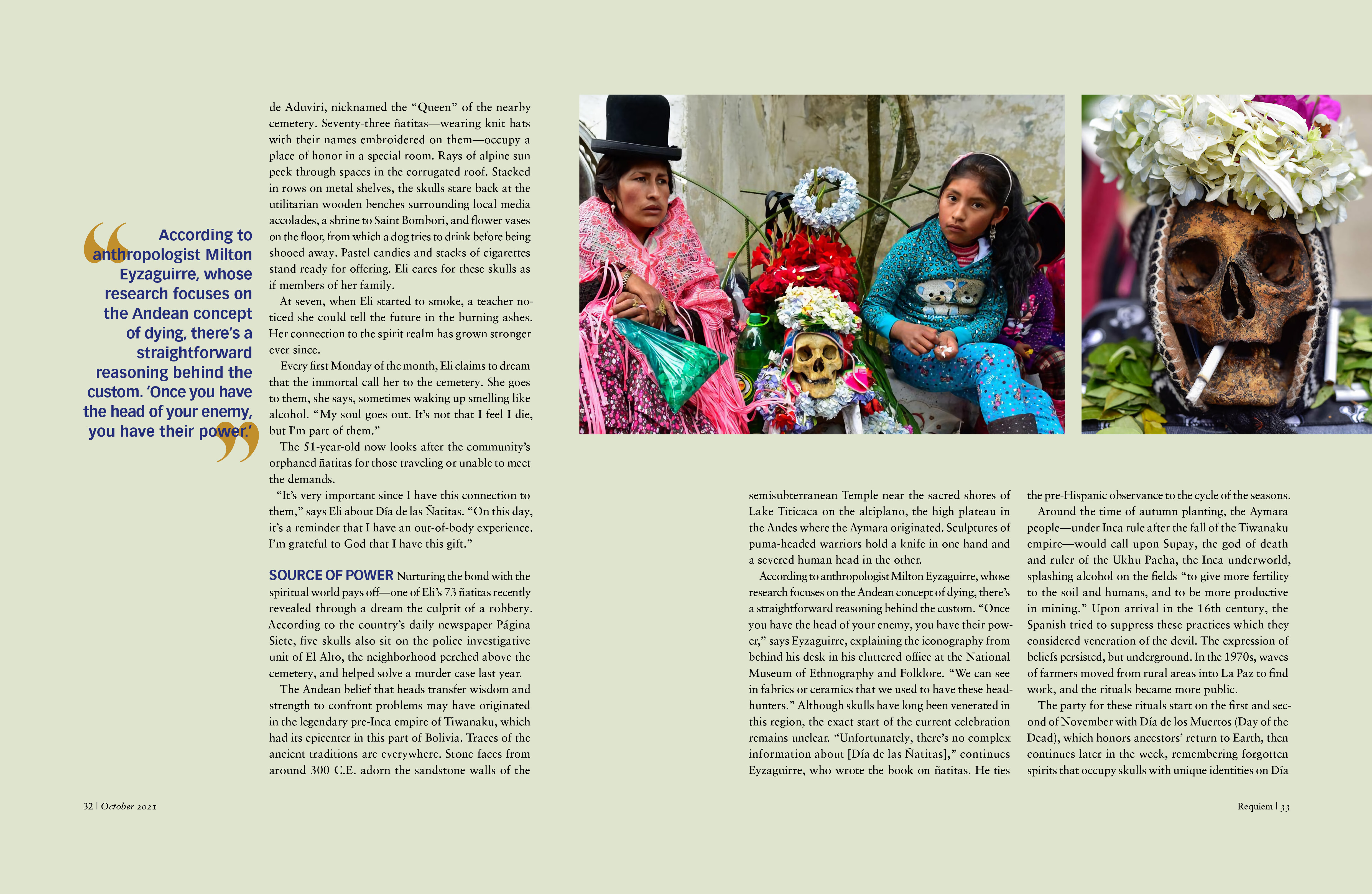
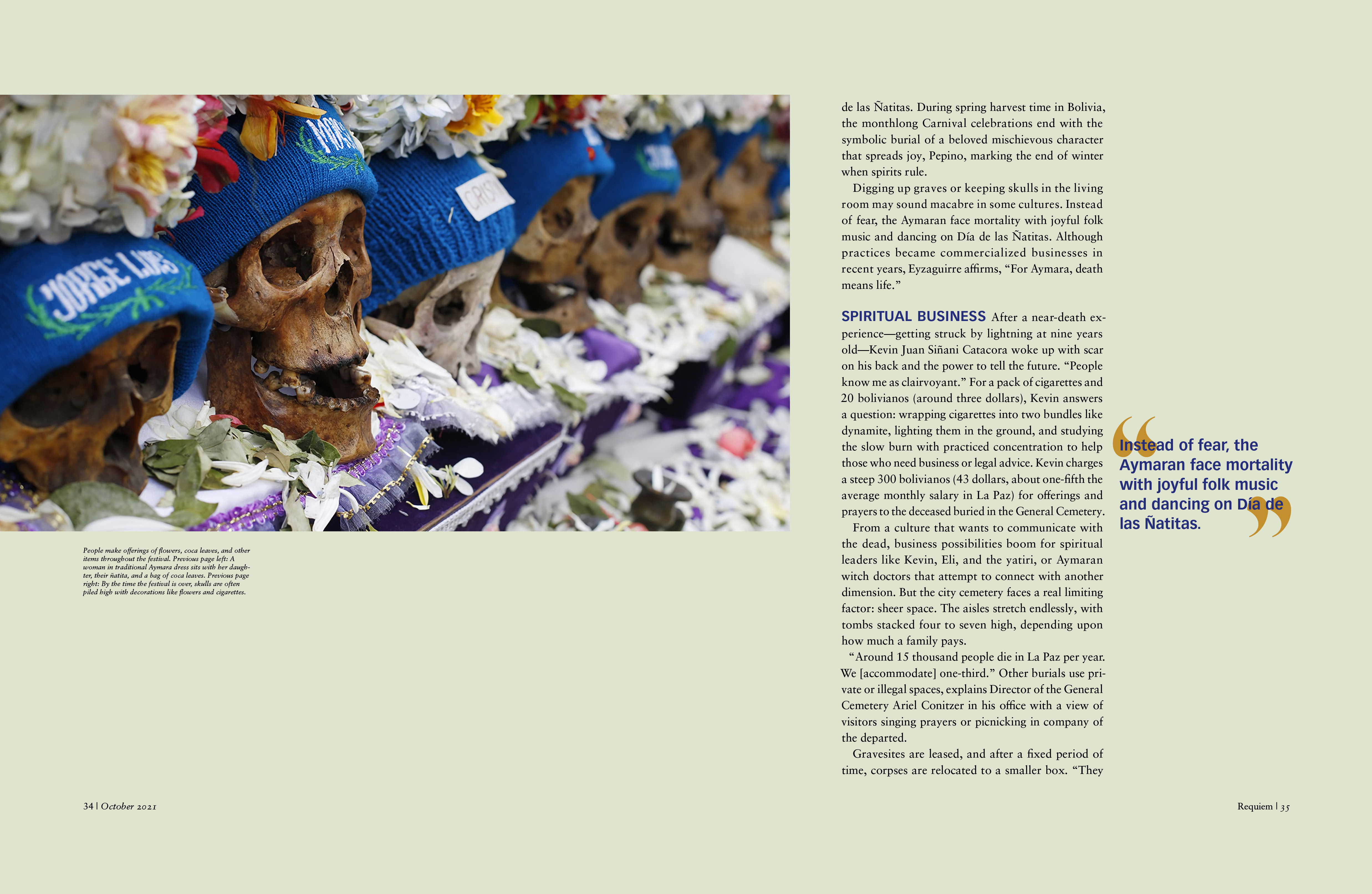
To make sure the whole publication had a consistent structure throughout, I created recipes for various elements of the magazine. These recipes included layout of photographs, various text columnar structures, and headline treatments. I wanted the layout to be clean and elegant to fit with the theme of the magazine, yet slightly dynamic since the subject itself is also robust and compelling. I made sure each feature article included a dynamic and expressive headline to match the vibe of the story and give it a bit of personality.
In addition to layout guidelines, I created a set of rules for bylines, headlines, subheadlines, pull quotes, and opening lines to create consistency throughout the magazine. Once these rules, styles, and systems were put in place, the rest of the 72-page magazine came together easily.
MAGAZINE SPREADS

REQUIEM MAGAZINE


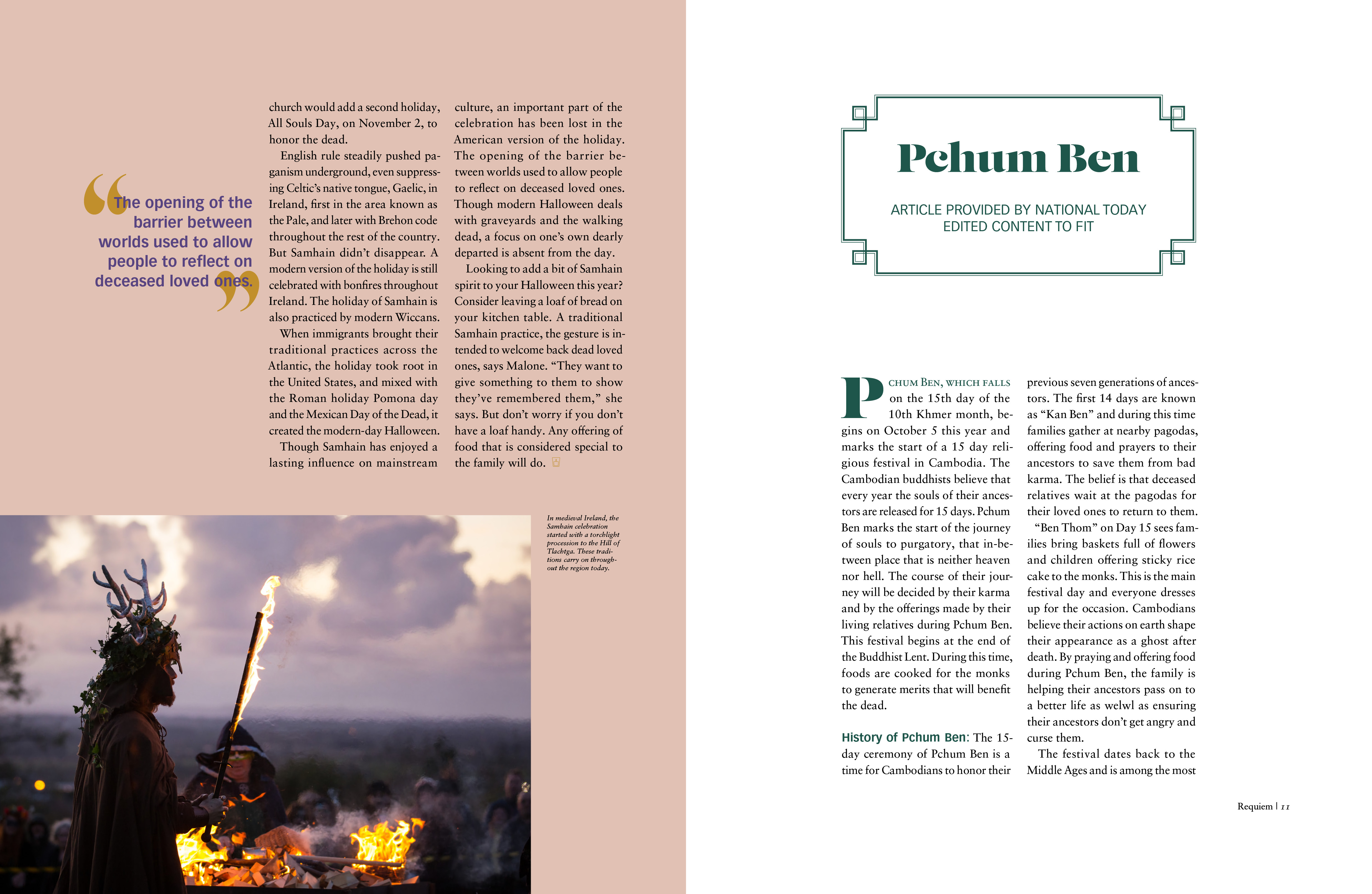
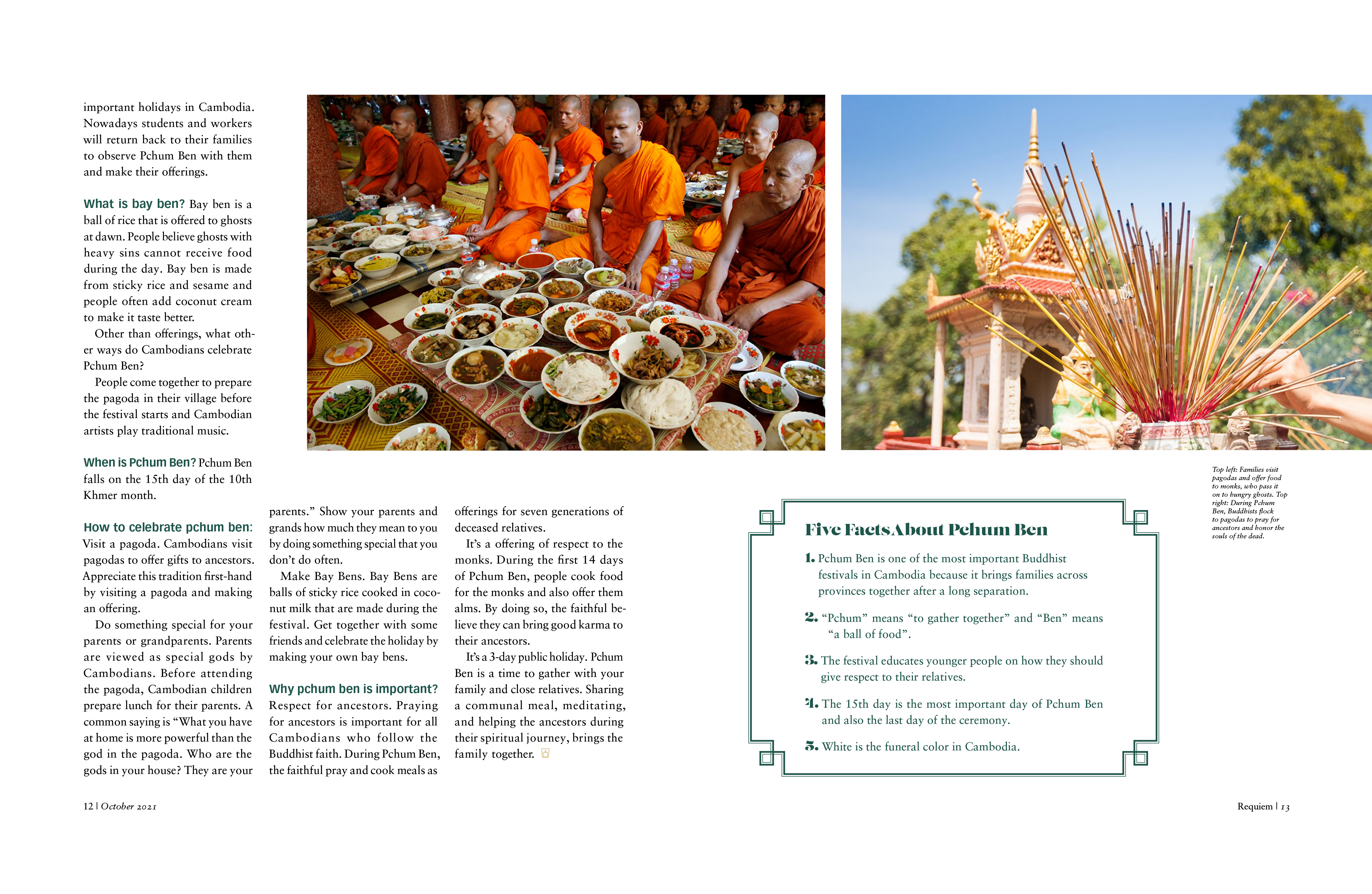
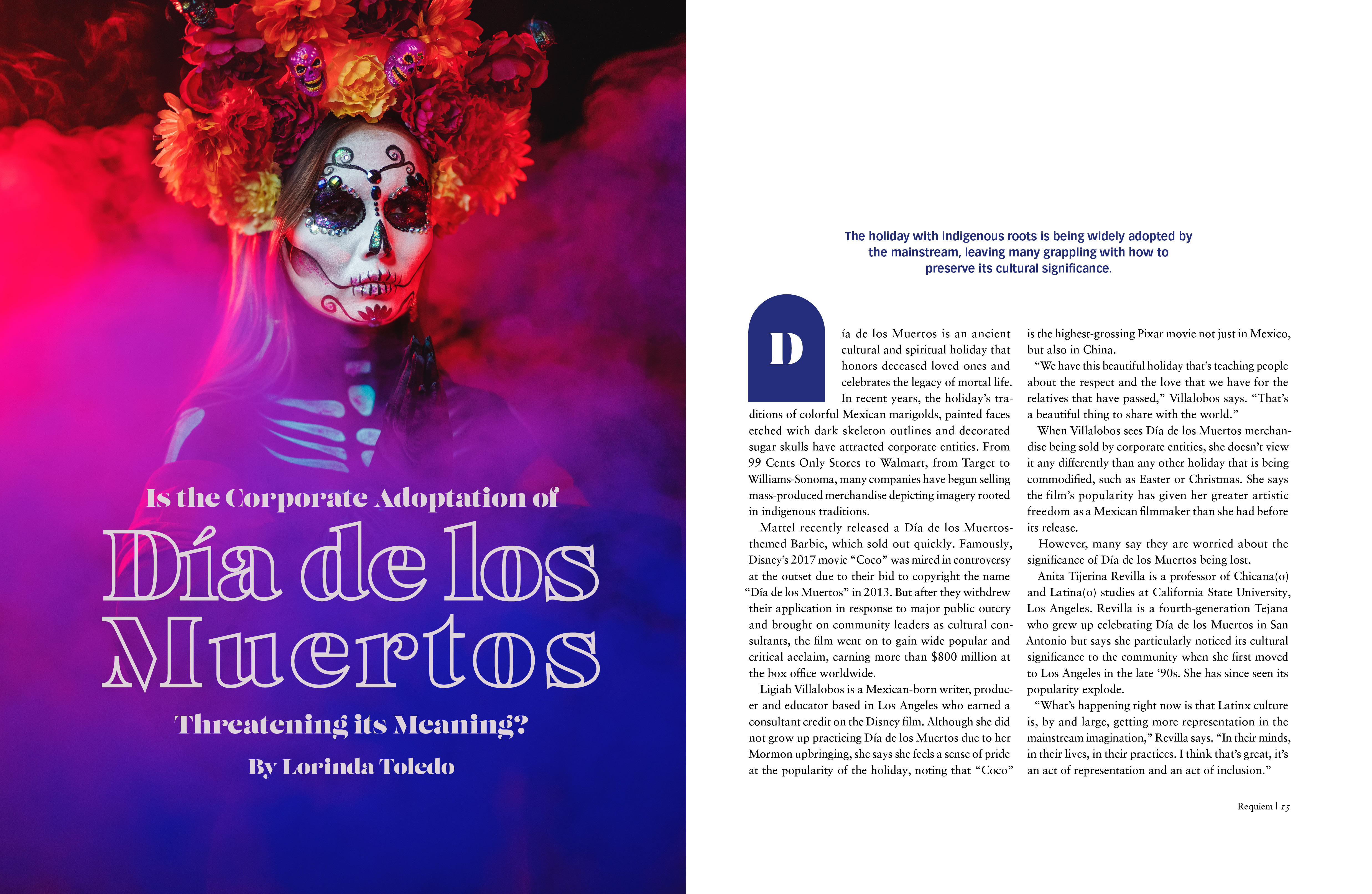
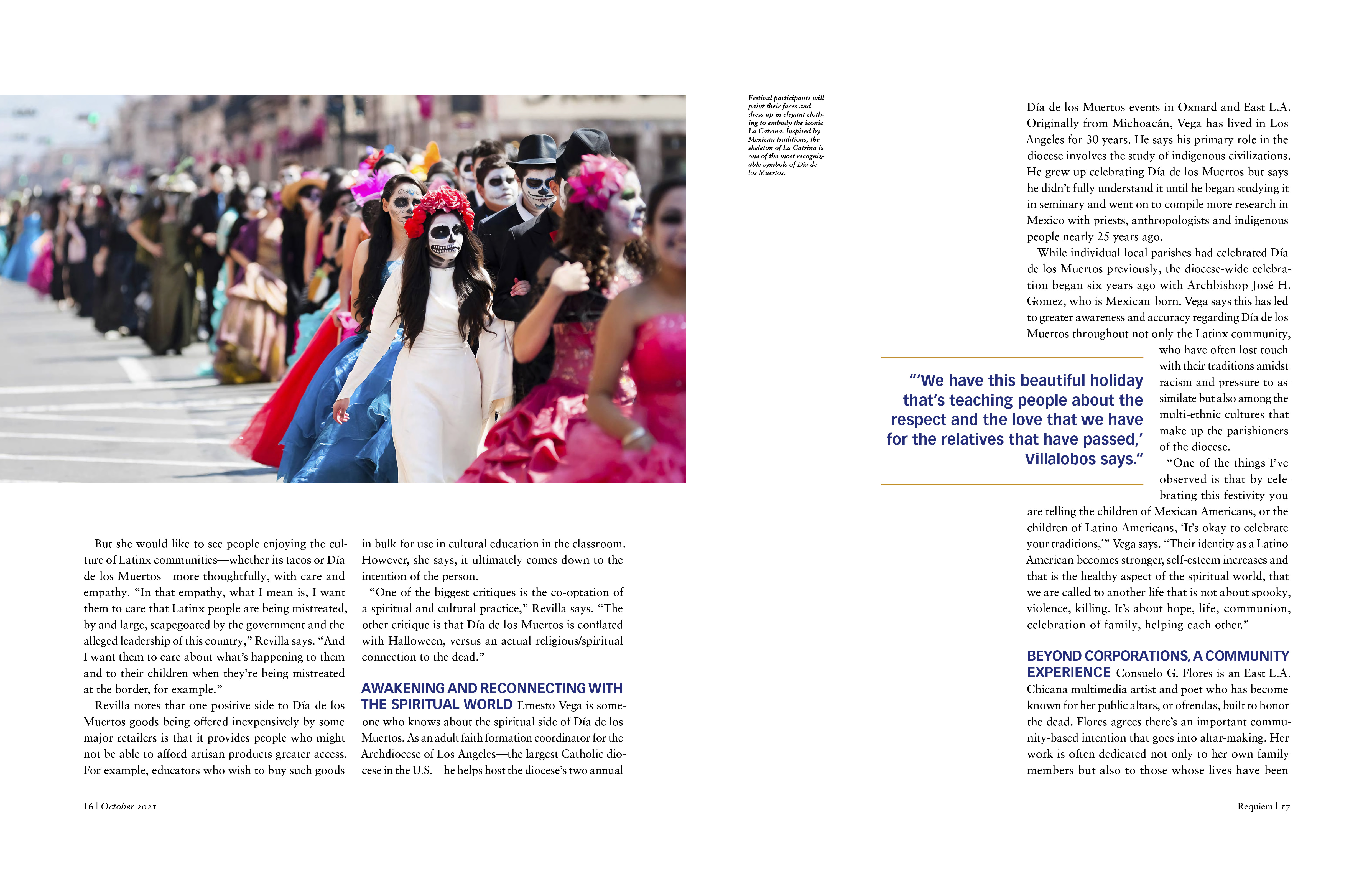
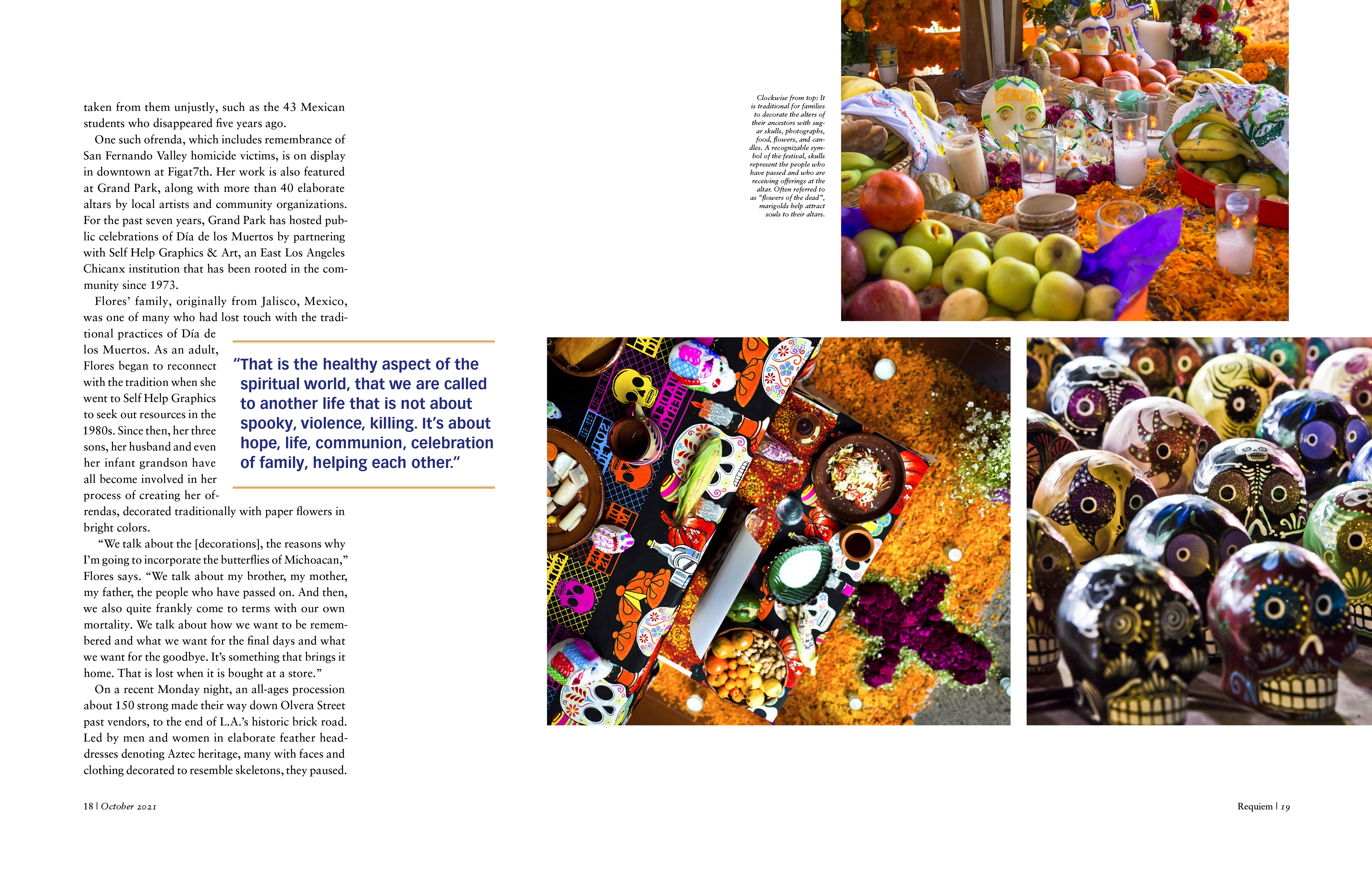
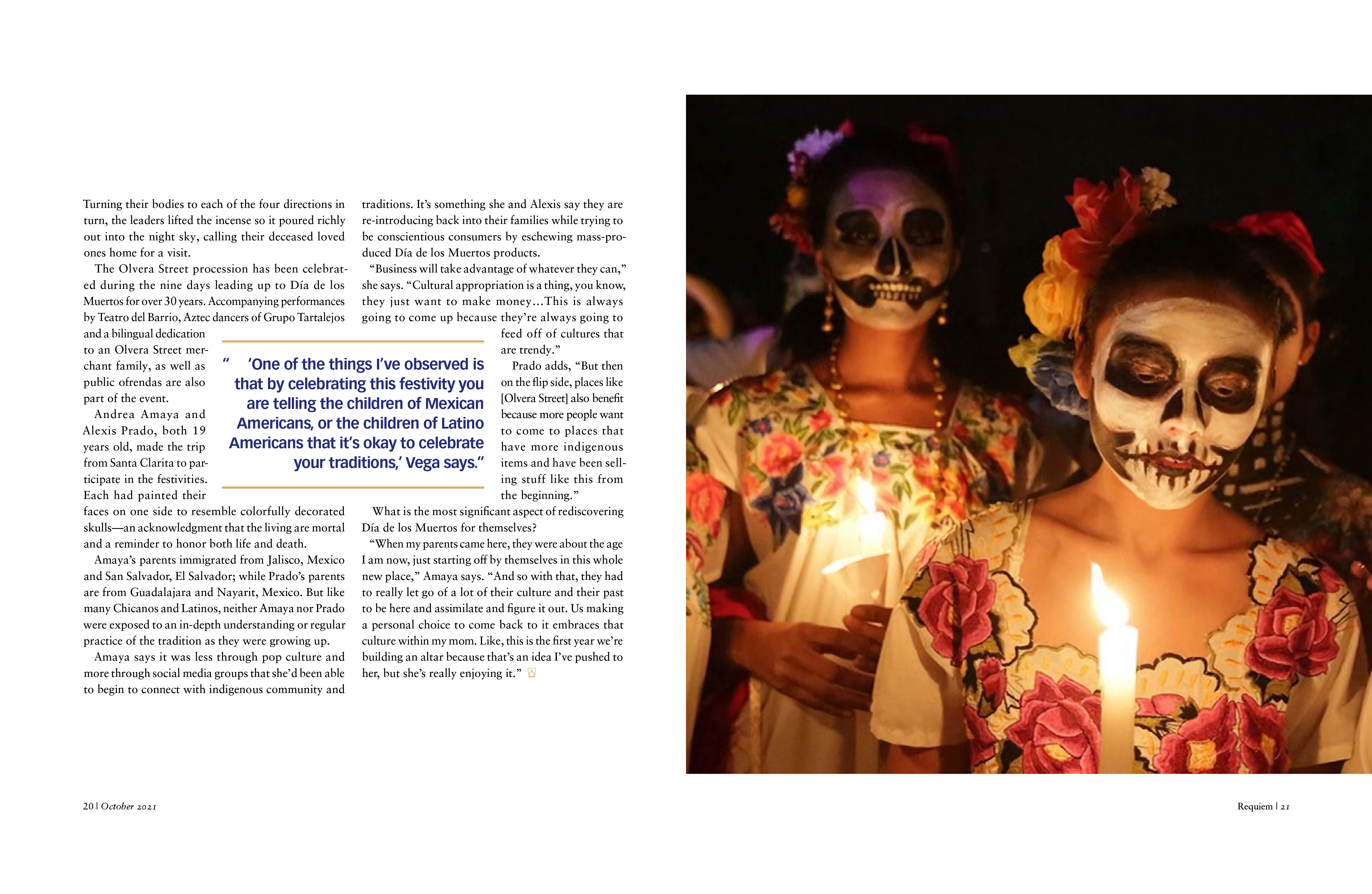
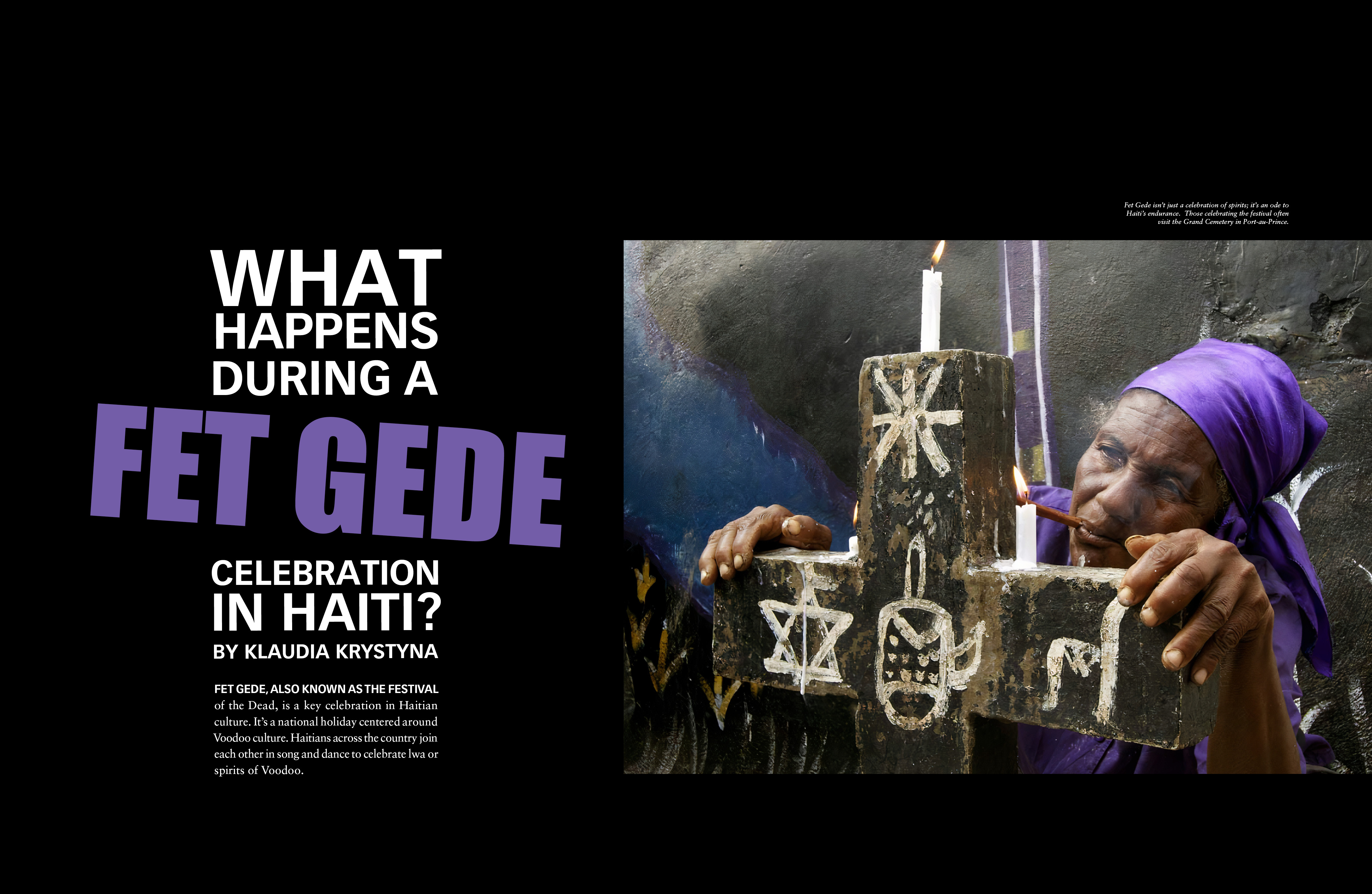
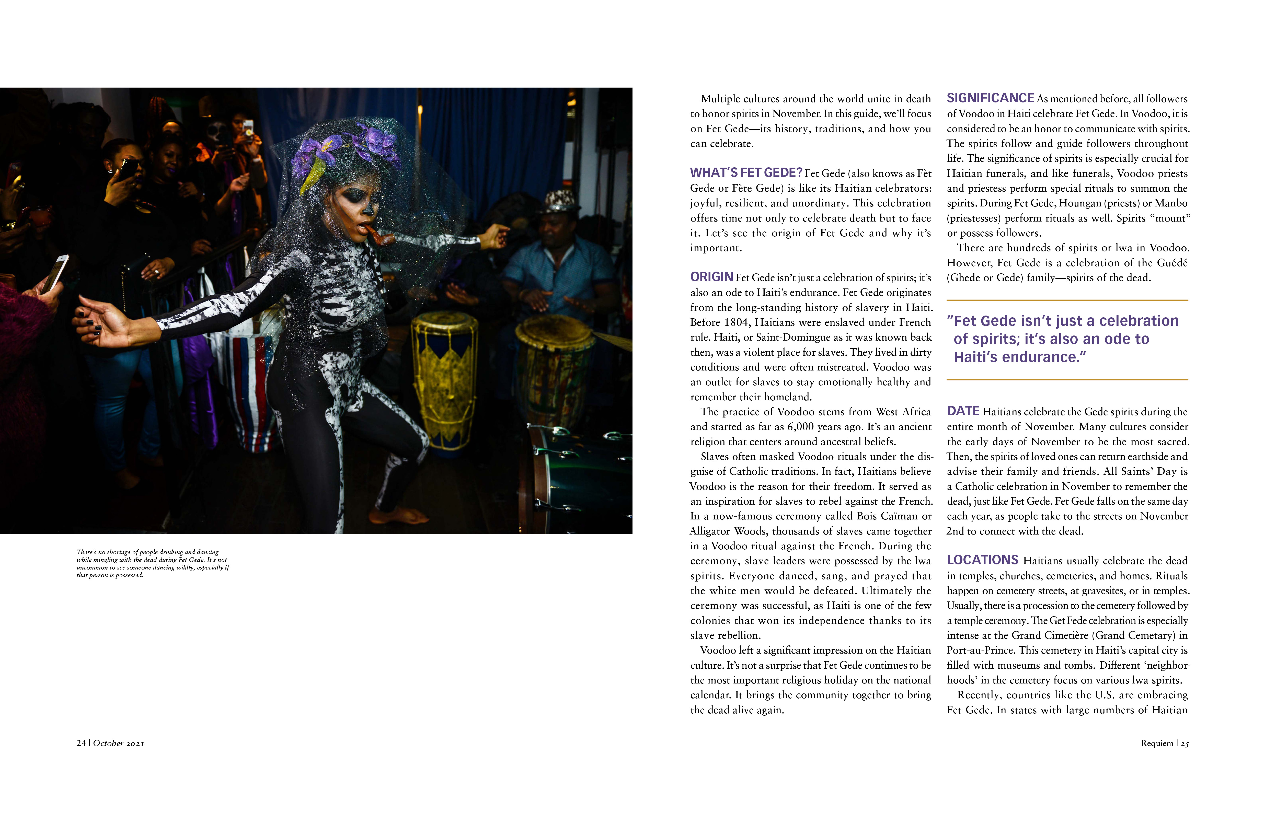

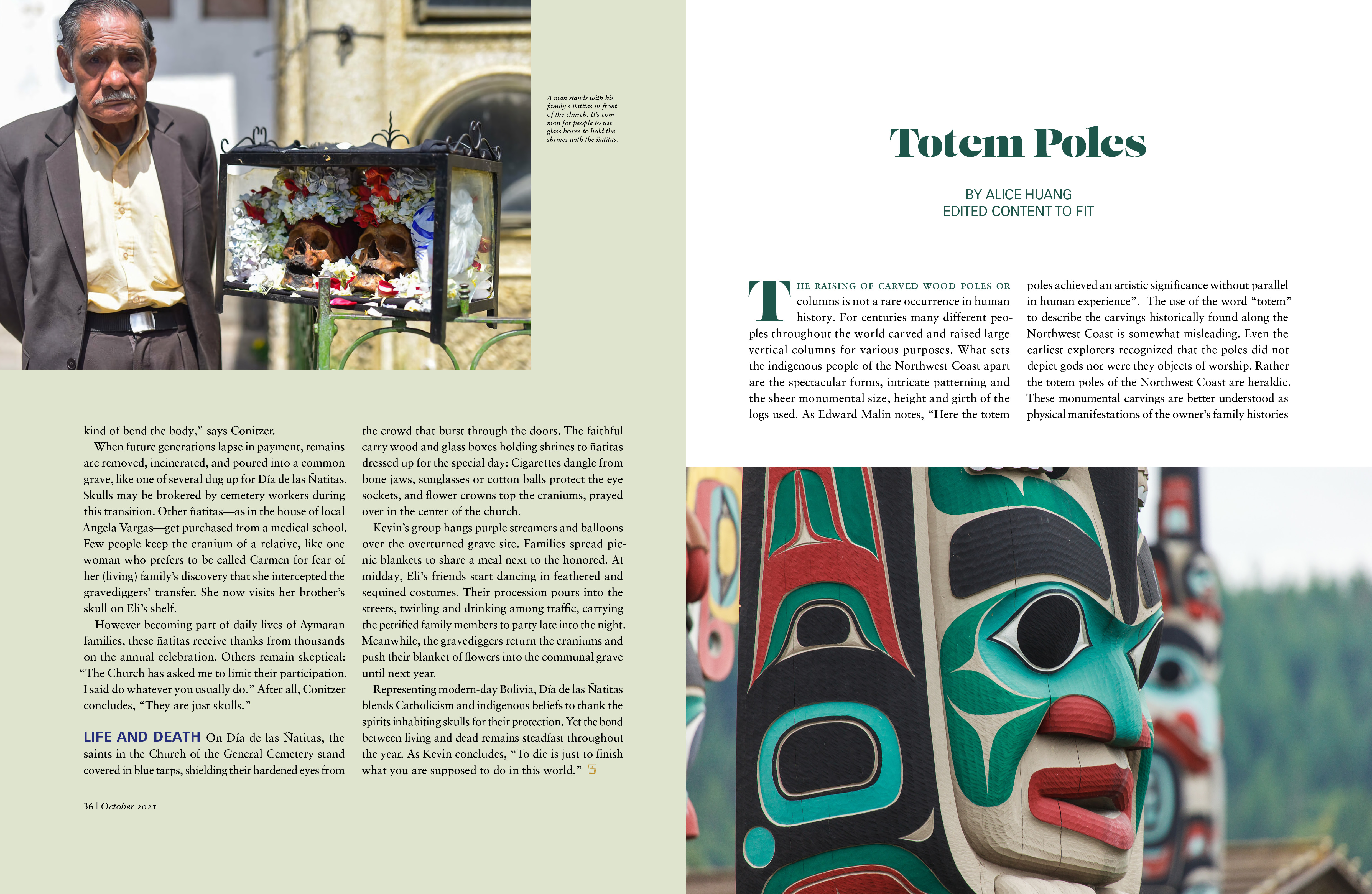
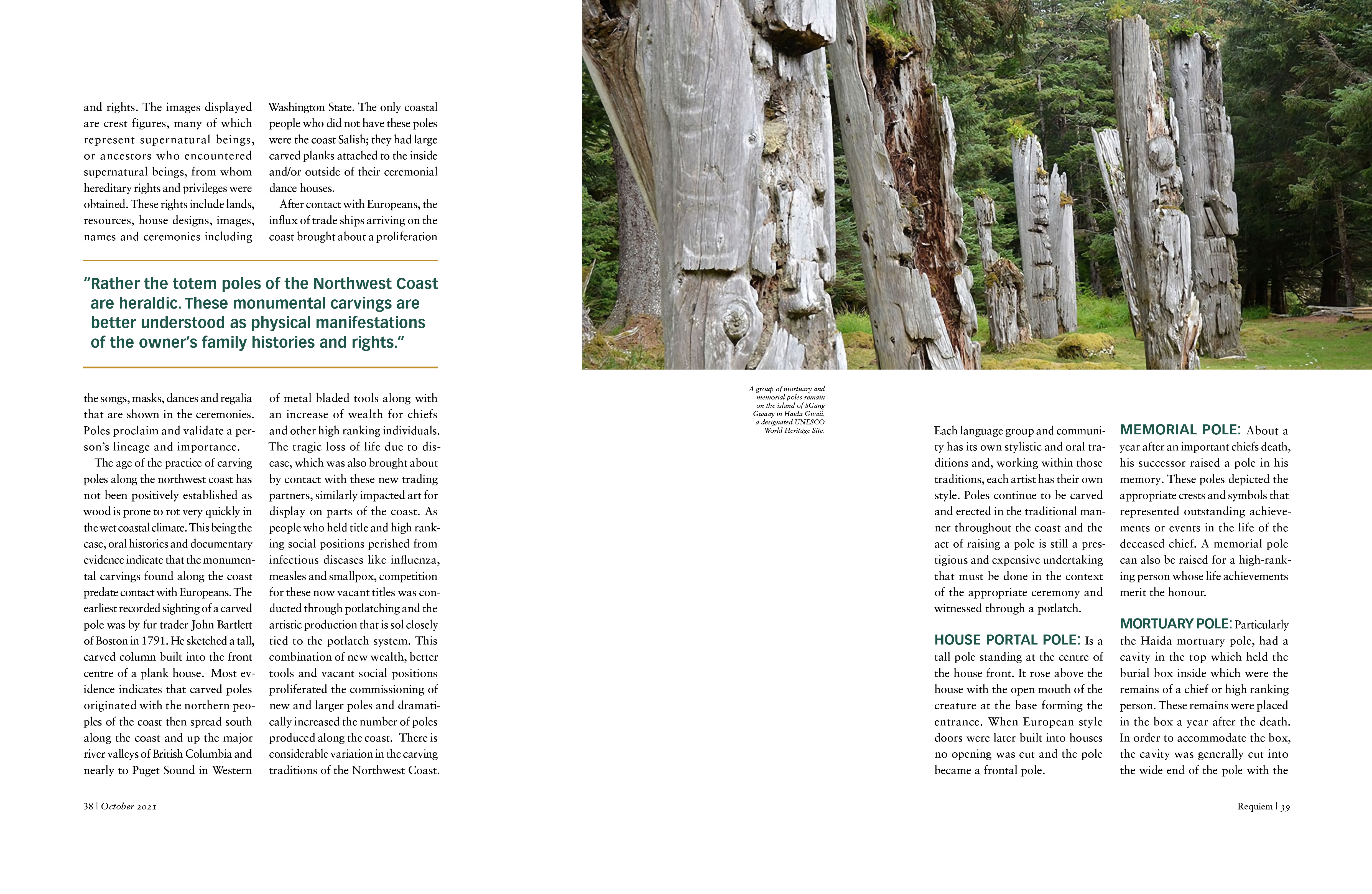
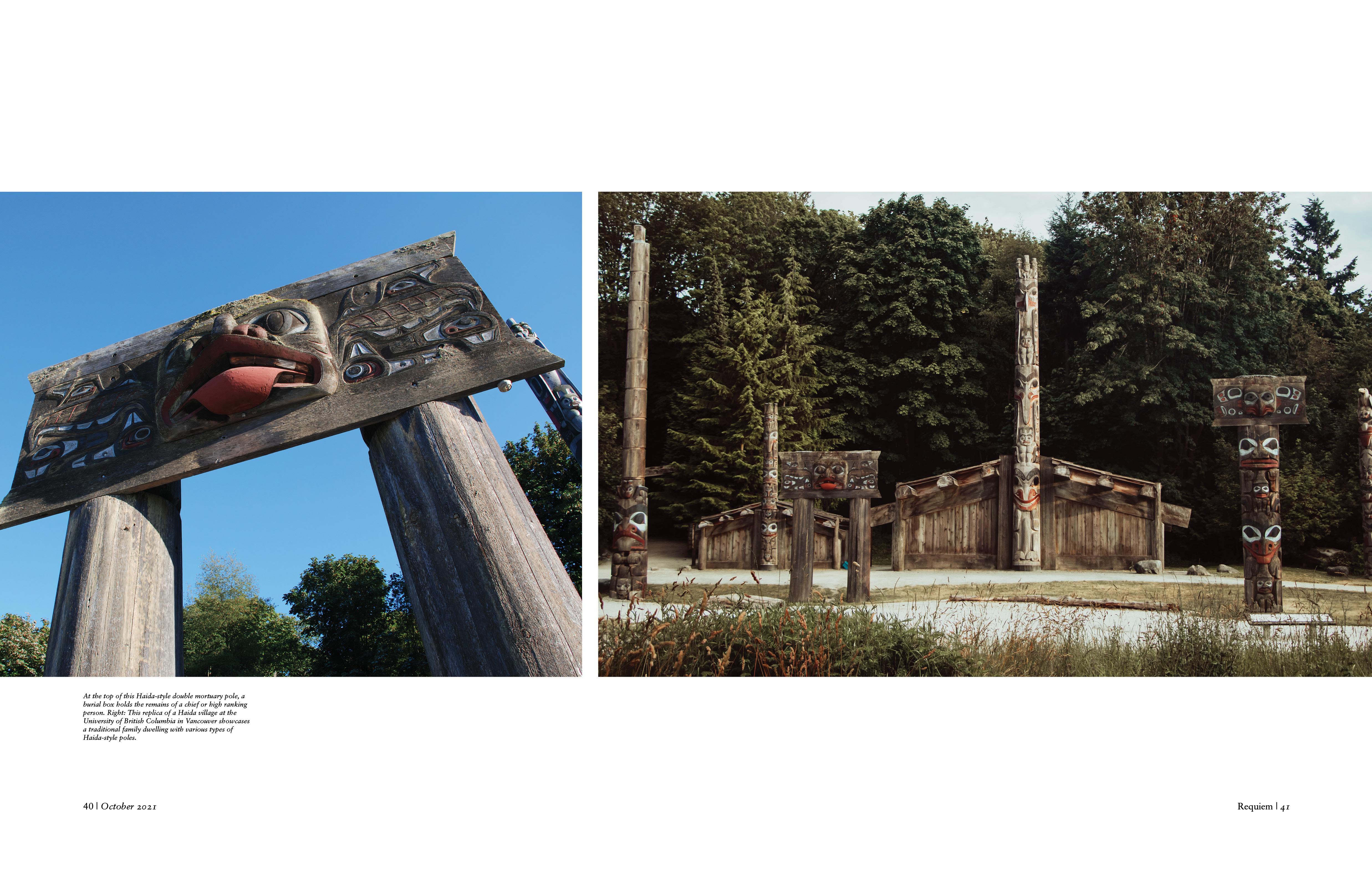
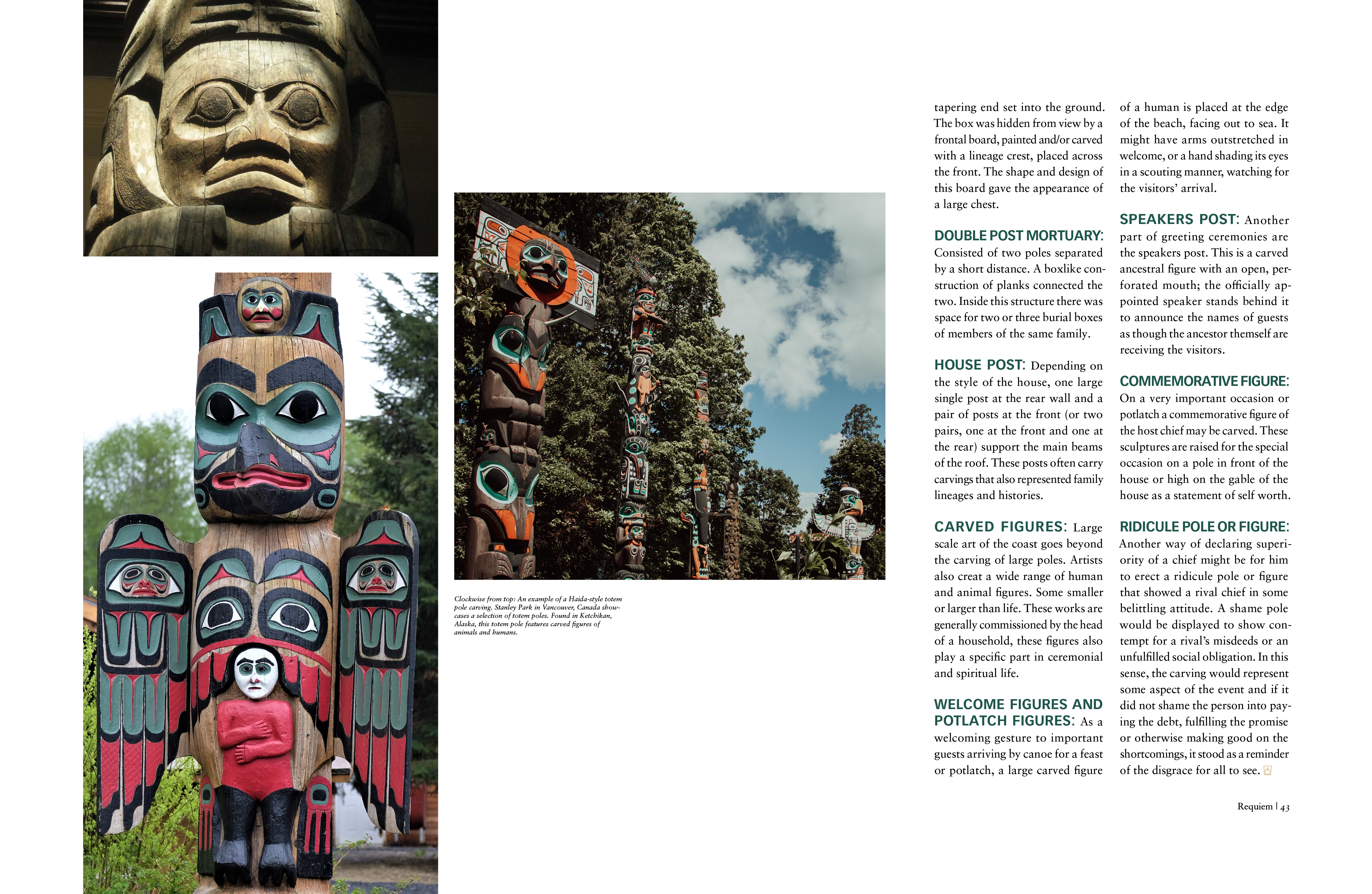

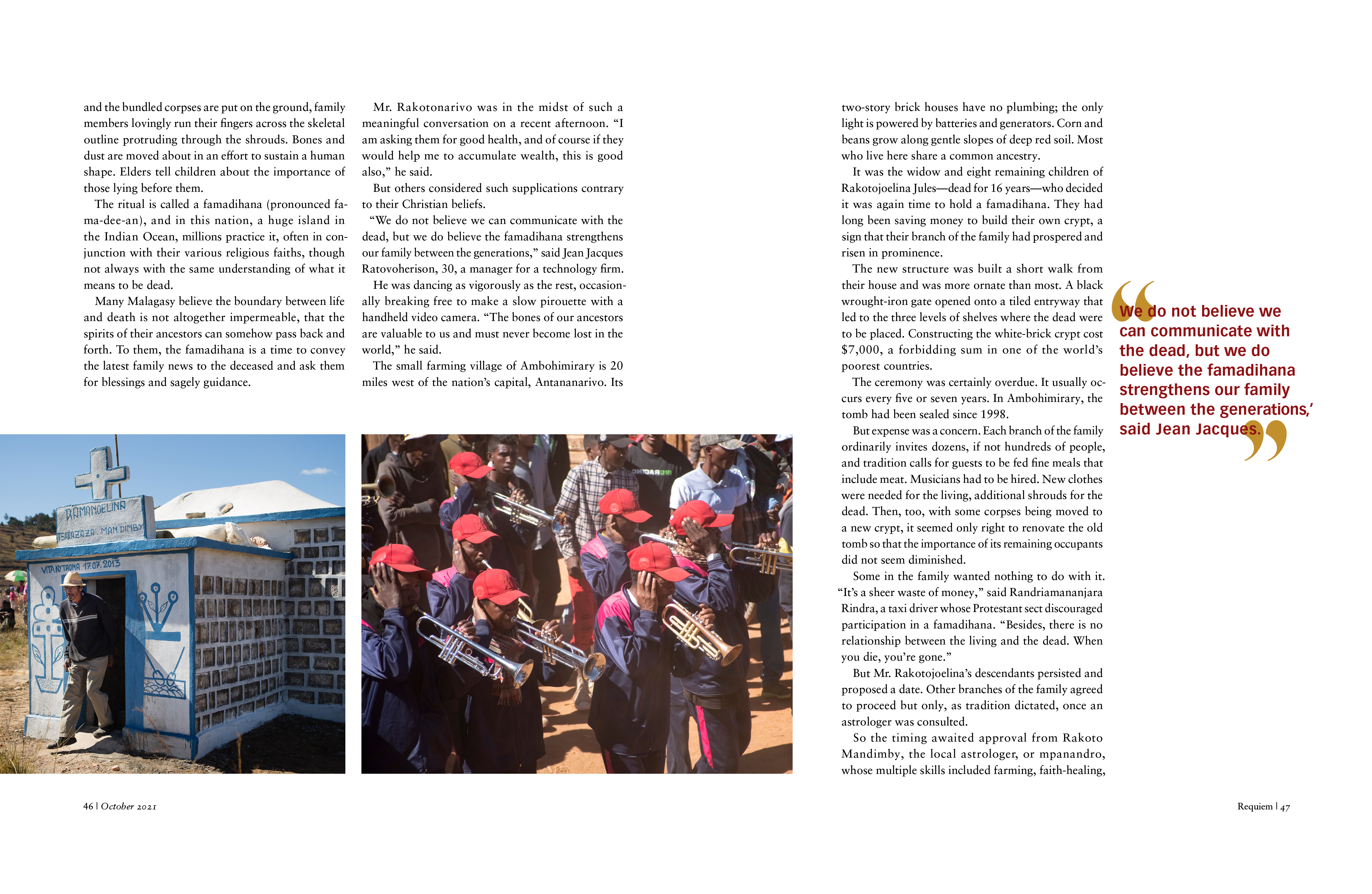
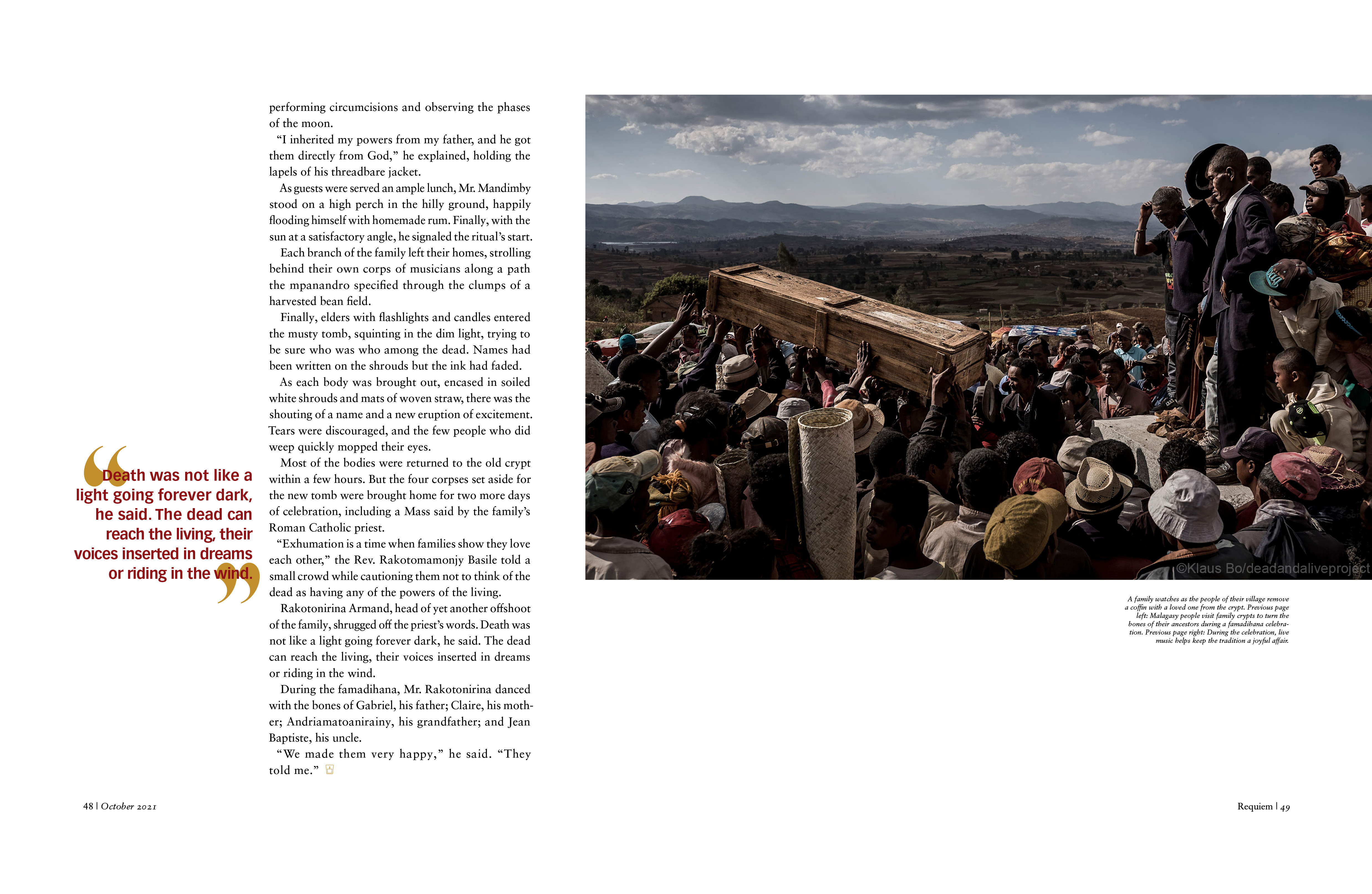
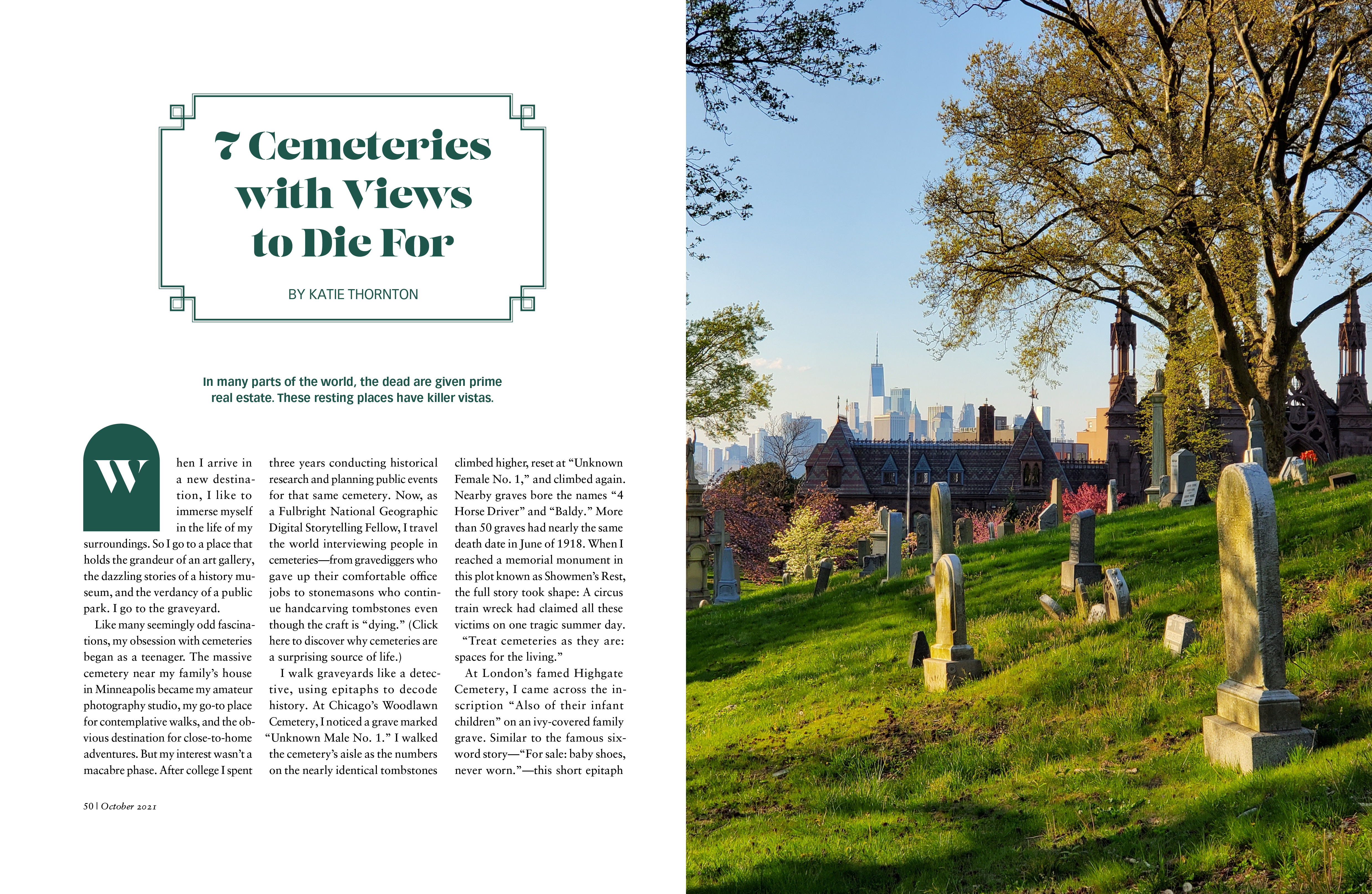
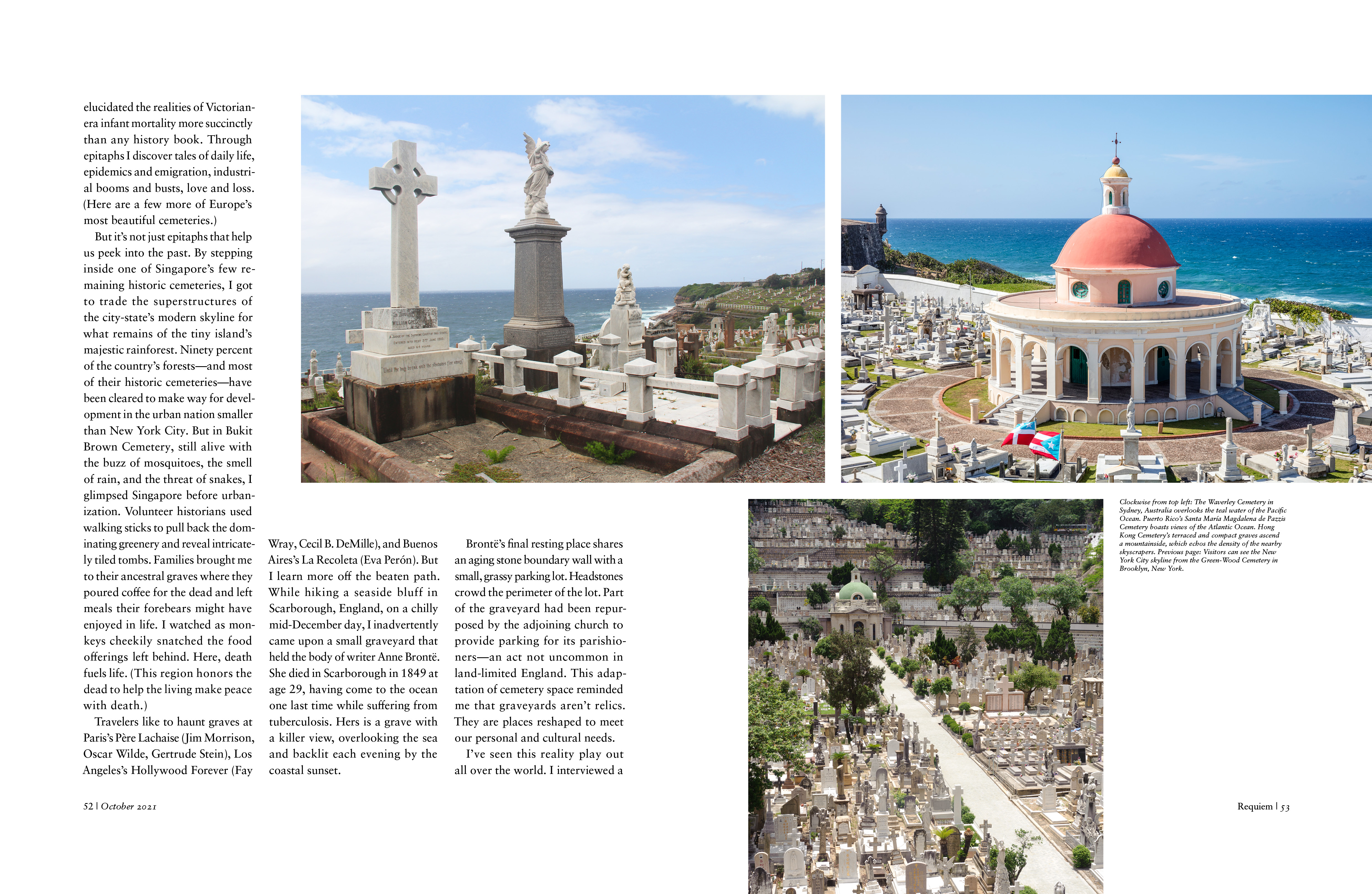
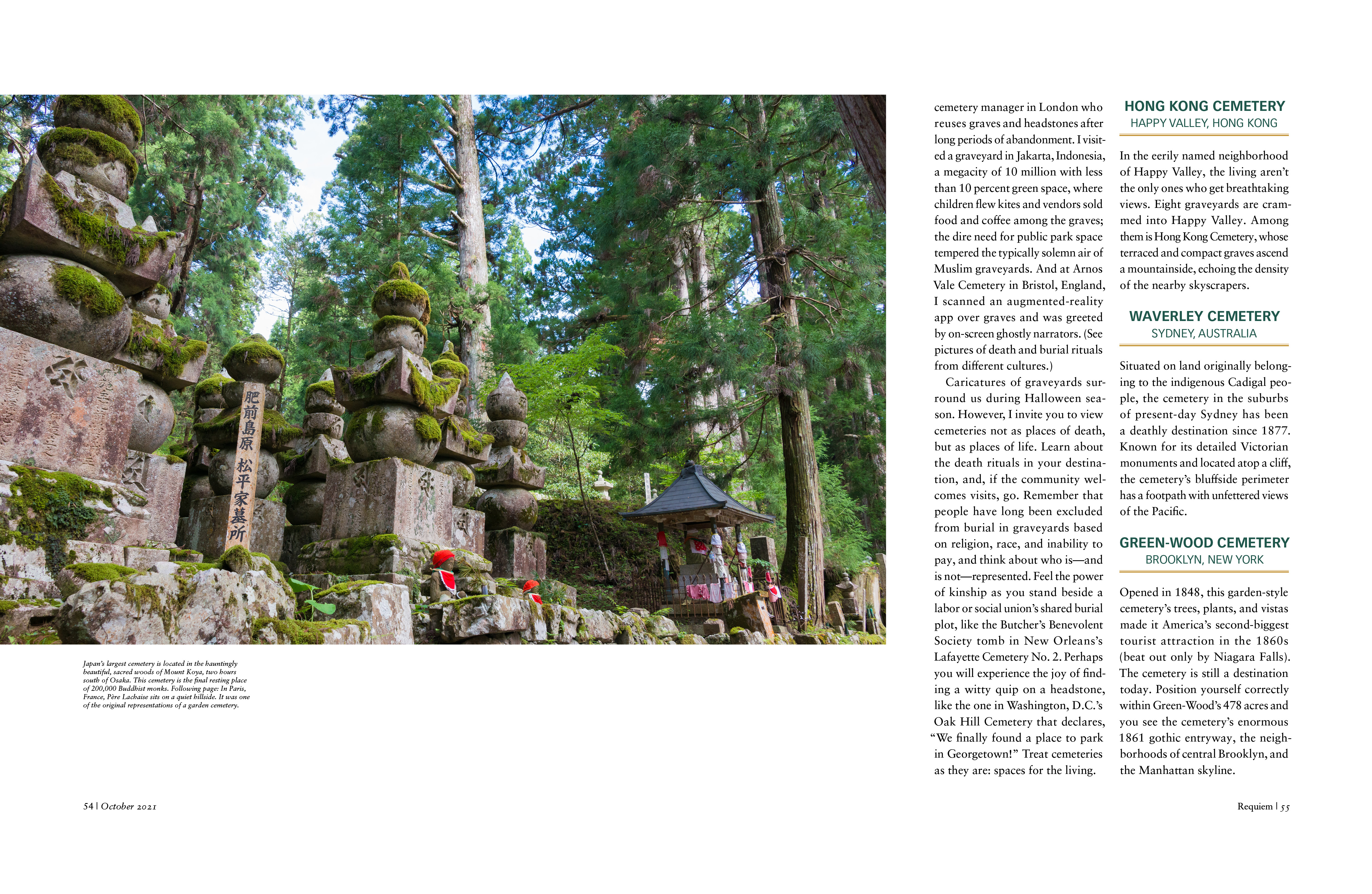
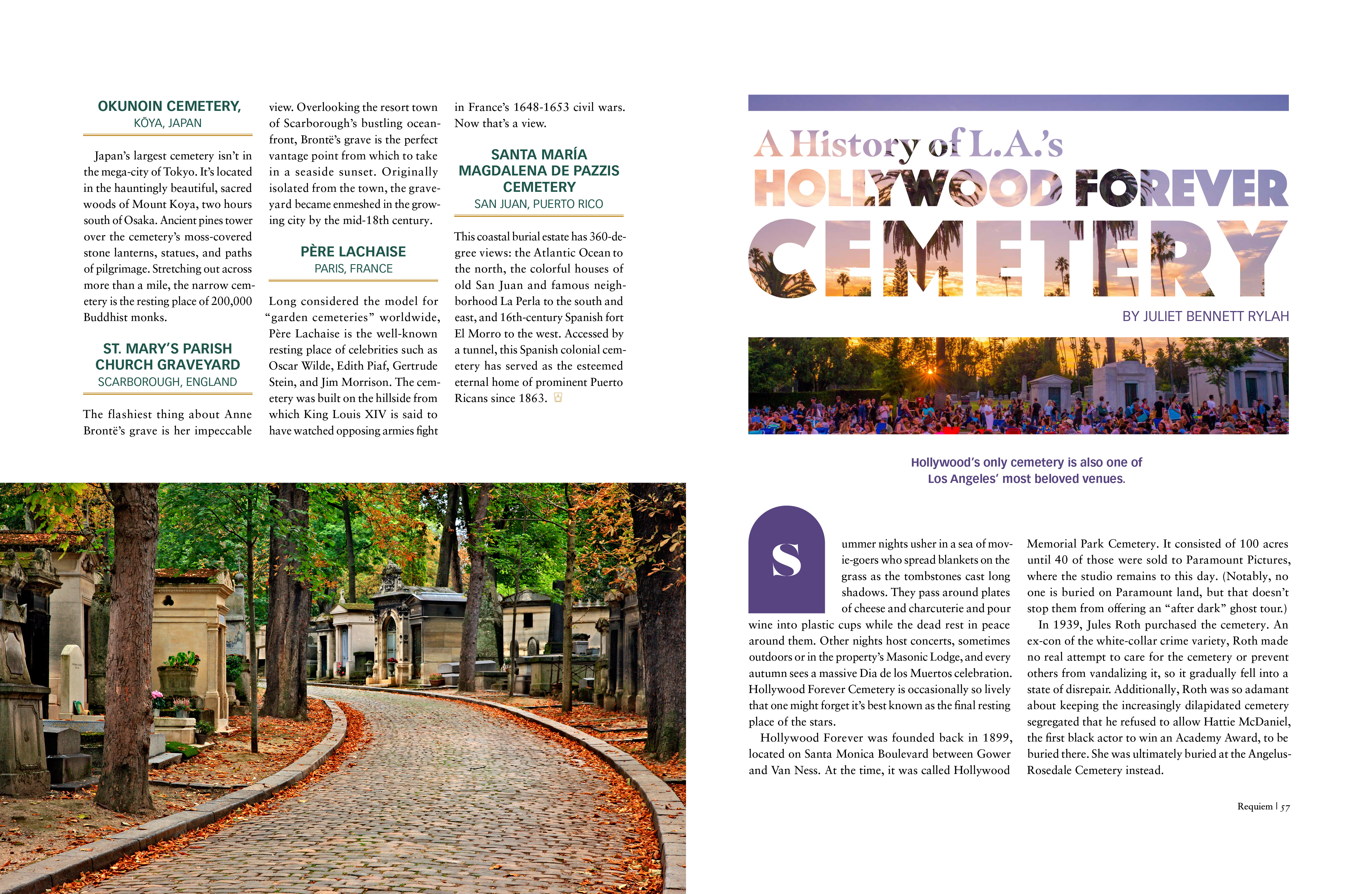
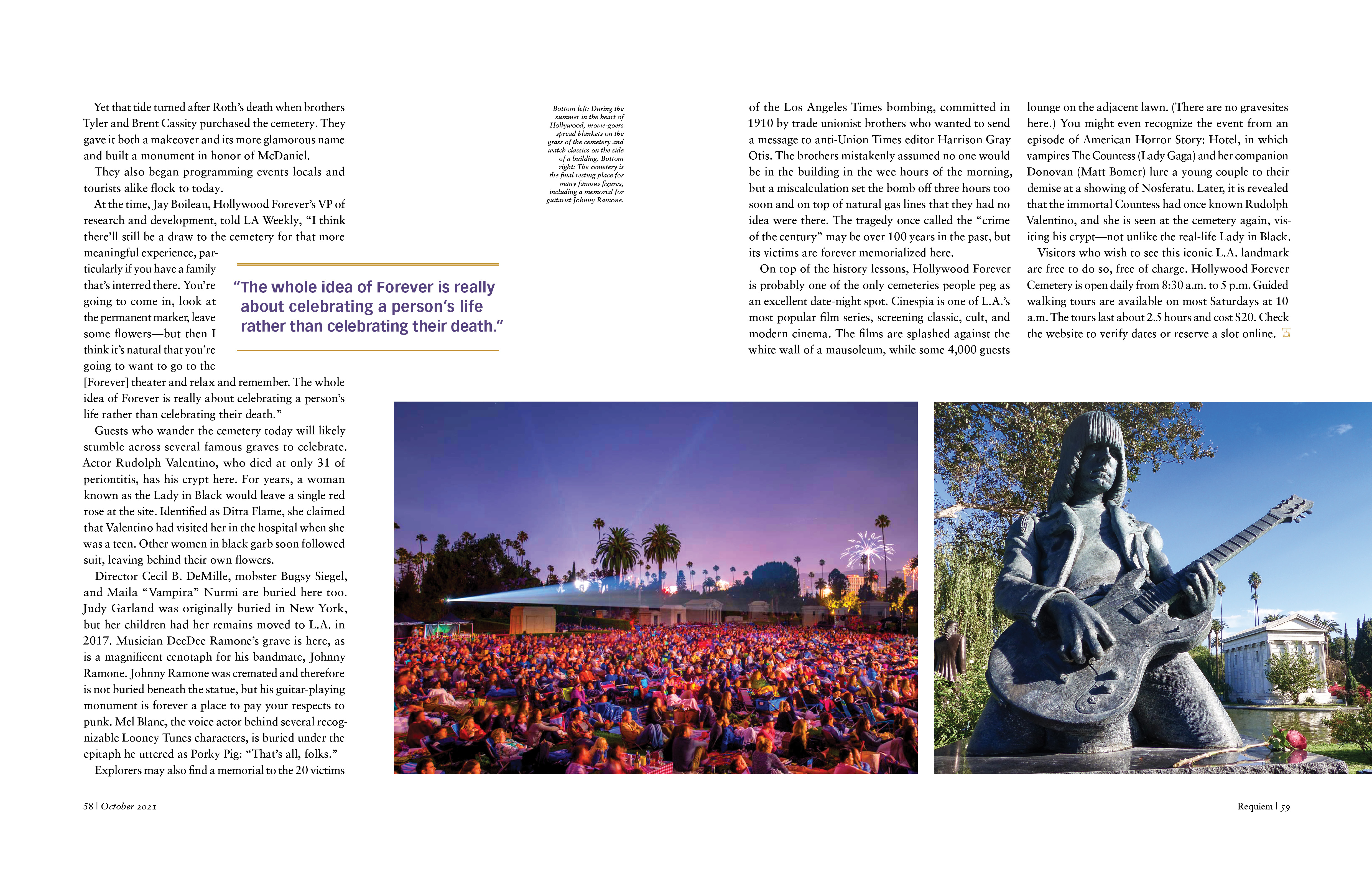
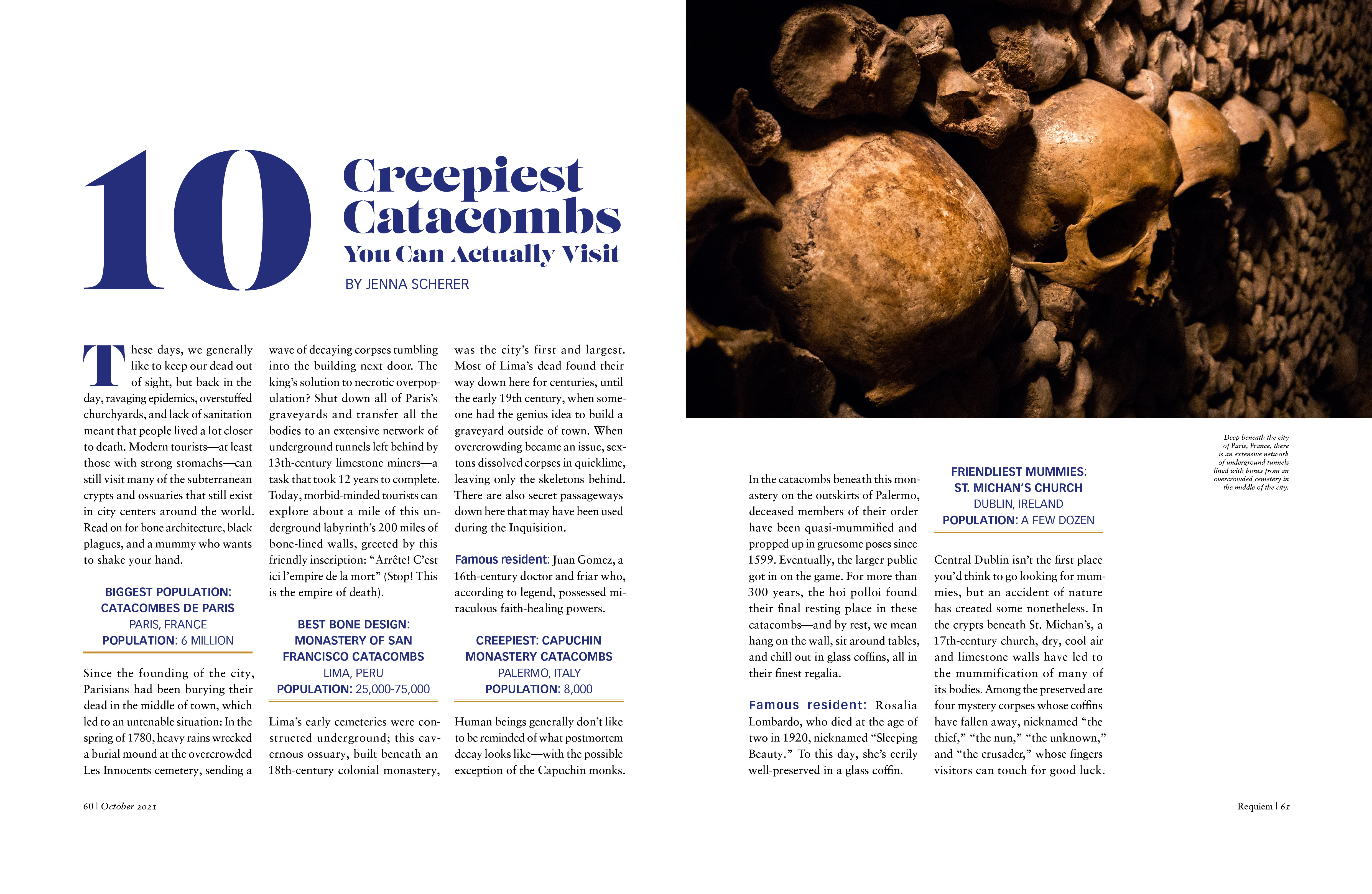



FINAL THOUGHTS
The high-quality visuals and compelling storytelling within each article creates a niche magazine that could last on the shelves for many years. By creating recipes for the publication structure, the magazine is cohesive, which helps the reader know what to expect with the layout. Even though the magazine’s organization is consistent, the content itself is intriguing, diverse, and unexpected, which captivates the reader to continue reading to learn more about the subject matter.

BONEYARD BUCKET LIST
Time length:
22 weeksTools:
Figma, Photoshop, IllustratorRoles/Skills:
Solo project - Design Layout, Time Management, Production, Art Direction, Marketing, BrandingOVERVIEW
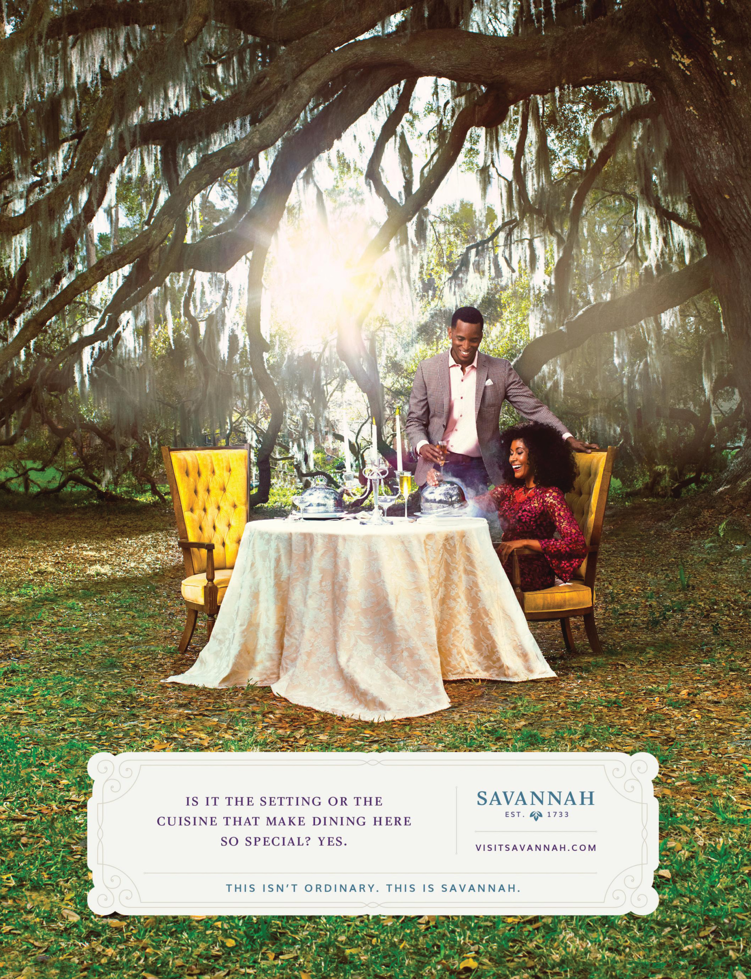
The goal of this marketing campaign was to encourage the public to explore locations through an engaging, uncommon tourist experience. Cemeteries are often overlooked as tourism destinations. However, from a different perspective, they are a beautiful part of our culture and provide a unique way to learn more about a beloved city. Cemeteries contain an abundance of rich history, beautiful art, and peaceful landscapes. By showcasing these cemeteries in a different light, tourists can learn about these historical landmarks and visit them (respectfully).
PROCESS
I researched guerrilla marketing trends, non-traditional advertising, and travel industry campaigns to create a marketing plan that would promote the top 18 cemeteries around the USA. Through research, I learned that scavenger hunts are great for activating consumers' attention for an extended period. In addition, interactive marketing is popular to engage users. I incorporated these discoveries into the marketing plan by creating a scavenger hunt with clues leading to the cemeteries on the top 18 list and a mobile “cemetery passport” app (that would be called the Boneyard Bucket List) for users to check off the cemeteries on the list as they visit them.
PROCESS DOCUMENTS


PROCESS CONTINUED
To create buzz and interest for the Boneyard Bucket List, there would be fake tombstones in touristy parts of the cemetery’s city during the launch of the campaign. These tombstones would have a QR code on them that will lead the user to the website. During the rest of the year, a time-lapse video of the cemetery and QR code will be projected on a building wall in the cemetery’s town or city. The video would change based on the season. After the user visits the website, the user would see clues that would lead them on a scavenger hunt to the cemetery.
Once they find the answer to the clue in the cemetery, they would take a picture of the answer and load it to their mobile passport, which would generate an etching of the picture. To encourage users to visit all the cemeteries on the list, the goal of the Boneyard Bucket List is to get an etching stamp for each of the cemeteries on the list in the mobile cemetery passport, like a bucket list. To add to the fun, there would be merchandise like posters, postcards, and candles available for the consumer to purchase.
INDIVIDUAL CEMETERY POSTERS




PROCESS CONTINUED
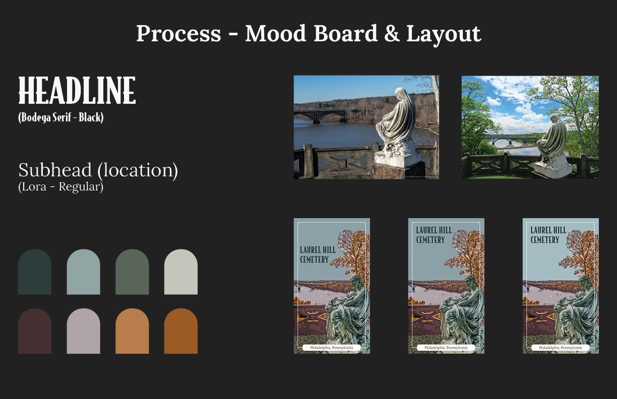
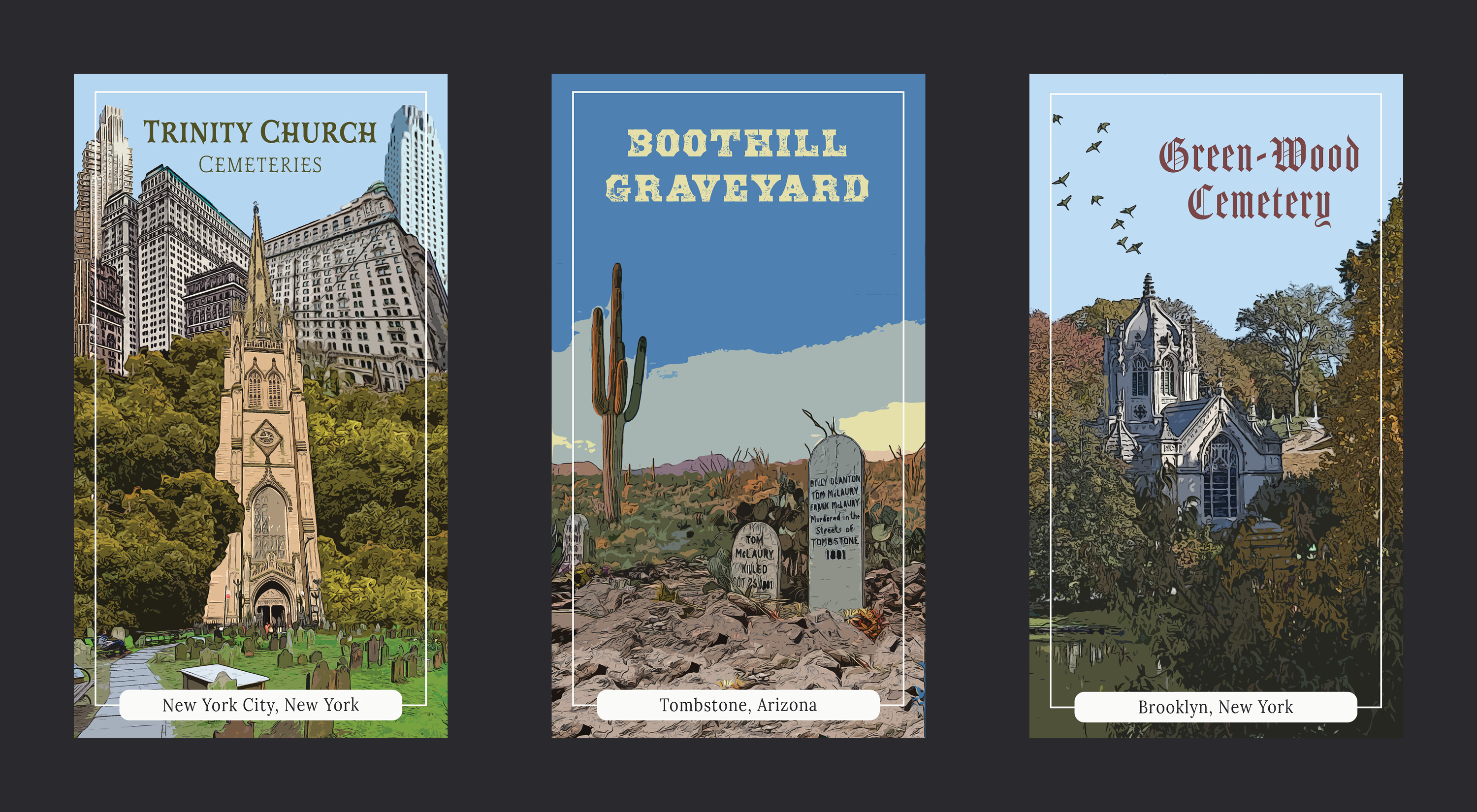
The posters would be used as the main images for each cemetery in the mobile passport and as souvenirs for purchase or promotional material. To create each poster, I researched the cemetery, brainstormed a layout that would incorporate a unique detail about the cemetery, and then created the actual poster. For the design, I was inspired by vintage travel posters. These are popular amongst travelers since they evoke nostalgia towards the destination, so I thought they would be useful to encourage people to explore cemeteries.
I developed a system for the layout and design for each poster. This system included a frame, text box with set typeface for the location, and a cartoon effect in Photoshop. This simplified the process and created a cohesive style, though each poster showcased the cemetery's unique personality through the imagery, colors, and headline typeface.
Click to view Mobile Passport App flow.
ADVERTISING


MOBILE PASSPORT APP

MERCHANDISE


FINAL THOUGHTS
The marketing campaign is successful because it offers intrigue, entertainment, and education through a niche tourist activity. Initially, the guerrilla marketing around the city intrigues the target audience. The scavenger hunt gamification in the cemetery offers a source of entertainment. And the Mobile Passport App provides education and information about each cemetery. The posters show a beautiful and unique side of each cemetery, which can help change the public’s perspective about the destinations. Since the Boneyard Bucket List includes a checklist, it gives the target audience a reason to continue exploring cemeteries.
VAIN BRAND REFRESH
Time length:
12 weeksTools:
InDesign, Photoshop, Illustrator, FigmaRoles/Skills:
Group/Solo project - Branding, Marketing, Environmental Design, Design Layout, Concept Development, Time Management, ProductionOVERVIEW
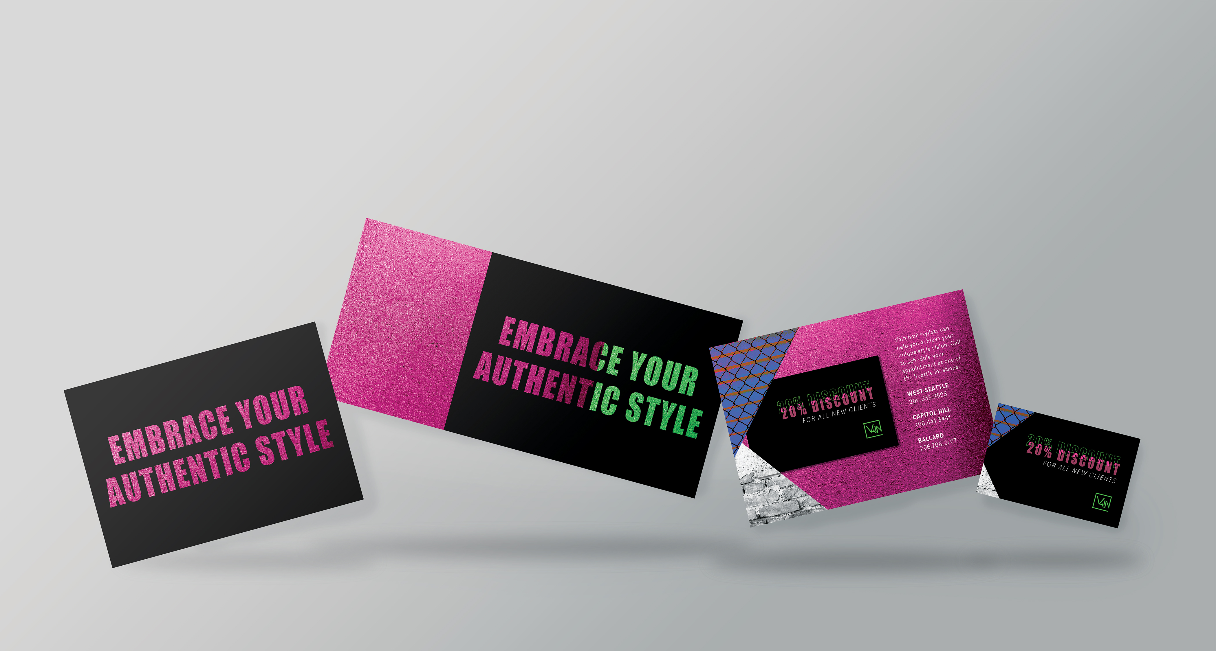
Vain Hair Salon’s current branding does not reflect who they are as a brand and is inconsistent across their three salon locations. Vain needs a new branding system that fits their style, while also encouraging their clients to explore their own self-expression.
PROCESS
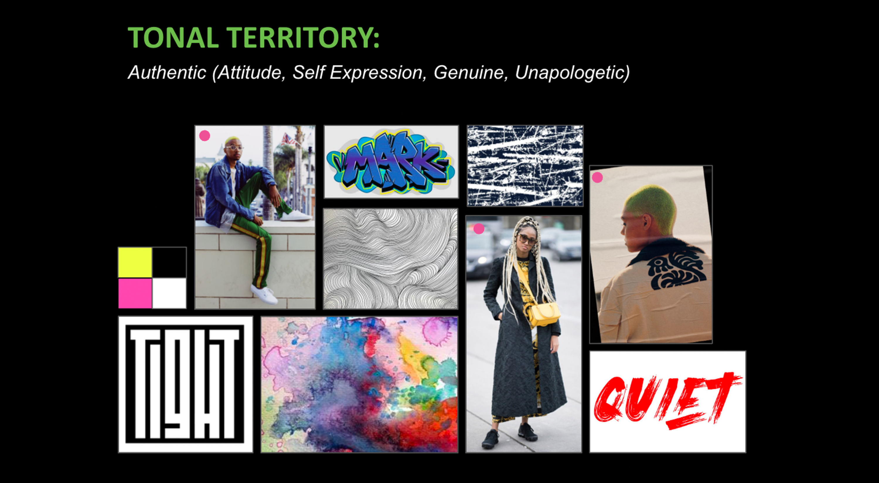
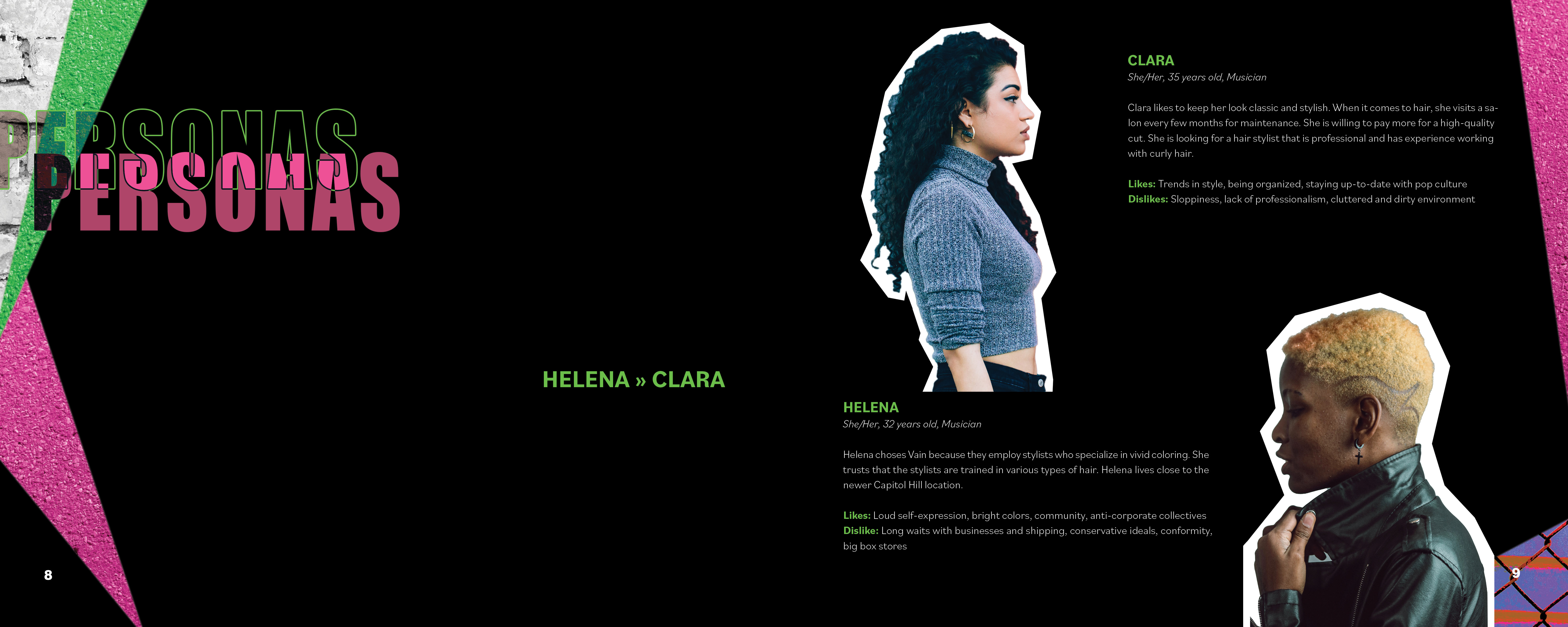
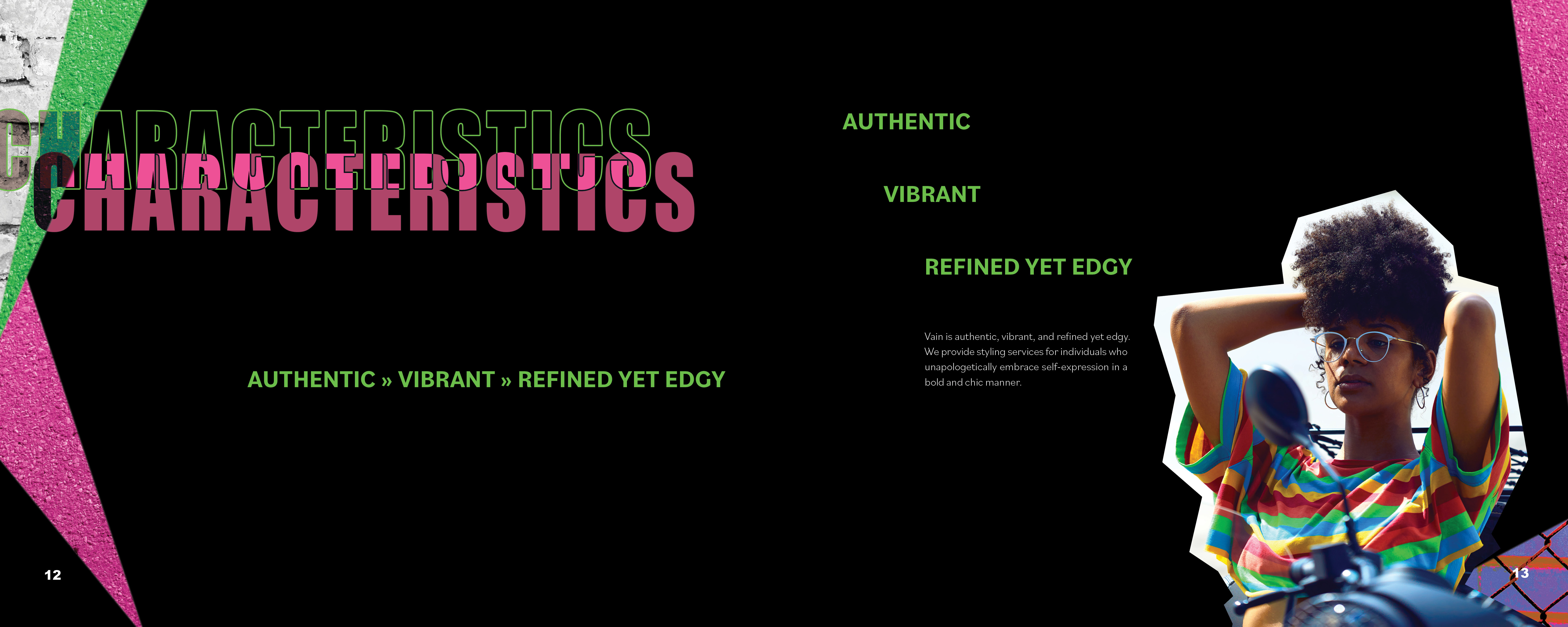
Two other students and I started our process with the research phase. We explored Vain’s background, audience, and competitors to familiarize ourselves with the current branding. Once this step was complete, we moved into the discovery phase to create the personas and a list of brand traits: authentic, vibrant, and refined, yet edgy.
We created tonal territories for each trait to show the textures, images, text, colors, and other visuals that could be used to describe each trait. As a team, we also developed a mission statement, brand positioning, and brand promise for Vain’s new branding.
RESEARCH & DISCOVERY PHASE




PROCESS CONTINUED
Inspired by our tonal territory traits, I developed the concept “Unconventional Style” and made a final concept board that I would use to guide other decisions and the production of branding deliverables throughout the rest of my project.
Click here to view Vain’s website redesign.
DELIVERABLES
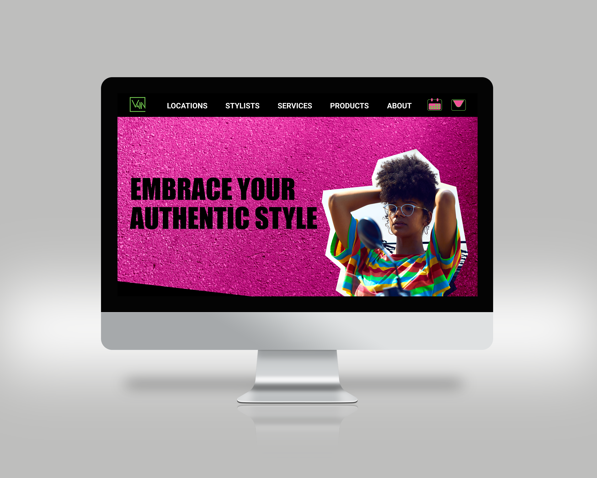
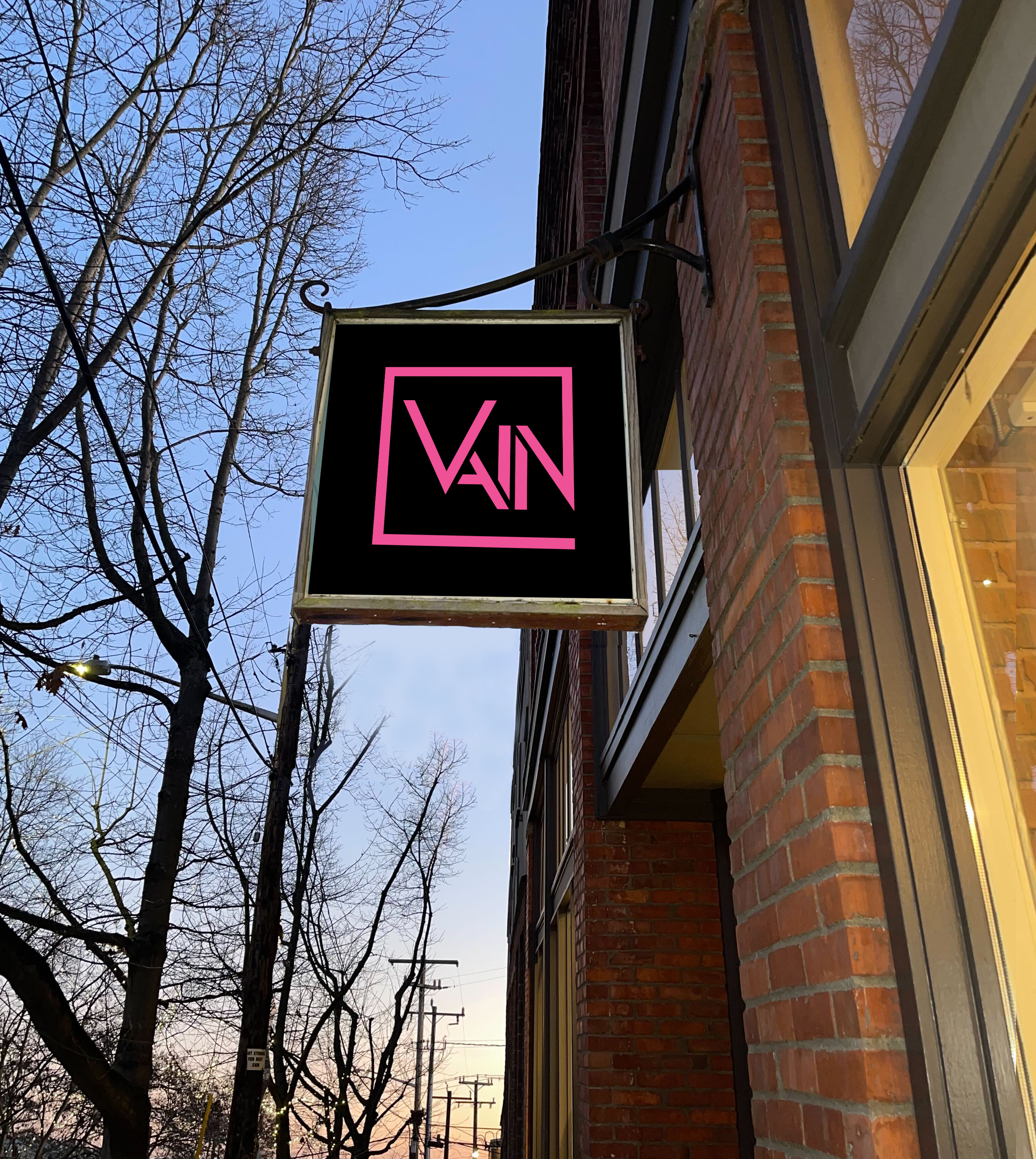


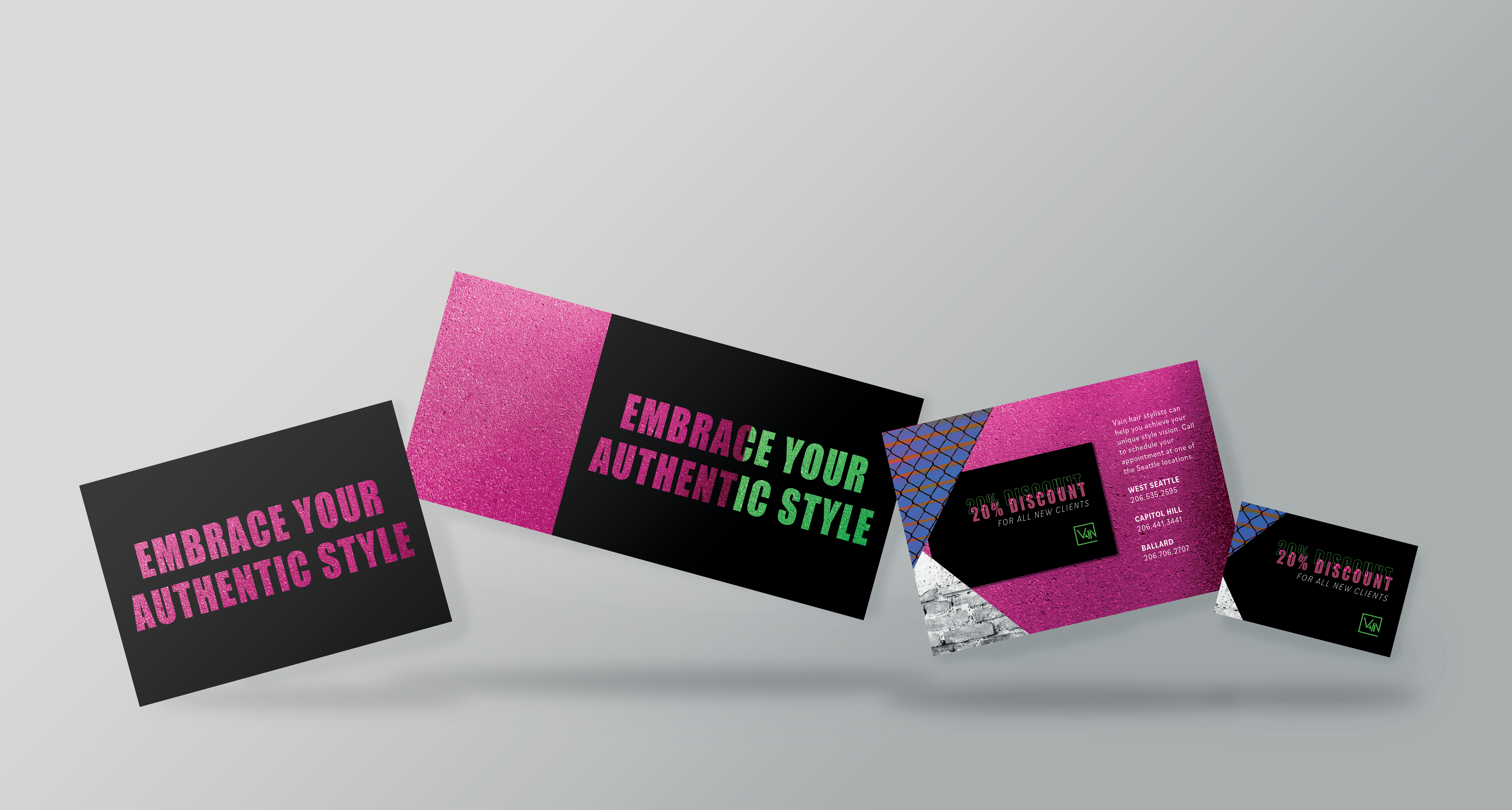
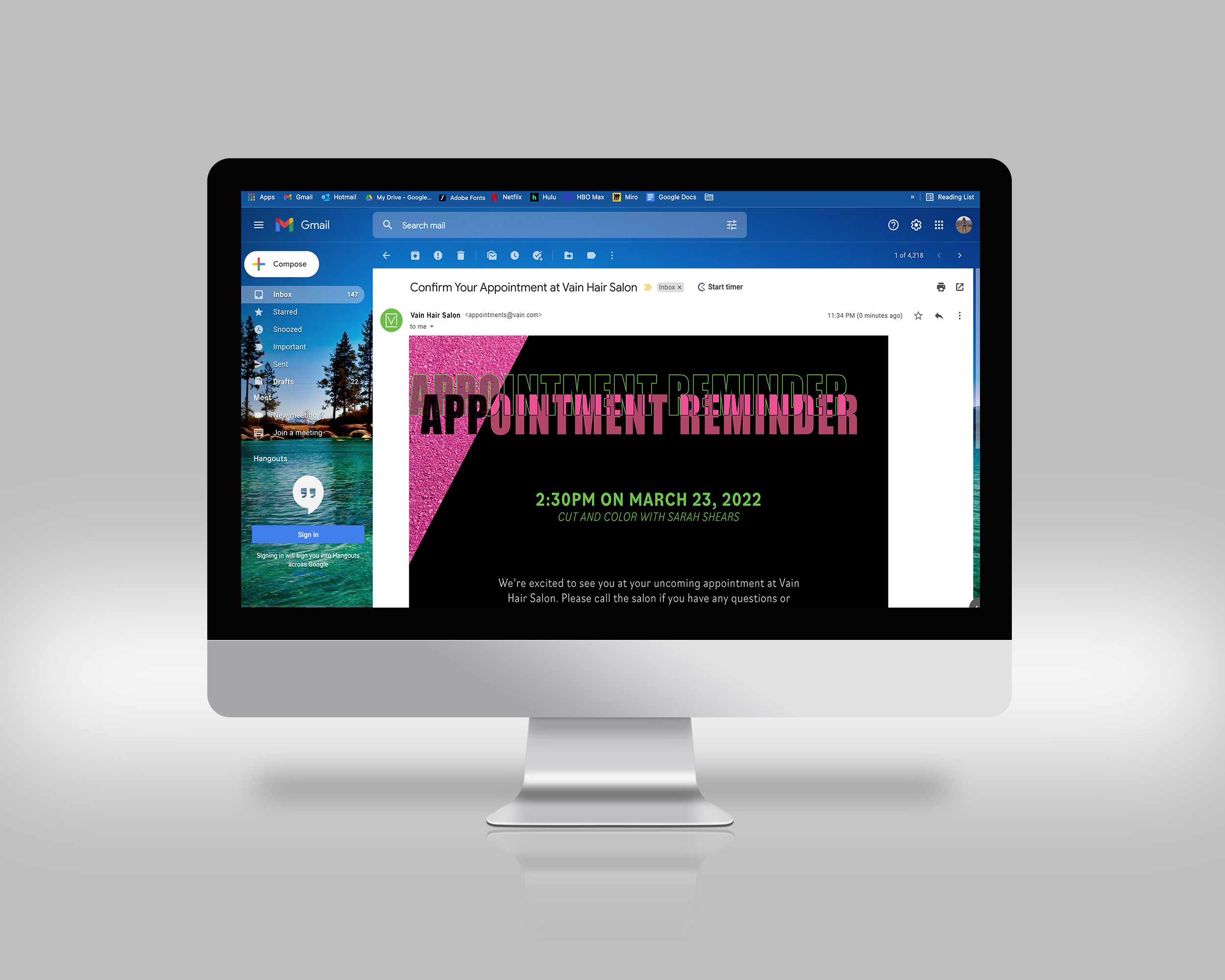
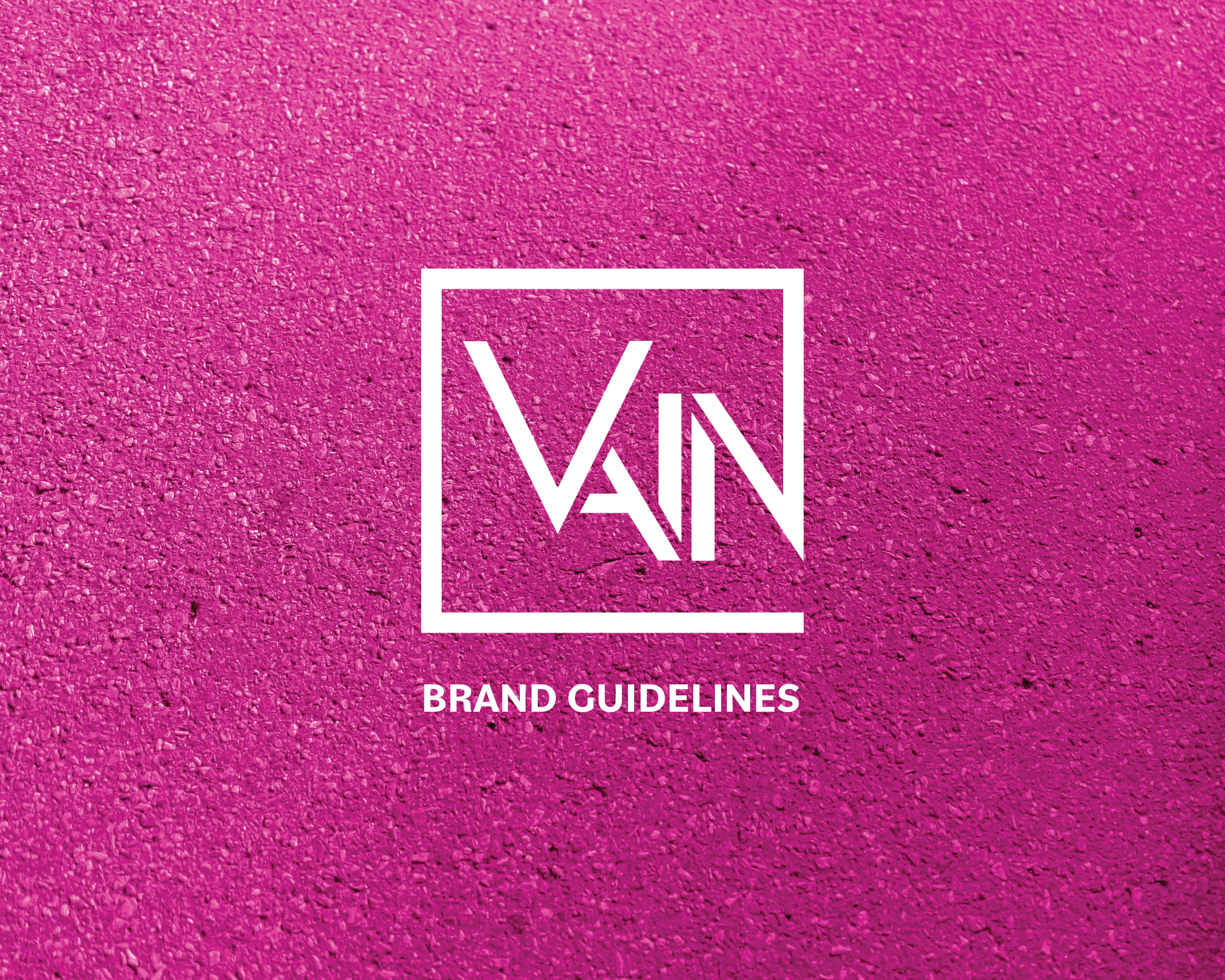
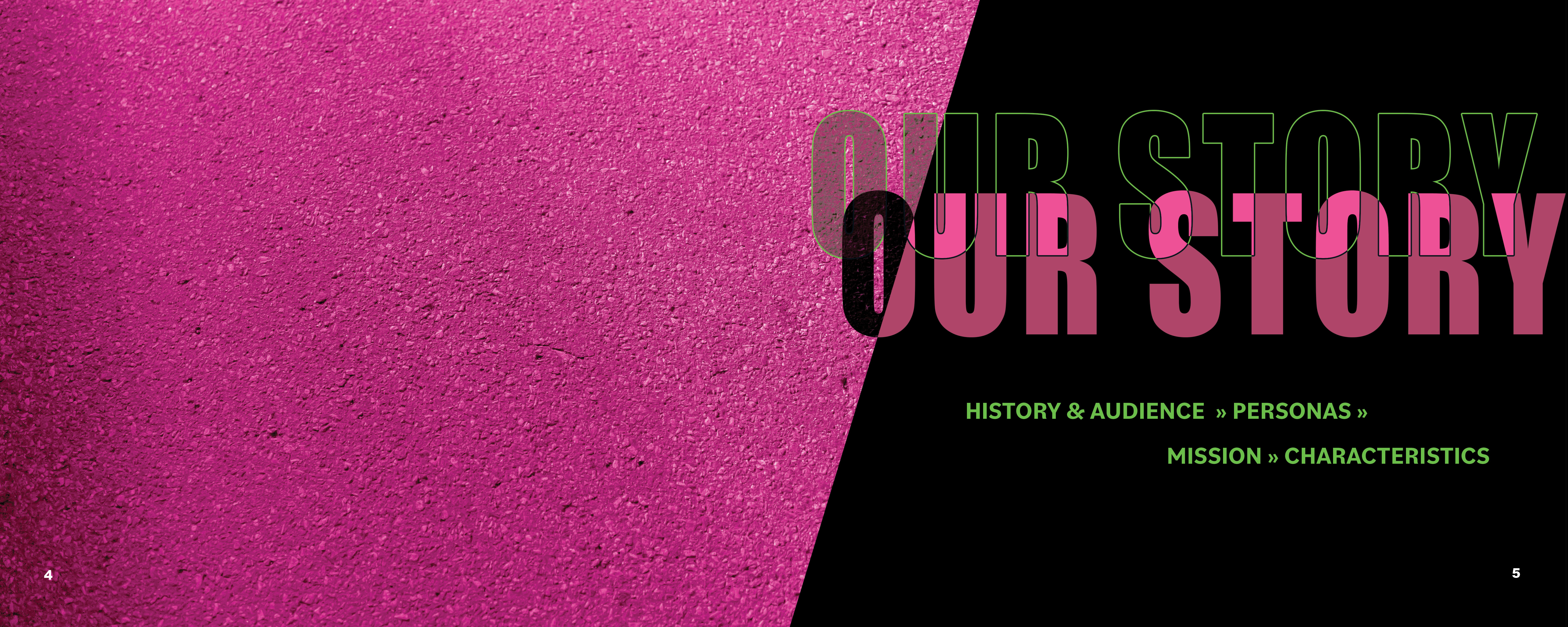
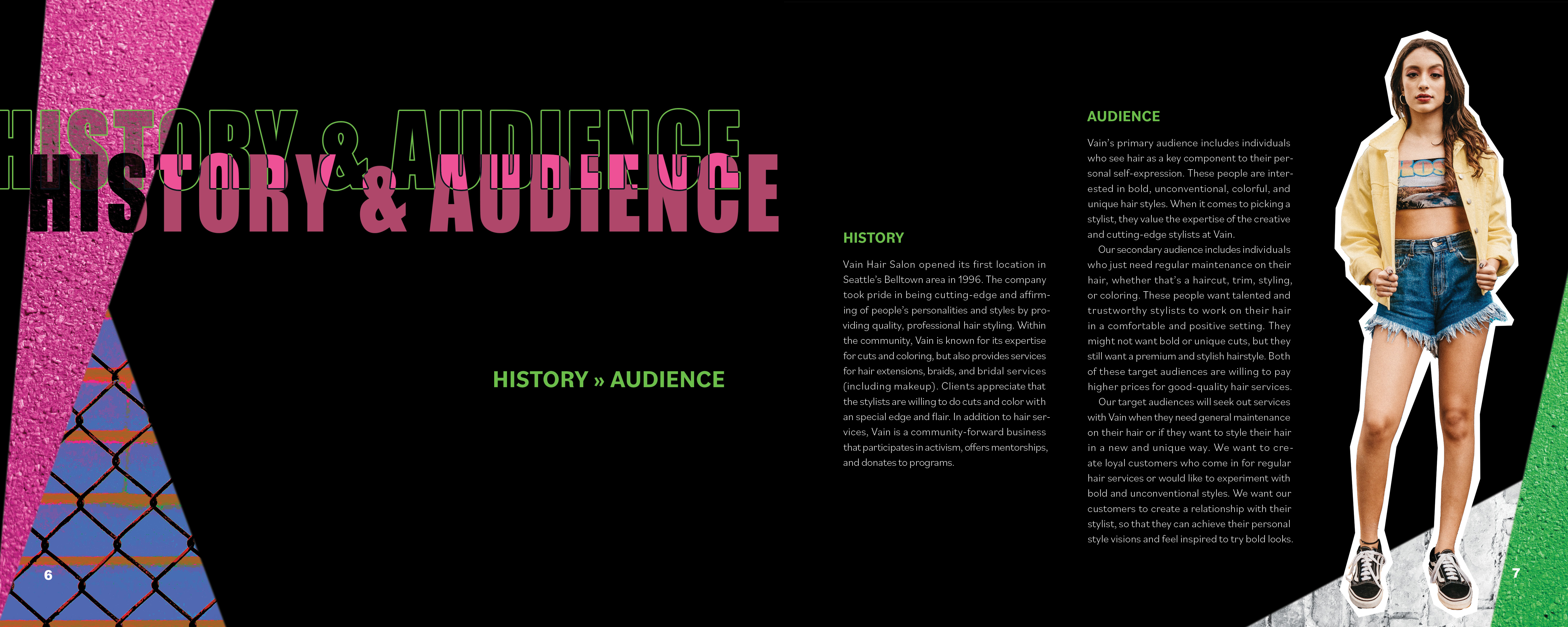
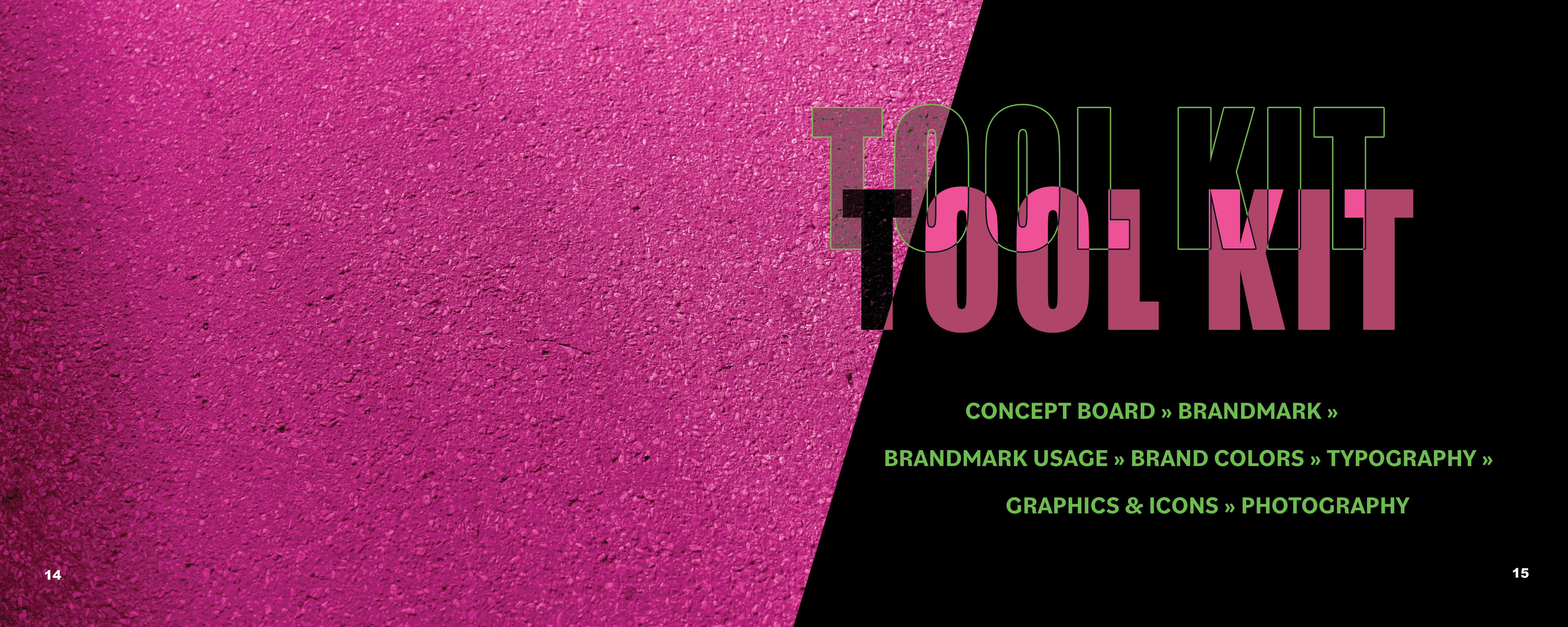
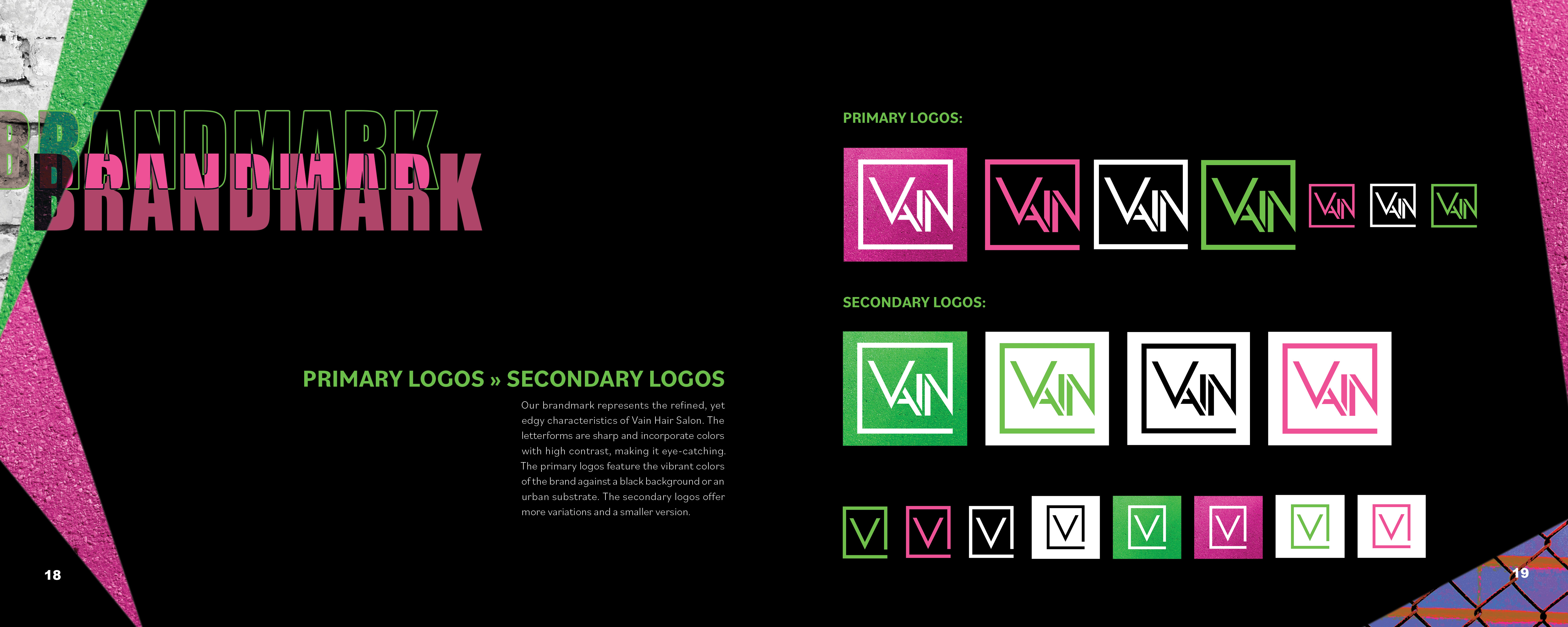
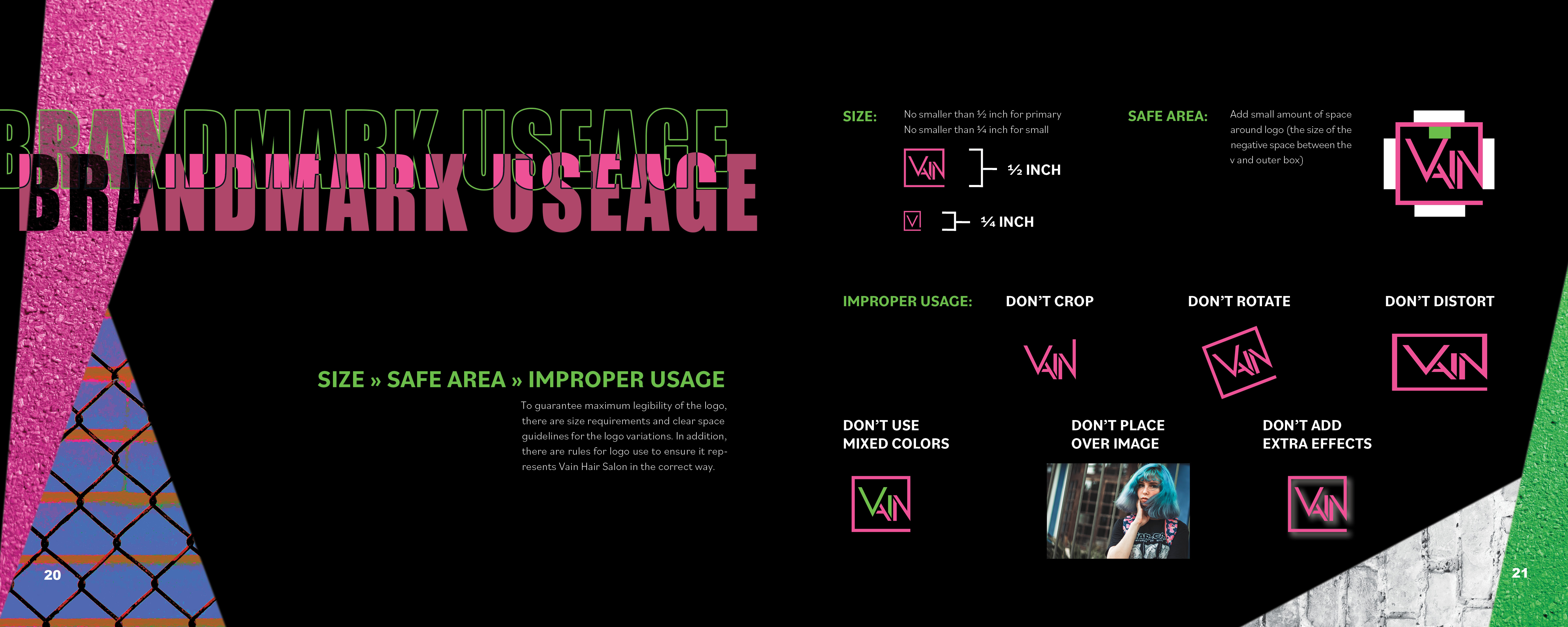
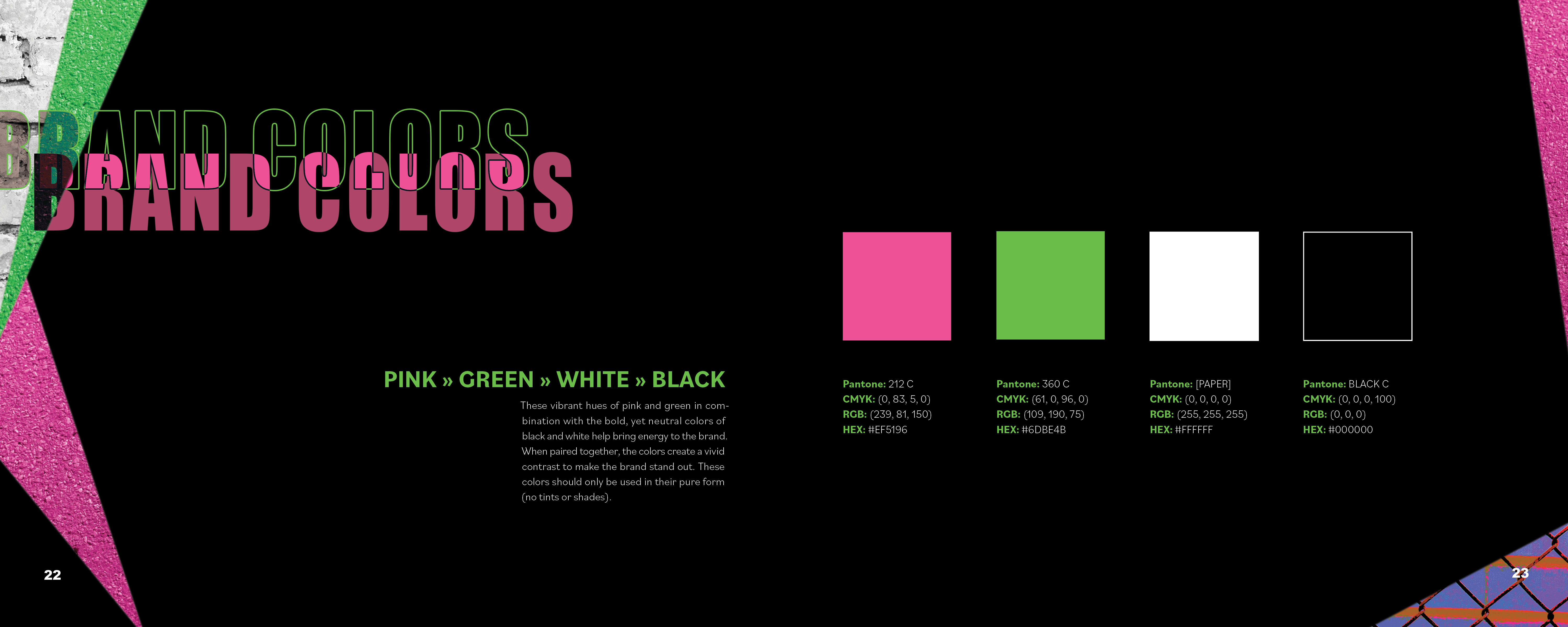
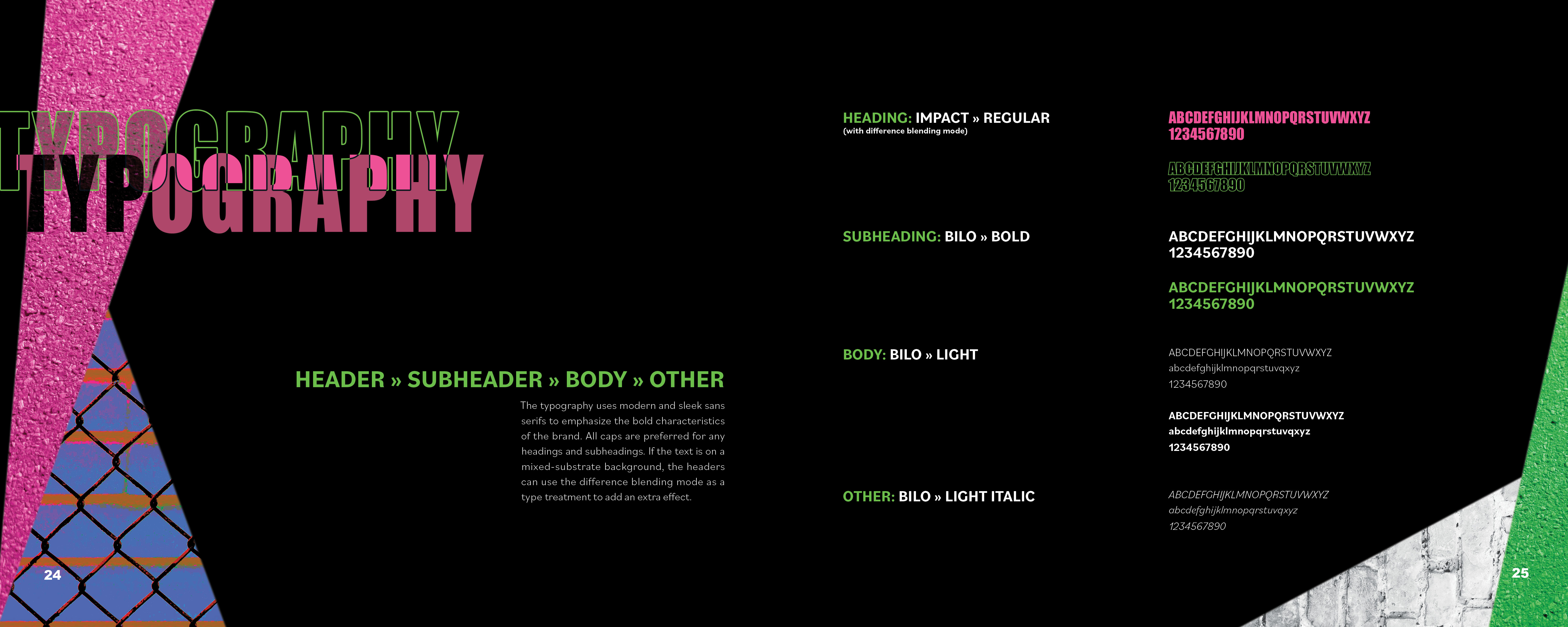
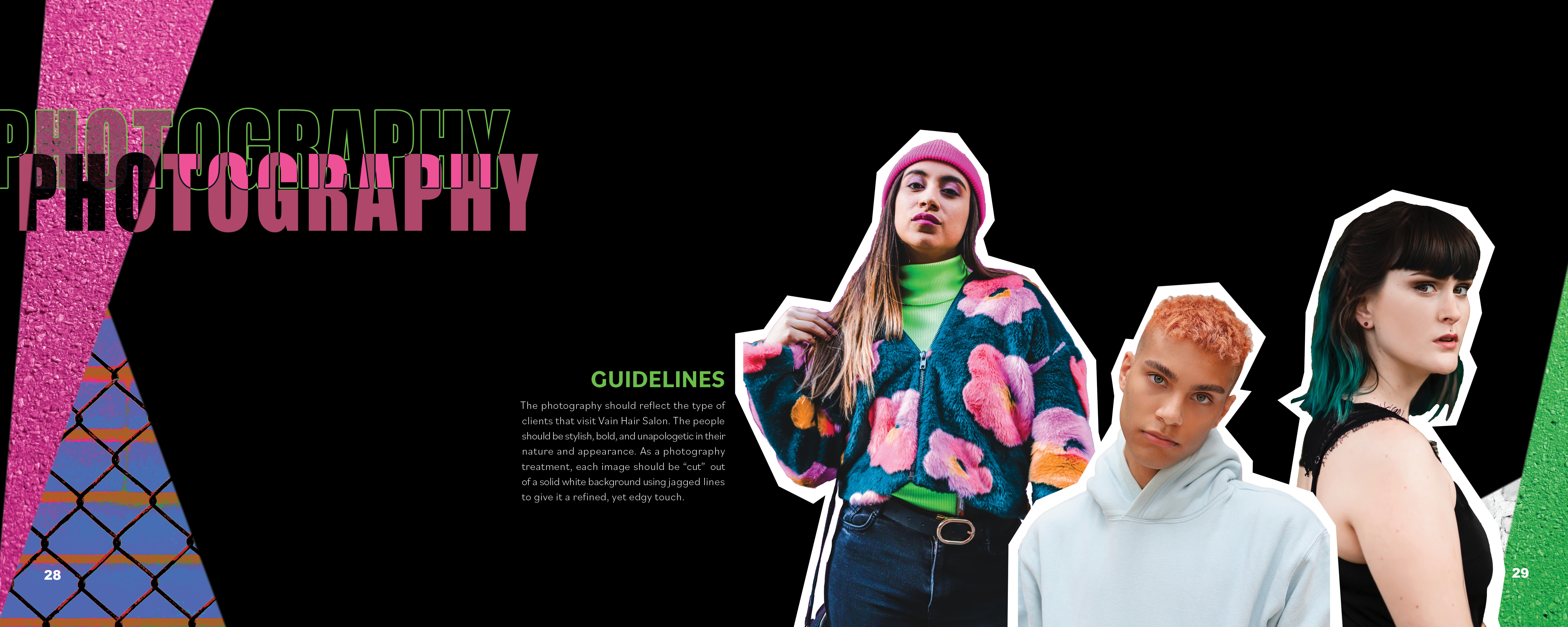
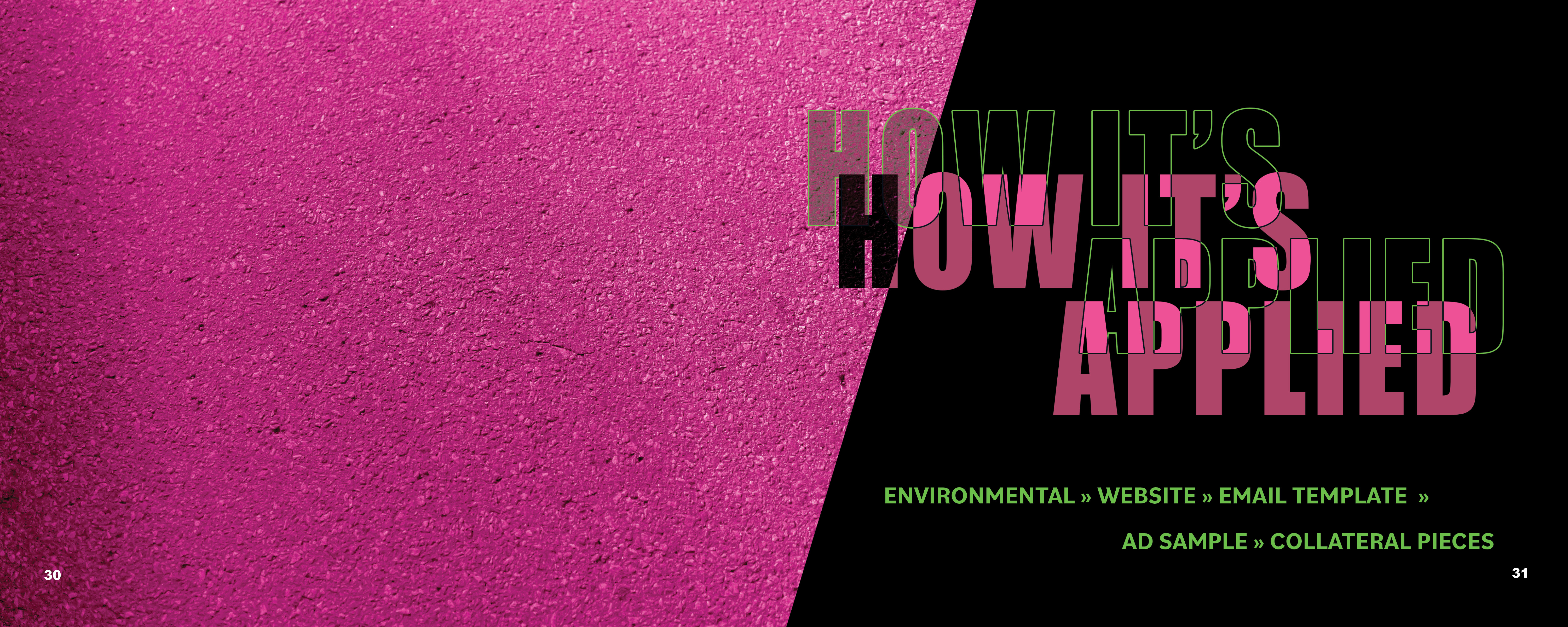
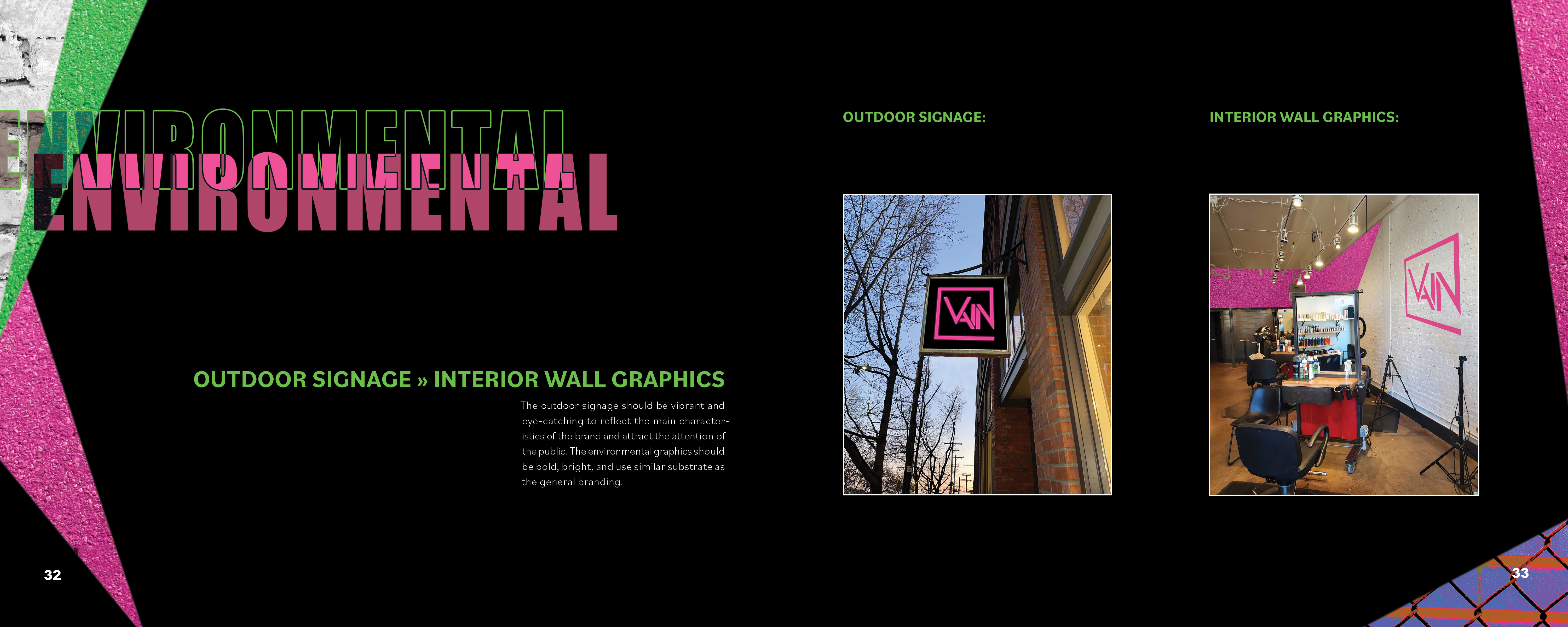
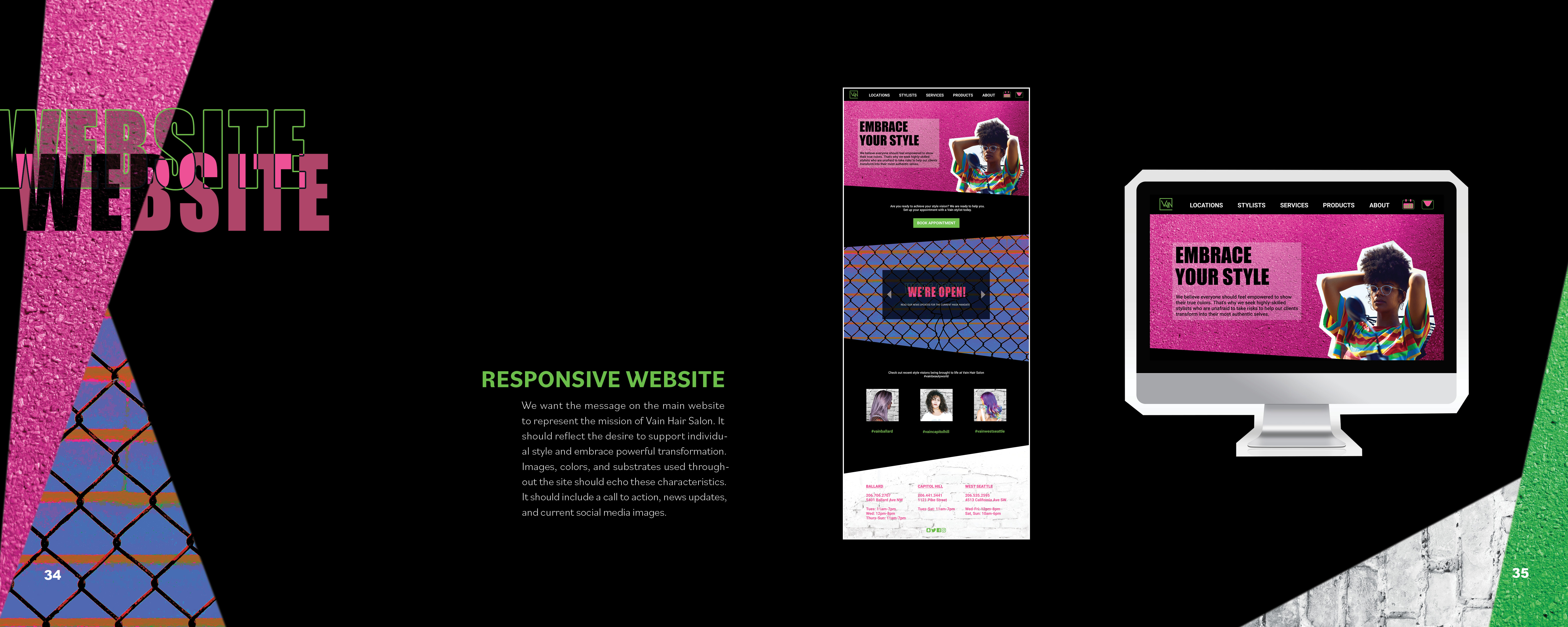
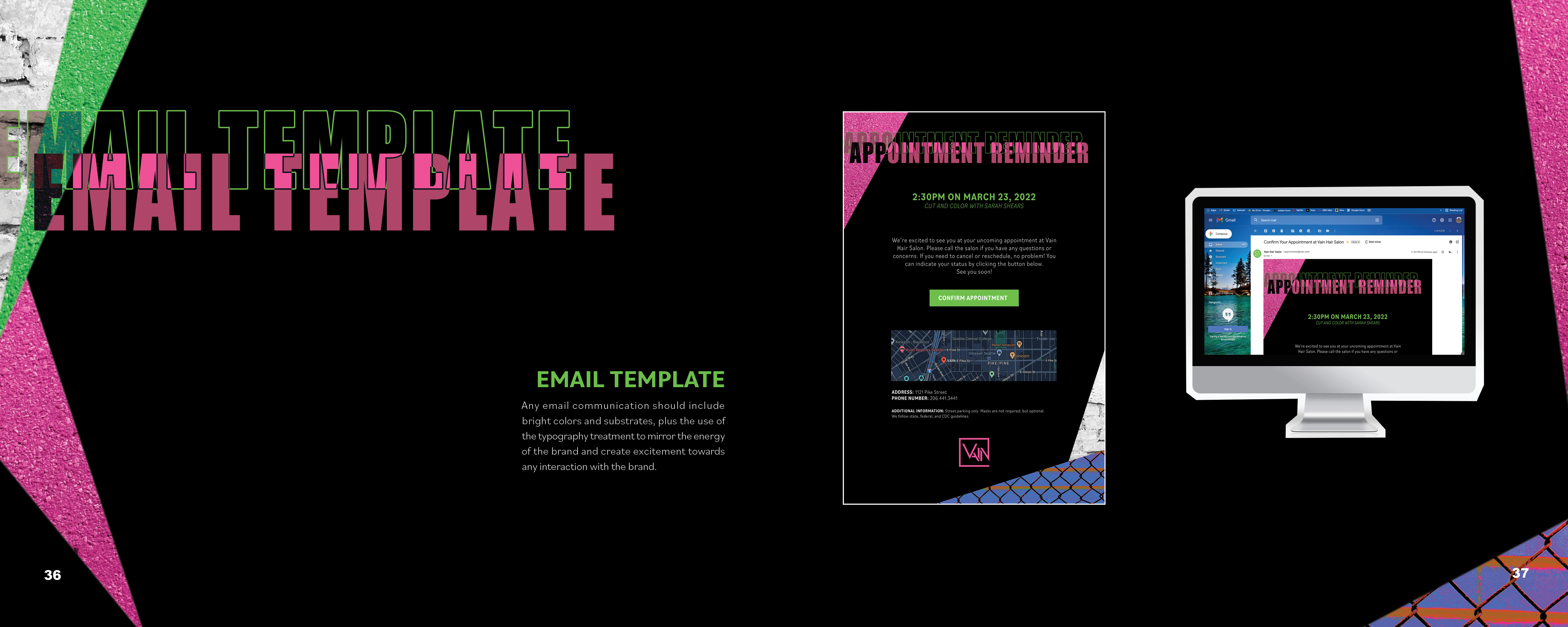
BRAND GUIDELINES BOOK






FINAL THOUGHTS
By simplifying the colors, textures, and graphics for the final concept board, it made it easier to create a strong system for typography, backgrounds, and other design styles.
The vibrant colors, urban textures, and authentic images of people work together to reflect the key characteristics and mission statement of Vain Hair Salon. The style is refined, yet edgy which makes it stand out against the crowd and attract Vain’s target audience. The style can be varied but also consistent and cohesive with all the pieces of branding.

WINEOLOGY
Time length:
9 weeksTools:
Figma, PhotoshopRoles/Skills:
Group project - UX/UI, Marketing, Branding, PackagingCollaborators:
Rabia FriedmanStephanie Guy
OVERVIEW
Wine subscriptions can often be pretentious and overwhelming for new wine consumers. Our team created a subscription box that makes wine fun, accessible, and easy to understand. Our challenge was to appeal to the curious wine drinker with an entertaining wine personality quiz, attractive packaging, relevant marketing, and web assets to support the wine subscription box concept.
PROCESS
To learn about trends in the market and how novice wine drinkers interact with wine, we researched competitors and conducted qualitative interviews. We discovered the target demographic is interested in customization, pretty packaging (without excessive packaging), and the surprise of what is inside the box. The target audience also loves trying new wines, but feels that too many options can be overwhelming. The current market provides little to no education about wine options and labels are inconsistent with information.
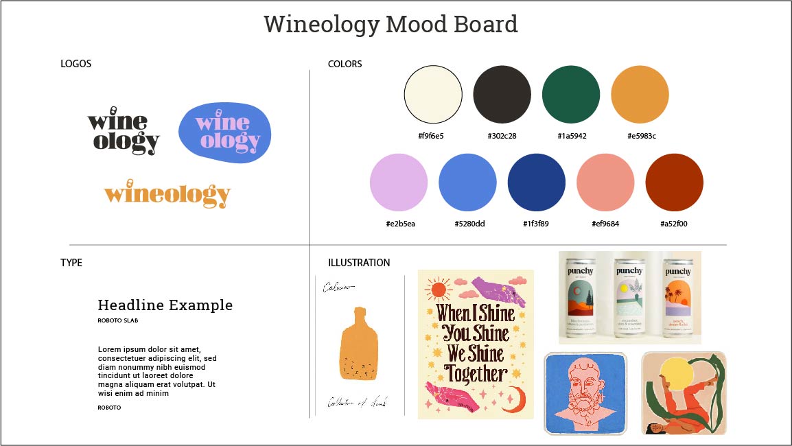
After analyzing our results, we focused on older GenZ and Millenials for our wine subscription service. We created a bespoke experience with a sassy tone of voice by developing wine tarot archetypes. The resultant brand was inviting, fun, and appealing to a curious wine drinker.
PROCESS DOCUMENTS


PROCESS CONTINUED
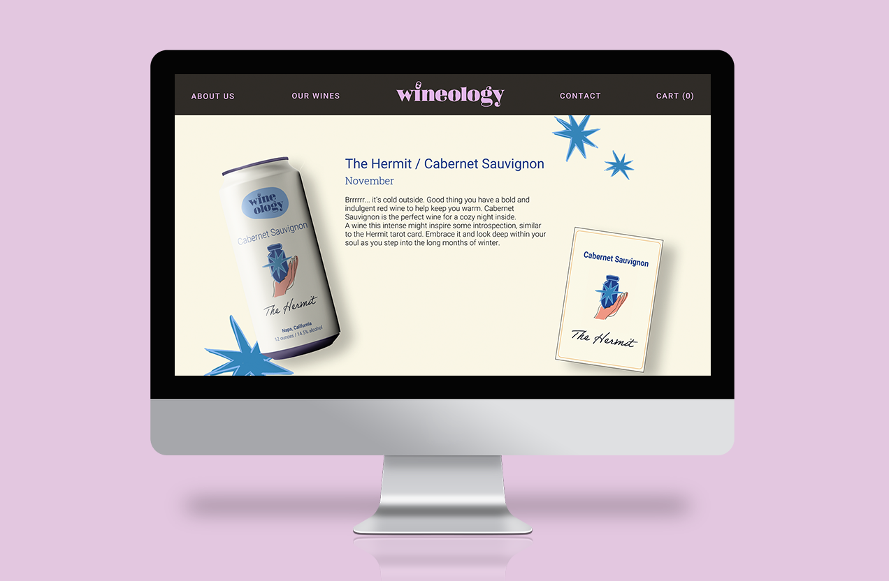
To make our brand more accessible, our wine comes in cans and can be purchased through a simple subscription model based on a user’s taste preferences. The tarot archetype indicates a wine personality for each user. For example, if the user takes our wine quiz and selects flavor notes and personality attributes of a Cabernet Sauvignon wine, then they are given The Hermit persona and sent those wines each month.
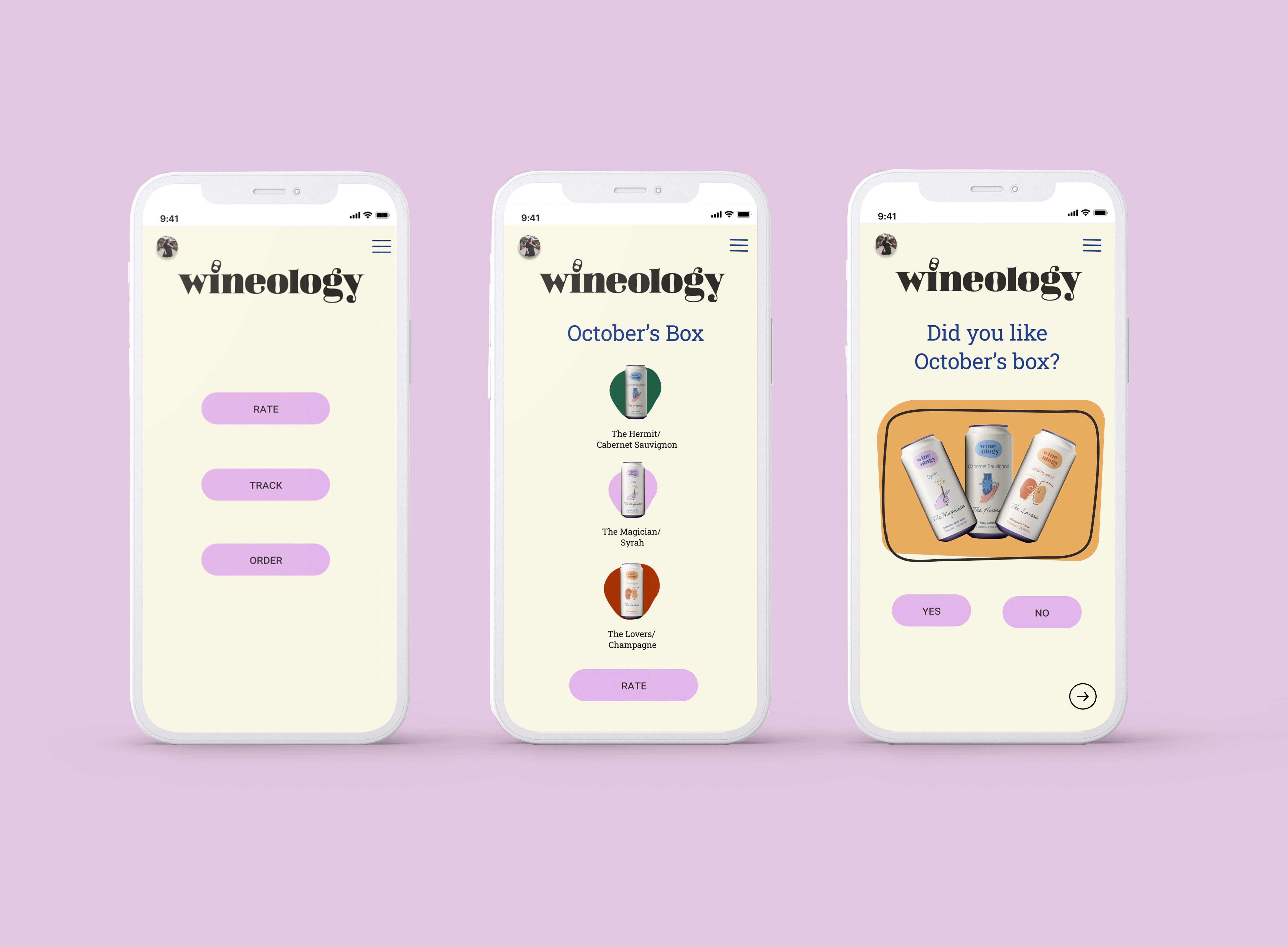
We spent a large majority of our project developing the look and feel of the brand. The website design explains the wine subscription process and includes the quiz that reveals each user’s wine tarot archetype. The following app flow shows the process of rating the different wines after enjoying each month’s subscription box.
Click here to view website and quiz.
WEBSITE & APP




UNBOXING EXPERIENCE


SOCIAL MEDIA MARKETING


FINAL THOUGHTS
The modern and attractive visuals for the packaging makes Wineology appealing to the target audience. The fun and unique storytelling through the tarot helps make the wine subscription box more entertaining and less pretentious than the competitors. For next steps, we could focus on reaching the target audience by social media marketing.
© Kristina Kenney
CONTACT ME
︎︎︎ kenney.kristina@gmail.com
︎︎︎ linkedin.com/in/kristina-kenney
︎︎︎ kenney.kristina@gmail.com
︎︎︎ linkedin.com/in/kristina-kenney